China’s new limit on video games for those under 18, the software features that are gone but not forgotten, Apple Watch exercise accuracy, and our writing on paper vs. typing preferences.
It’s been a rough few weeks for AgileBits, the company that makes password-manager 1Password. It announced that the new version of its Mac app would be built on a new, powerful and consistent code base, ensuring a consistency of product and a faster upgrade pace. Sounds good, right? It certainly did to AgileBits, which clearly saw its decisions as a win.
Of course, many Mac users reacted quite differently. What AgileBits actually did was throw its native Mac app in the garbage and replace it with an app built with the web-development system Electron, one that would be identical to the versions of 1Password on Linux and Windows. Good news, Mac users! We’re replacing your Mac app with a cross-platform, lowest-common-denominator version! Please clap.
On iOS, translate an Apple News URL into a real one via Shortcut.
A Six Colors subscriber writes:
If you have an Apple News link, is there a way to get the internet source link from it?
Apple News has this annoying habit of refusing to generate proper links for sharing. Instead, every link points to apple.news, which redirects Apple users to the News app and everyone else to a preview page. If you like those links opening directly in News, that’s fine—but if you share a link with someone else, you’re also advertising your use of Apple News and not supplying the real web source address of the story. These links can be especially annoying in some contexts because they obscure the source site and other details (like the keywords in the headline) that people might use to decide if the link is worth a click.
If you’re using Apple News on the Mac, you can find the source by choosing Open in Safari from the File menu, or choosing Safari from the Share menu, then copying the link from Safari. On iOS, you can use this shortcut from the share sheet—in Apple News or by tapping on holding on a link almost anywhere!—to convert the URL and share it.
If you’re not a fan of the Apple News app and would prefer to use your browser, consider using Jeff Johnson’s Mac app StopTheNews, which registers itself as the default opener for Apple News URLs, decodes them, and then sends them to your default web browser. The app launches when invoked and automatically quits when it’s done, so it’s only running for a moment when you click on an Apple News link. (A related app, StopThe MacAppStore, does the same for Mac App Store links.)
It’s the first-ever Upgrade Call-In Show! This week, Myke and Jason answer listener questions about Apple, themselves… and popular dance steps. Go ahead caller—we’re listening.
As we’ve gotten prepped to move to our new house, I’ve decided to switch up my TV audio setup from my old stereo receiver and bookshelf speakers to a soundbar, the Sonos Arc.1 When I made the purchase (on Massachusetts’s tax free weekend, and with a nice coupon), the discounted rate on the Roam made it a no-brainer to throw in. I figured it would make a solid “around the house” speaker that we could take outdoors, to a room with no other speakers, or even on a trip.
Conveniently enough, the Roam appeared just a couple days before my wife and I ventured off on vacation to a Wi-Fi-free undisclosed location, so I charged up the newly acquired Roam and threw it in my backpack.
This proved to be a solid decision.
When in Roam…
The Roam’s controls live on one of the end caps.
The Roam is pretty compact: at 6.61″ by 2.44″ by 2.36″, its rounded triangular body is about the size of a short, skinny water bottle. But that small chassis is packed with tech, attested to by its surprisingly heavy weight of .95 lbs.
Both end caps are rubberized, and one features playback controls: a play/pause button that also lets you skip tracks and go back with double and triple clicks, volume up/down, and a microphone mute. On one of the long edges you’ll find an on/off button also used for Bluetooth pairing, as well as a USB-C charging port. (That location, helpfully, ensures that the power button and charging port are always accessible, no matter the orientation of the Roam.)2
What makes the Sonos Roam attractive is its versatility. If you’ve got an existing Sonos setup, it’ll function like any other speaker in your setup; you can group it with other speakers and control playback via the Sonos app. Like most modern Sonos speakers, it also supports AirPlay 2, so once it’s configured, you can simply select it like any other AirPlay speaker from your iOS device or Mac.
However, if you take it out on the road, as I did, to some place where there’s no Wi-Fi network, Sonos has smartly made sure that the Roam maintains its utility via the inclusion of Bluetooth. That means you can take it anywhere you take your phone or other audio-playing device and still be able to jam to your tunes, listen to a podcast, or even watch some TV.
And indeed, we ended up using it for all of those things.
Apple today announced it has acquired Primephonic, the renowned classical music streaming service that offers an outstanding listening experience with search and browse functionality optimized for classical, premium-quality audio, handpicked expert recommendations, and extensive contextual details on repertoire and recordings.
With the addition of Primephonic, Apple Music subscribers will get a significantly improved classical music experience beginning with Primephonic playlists and exclusive audio content. In the coming months, Apple Music Classical fans will get a dedicated experience with the best features of Primephonic, including better browsing and search capabilities by composer and by repertoire, detailed displays of classical music metadata, plus new features and benefits.
I know a lot of classical music aficionados who have been frustrated by the way Apple Music handles the genre (even calling it a “genre” is a bit reductive, I know), so this strikes me as good news for Apple Music subscribers.1
Trying to read the man pages for the utilities most frequently seen in these extended command chains didn’t make them seem more approachable, either. For example, the sed man page weighs in at around 1,800 words alone without ever really explaining how regular expressions work or the most common uses of sed itself.
If you find yourself in the same boat, grab a beverage and buckle in. Instead of giving you encyclopedic listings of every possible argument and use case for each of these ubiquitous commands, we’re going to teach you how to think about them—and how to easily, productively incorporate them in your own daily command-line use.
I really appreciated this piece: though I’ve been a long-time user of grep and I’ve seensed and awk I’ve never really grokked1 how best to use them. Salter’s overview is very simple and runs through the most basic uses which means that I may actually end up using and understanding them instead of just pasting in code I got from somewhere else.
The design of Safari 15 on the iPhone has gone to a better place, but Stephen Hackett reminds us that trouble on the Mac and iPad remain:
The ordering of the UI elements at the top of the screen… divorces the tab — which includes the name of the current webpage — from the webpage itself. Maybe everyone at Apple prefers their bookmarks in the Sidebar instead, but for those of us who are used to the more traditional location, having the Favorites Bar split the tab and its content makes skimming what tabs are where more work than it should be.
To make matters worse, it’s hard to tell at a glance which tab is active and which is inactive. Previous versions of Safari didn’t struggle with this, but Apple has seem to fit to bring the age-old “which iPad app has focus” problem to the browser. Using the Monterey beta, I almost always end up trying to tab to or away from the wrong tab because I can’t quickly register which one is active when looking at the tab bar.
I think Apple has improved the legibility of the selected tab a bit in recent betas, enough that it’s usable, but it’s not as good as it could be.
As to the placement of the Favorites Bar — there’s really no excuse. It breaks the entire metaphor of tabs by placing non-tab-specific content beneath tabs, and divorces the tabs from the URL bar. I’d like to believe that this is a design oversight that Apple will correct at some point, but my fear is that Apple simply doesn’t think the Favorites Bar is a relevant feature in a world where you can browse your favorites from a Safari Start Page.
I like the Start Page a lot, and on the iPad I frequently navigate to favorite sites via the Start Page. But on the Mac I use the Favorites Bar all the time. It’s a valid and valuable Safari feature, and it deserves better than the bad placement it has in the current Safari 15 betas.
Here at Apple, we know how important browsing the web is to our customers. It’s how many of us pay our bills, manage our health care, and attempt to figure out exactly what an ‘updog’ is.
So when it came time to redesign the interface to our industry-leading web browser Safari, it was an endeavor we undertook with the utmost seriousness that befits the critical nature of the app’s place on our platforms. This couldn’t be something that was just slapped together or changed for the sake of change: altering something as fundamental as the conceits of a web browser is an action that must be thought through carefully, with every facet justified and considered. At Apple, we pride ourselves on saying a thousand no’s for every yes, as anybody who’s ever dealt with our PR department can attest.
But after days of painstaking work developing this brand new interface, we’re pleased to finally share with you… the new Safari.
It starts off with the all-new address bar. At Apple, we like to say we’re at the intersection of technology and liberal arts, and I’ll tell you where that intersection isn’t: floating over the content that you want to see and interact with. Instead, we’ve positioned the address bar cleverly at the top of the browser window, so you can easily understand at a glance what site you’re on.
But we haven’t stopped there. Located conveniently inside that address bar, you’ll find a button for arguably the most important web browsing feature, refreshing a page. It’s a staple of the web browser, and there’s no reason to be coy about the need to access it. Bam. We’ve put it right in front of you, plain as the hair on Craig’s head.
Let’s talk tabs. With our latest operating system updates, we’ve added a great new feature called Tab Groups. That’s because we know our users are passionate about browsing in tabs, whether they have a thousand or two thousand open at any given time.
Tabs are an important part of the browser window, so we think it would be silly to minimize their appearance in ways that make them less functional. After all, these days we use powerful devices with the ability to display important information when and where you need it, not constrained by any artificial idea of space efficiency—this isn’t a college dorm room.
On the iPhone, especially, we realize that people want quick access to features like sharing and bookmarks, and that’s why we’ve designed a clever toolbar that provides single-button access to some of the most commonly used features. There’s a temptation to hide these away, or smush them together into the digital equivalent of a ‘junk drawer’ in the name of that same space efficiency, but our guiding principle has always been that design isn’t just how it looks, but how it works.
Getting to this new version of Safari hasn’t been easy, but we know our customers will be pleased by the result: an efficient and effective web browser that lets them get to the heart of the web browsing they need to do each and everyday. We think it’s important to be thoughtful in our design process, and we think that’s borne out in this year’s beta process in which our developers and early adopters responded so positively to the new Safari.
Only Apple, with its combination of hardware, software, and services, has the power and know-how to deliver such a groundbreaking piece of software that promises to change the very way that we interact with the web, with unprecedented speeds and 120 percent less swearing. We think you’re going to love it.
[Dan Moren is the East Coast Bureau Chief of Six Colors, as well as an author, podcaster, and two-time Jeopardy! champion. You can find him on Mastodon at @dmoren@zeppelin.flights or reach him by email at dan@sixcolors.com. His next novel, the sci-fi adventure Eternity's Tomb, will be released in November 2026.]
Whether we see ourselves one day carrying foldable phones, our thoughts on drone and robot delivery, changing the rules of copyright, and designing our own computers. Jason sits in for Dan this week!
iCloud Private Relay will be released as a public beta to gather additional feedback and improve website compatibility. (82150385)
Essentially, Apple has decided to launch iCloud Private Relay as a beta when iOS 15 ships in the fall, and the feature will be turned off (for now) by default. Paying iCloud users will be able to turn it on and try it out. iCloud Private Relay helps obscure web-browsing behavior by passing website requests through two proxy servers.
It seems like Apple’s slowing this roll-out down, at least in part, because there are lingering compatibility issues with some websites—most notably sites that are displaying the wrong region-specific content, or getting confused when signing in. There are some fairly easy remedies web developers can do to make these issues go away, but getting the web to adjust to any new feature takes time, and Apple appears to have erred on the side of caution.
Apple has put TestFlight for Mac into public beta testing. After years on iOS, in June Apple announced that its tool for beta-testing apps would come to the Mac this year. It’s been missing in action during early macOS betas, but as of Wednesday, it has arrived. For developers who want to use it, and fellow developers who want to sign up for betas on their Macs running macOS Monterey Beta 5.
This isn’t just for Mac apps, either. According to John Voorhees at MacStories, iOS apps that run on M1 Macs also appear in TestFlight on the Mac.
A couple of decades ago, most people probably didn’t imagine there would be a day when they would carry around an incredibly powerful piece of technology that would be utterly integral to their daily lives. Back then, cellphones had only recently become affordable (it hasn’t even been 20 years since I got my first one); the concept of fitting the internet into your pocket was still a few years away.
But the smartphone revolution came, saw, and conquered. Nowadays it’s far easier to imagine getting by without a car or a computer than without a smartphone. But technology has a way of never standing still and, moreover, technological evolution seems to progress at an accelerating rate. The amount of time it took us to go from mainframes to desktops was a lot longer than to go from desktops to laptops, or laptops to smartphones.
Which raises the question: what happens after the smartphone? Every big tech company in the world—well, the smart ones at least—has got to be looking down the road to figure out where our digital future is headed, and Apple’s no exception. The clever folks in Cupertino have clearly already been thinking about this, and you might be surprised to realize that a few of the contenders are already here—even if they’re not about to supplant your iPhone in the near future.
Notes in macOS Monterey includes a lightweight tagging feature.
What do you think of when you think of the apps Apple includes with macOS and iOS? Are they too simple, too complex, or just right? Do you use them or ignore them in favor of more sophisticated apps from third-party developers? Is the fact that they’re included with every device a bonus or a mark against them?
In truth, the path Apple takes with its included apps is a precarious one. Included apps are a part of the overall value of the operating system, and by extension, Apple’s hardware. And most users will never, ever download a third-party app to replace the ones included on the device. (Apple’s role as a dominant player in the podcast market owes an awful lot to the fact that in recent years every iPhone has shipped with an app called Podcasts.)
A built-in app has to be easy enough for everyone to use without much trouble. It’s got to be a crowd-pleaser. But at the same time, it needs to move with the times or risk being left behind. Yet when one of Apple’s apps moves ahead, it invariably does so by adding features that were previously available in third-party apps. And at that point, Apple will be accused of “sherlocking”1 those features and threatening the future of those apps.
Given that the word sherlocking is nearly 20 years old (and the concept behind it is even older), this is not a new issue. It’s easy to tell stories about big, bad Apple coming in and destroying the markets for third-party apps by building their best features into the free core of the operating system—because it’s true. But it misses the point.
Apple can’t afford to keep its built-in apps simple and stupid. It does have to try to surf the zeitgeist, but delicately, providing the masses with crowd-pleasing features reminiscent of those found in other apps. App developers that build alternatives to Apple’s products by filling in obvious omissions apps are playing with fire—because Apple will eventually fill those obvious holes.
Canny app developers know that when Apple adds features to its built-in apps, it’ll do it by creating something that’s been sanded down silky smooth and varnished to a shiny finish. It’ll be the sort of feature that appeals to those masses but lacks all the details, the fiddly extras, the edge-case features—and that’s the place where a third-party app can continue to add value and keep its business going strong despite Apple’s arrival.
To use an example from iOS 15, Notes and Reminders have added support for tagging individual items. Sounds pretty fancy, but if you look closely, you’ll find that it’s simple. Anything you type as a hashtag is recognized and added to an index of tags. You can click on tags in the sidebar to search for them. You can build smart lists based on them. But that’s it. No notetaking or to-do app should be quaking in their boots.
Inspired by, not sherlocking, PKM apps
Still, it makes me wonder about the future of the Notes app. The hottest thing in personal productivity are Personal Knowledge Management (PKM) tools such as Obsidian and Craft. These are apps or web services (or both!) that let you collect information in various documents and letting you link them all together, creating a Wiki-like experience for your notes—including features like a graph view of all connections and a list of all documents that link into a given document.
Obsidian will let you interlink documents (left) and display incoming links in a panel (right).
So if you work in the Notes team at Apple, what do you think when considering all the PKM hype? Do you consider it too hot to handle, something that’s way too far out-of-bounds for a simple app like Notes? Or do you consider it an important future direction for Notes to keep it relevant?
My guess is—surprise, surprise—somewhere in between. I suspect that the Notes team would try to understand what user needs PKM tools are fulfilling—and whether the broad middle of Apple’s user base has similar needs. If so, what could Apple do to fulfill those needs in a way similar to what the PKM tools provide, but with much greater simplicity. The result is probably an update to Notes for iOS 16 or 17 that offers features that seem vaguely PKM-like, but probably in a way that hard-core users of Obsidian will turn their noses up at. Users of Roam Research will say Apple’s new features are “for babies.” A blogger will accuse Apple of trying to “sherlock” Craft.
It’s all very predictable. And the result will be: Notes will get better, the other apps will keep on serving an audience that needs a lot more out of their apps than Notes can ever provide, the blog post will get attention for a couple of days, there will be a minor spurt of Twitter outrage, and life will go on.
(For the record, I’d predict that Notes will pick up the ability to cross-link to other notes, and you’ll be able to view backlinks from a particular note. I’d also expect Apple to expand its support for tagging, including using hashtags to jump around to related Notes.)
Sherlocking 1Password? Too late.
The macOS Monterey password manager is good enough for most—but not all—individuals.
At the risk of stoking more outrage, let me bring up another recent example of the tension between Apple’s built-in features and those found in third-party apps. Recently AgileBits announced 1Password changes that angered a lot of people. I pointed out that Apple’s new password-management features in iOS 15 and macOS Monterey are impressive enough that many 1Password users might not need to use the app anymore. I suspect that AgileBits’s drive toward supporting teams and larger businesses over the past few years has been driven by a realization that basic password management is rapidly becoming table stakes for device operating systems.
And in fact, I have heard from many upset 1Password users who say they can’t really abandon the product because they have come to rely on shared vaults with family members and collaborators. This was all according to plan. AgileBits is moving that product into areas that aren’t as easily replicated by Apple or Google or Microsoft.
That said, I would imagine that most individual users can get by with Apple’s features just fine. Between the new password manager, which supports time-based authentication codes, and the longstanding ability to password-protect and encrypt notes in Notes, a lot of 1Password’s core functionality is going to be built into every Mac, iPhone, and iPad.
This is how this works. The vast majority of users will now get access to a password manager that’s good enough for their needs. People who have never really used a password manager or never used time-based authentication codes will now be more likely to do so because it’s all built-in with an improved interface. But there will remain a large market for people and organizations that need more than Apple can deliver.
And Apple will continue to walk that line, trying to keep its apps relevant but with mass appeal.
Two decades ago an app called Watson wrapped web search into an app interface. A software update to Apple’s Sherlock search utility (long since replaced by Spotlight) introduced similar functionality and displaced a large part of Watson’s potential user base. ↩
This week we kick off our annual fundraising for St. Jude, ask listeners to call in with their questions, and discuss how Apple approaches putting features in—and taking them out—of its public betas.
My thanks to Tempo for sponsoring Six Colors this week. Tempo is an email client with a calming interface, with unique features designed to remove email anxiety and put you in control.
Tempo delivers new emails in batches around a customizable schedule, giving you control of when you get notified to sort through everything that’s new. You can sort your inbox, mark everything that needs your attention as a To-Do item, set Reminders for later, and archive the rest. There’s also a special tab to keep newsletters neatly separated from the rest of your inbox so that you can read them in peace.
Tempo also believes in privacy, not selling data and actively removing tracking pixels. It’s a company and a tool that believes our most important work happens outside of your email client.
August 20, 2021
Dan’s got an Existence Reveal, Apple shows some restraint regarding OS features, and built-in iOS apps get smarter.
[We’re taking next week off. The Six Colors Podcast will return Sept. 3.]
Apple has spent a long time moving its operating systems and the apps that run on them closer together. Take a look at Apple-built apps like Music, Photos, Notes, and Reminders and you’ll see years of effort to bring those apps together both in terms of looks and functionality.
And yet some differences have persisted, ones that have always implied more of a philosophical divide than a technical one. Some of the most advanced features on macOS didn’t migrate to the iPhone and iPad, no matter how useful they might be.
But things are changing. The iPad and Mac, especially, are coming together. Apple has spent years suggesting that the iPad is becoming a peer of the Mac. It’s tough to square that argument with the decisions that keep advanced features on the Mac and off of iOS.
I don’t want to get too excited, but this fall with the release of iOS 15, Apple is breaking through a barrier that has previously starved its iOS apps. We’ve entered the era of smart features on iOS, at last.
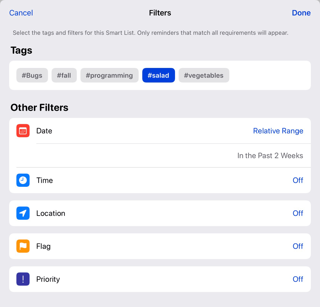
Reminders in iOS 15 offers user-created Smart Lists.
Not so smart, Apple
Today, my iPhone and iPad use iCloud to seamlessly sync my music and photos libraries, as encapsulated in the Music and Photos apps. And yet a few items on my Mac just won’t sync to those devices, no how hard I try: Smart Albums and Smart Playlists.
If you don’t know, these are features that allow items to be collected together based on user-defined attributes, rather than being defined manually by adding items to an album or playlist.
Since the earliest days of iTunes, you’ve been able to create a Smart Playlist containing the 25 songs you’ve played the most, or songs added to your library in the last 60 days, or all songs that match a particular artist but aren’t part of a live album.
Similarly, for years iPhoto and later Photos have allowed users to construct albums based on photo data. For example, I have a Family Photos album that only displays photos containing me, my wife, and our two kids. (It’s a great one for use when constructing a holiday card.)
Apple Mail on the Mac offers Smart Mailboxes, which let you display all messages matching critera like the sender, text found in the subject, or if a message contains attachments.
Not only can’t you construct those Photos albums on iOS, you can’t even see them. They just don’t sync. (A workaround is to copy the results of a smart album into a static album. This will sync—but that new album won’t update automatically as your library changes.)
I’ve been frustrated about this feature not migrating to iOS for a long time, but I always told myself that it was a power-user feature, and Apple was probably philosophically opposed to adding custom filters to a platform that’s fundamentally less complex and powerful than the Mac.
But things have changed!
The smart future
Notes in iOS 15 lets you create Smart Folders based on tags.
In iOS 15, Apple is adding new features to Notes and Reminders that undermine the entire idea that the iPhone and iPad are devices that can’t handle the building and display of rules-based collections.
In Notes, Apple is adding support for adding organizational tags to notes. As a part of this feature addition, you’ll be able to create Smart Folders that will display any note containing a particular tag or set of tags.
In Reminders, Apple is adding Smart Lists. A Smart List will show all your reminders that meet specific criteria—not just tags, which are also being added to Reminders, but date and time ranges, location, flagged status, and priority. Adding a new reminder to a Smart List will even do the right thing and apply all the attributes that define that smart list. Very clever. Very sophisticated.
Which brings us back to Music, Photos, and Mail. I don’t want to say that the developers of the Notes and Reminders apps have made their colleagues look bad, but… well, they have. They have broken the seal. They have proven that iOS can handle dynamic, rules-based organizational groupings.
So no more excuses, Apple. Notes and Reminders in iOS 15 show the way. Time to sync up these features with Photos, Music, and Mail on iOS.