Reviews are in and the new MacBook Pros are a hit! Customers love the power, the battery life, the not totally garbage webcam, and the function keys that are actual keys. It’s hands down the best pro laptop Apple has made in years, and nobody could be disappointed by a single aspect of it.
Well. Except…the notch.
What used to be just a campfire tale warning children about the danger of those newfangled iPhones has now come for all of our Macs. Devouring our menu bars with no remorse. Consuming cursors with a vengeance. Concealing valuable, much-needed screen real estate.
Surely Apple, in its infinite loop wisdom, could have found a way to design around the notch. A company that can fit thousands of songs in your pocket? One that can pack so much power into smartphones that they can outperform expensive computers? That continues to make money with the efficiency of a machine designed only to make money? No, the idea simply beggars belief, which means there’s only one reasonable conclusion that any right-minded person can reach.
Conspiracy.
What is Apple hiding behind the notch? What truth lurks, obscured only by that seemingly innocent black, half rounded-corner rectangle?1 I’ve spent hours upon hours poring over obscure history books, ancient texts, and, naturally, the darkest corners of the Internet2, carefully sifting the incisive from the inane, the observant from the obvious, and the sharp from the batsh—well, you get the picture. After careful consideration of the facts, I’ve emerged with six contenders for the best theory as to what lies beneath…the notch.
Universal Control: Apple promised the feature in its latest releases, but it’s barely been featured in the beta releases. What gives? Simple answer: the control to enable it is hidden right under the notch. All you have to do is slide your cursor behind it, hold down globe-command-shift-option-control and click your trackpad three times while chanting “There’s no place like home.”
A better webcam: Just 1080p? Are you kidding? Of course Apple packed a better camera into its latest and greatest laptop. Even the $329 iPad’s camera is a 12 megapixel wide angle module with Center Stage, and it’s not like Apple would put a worse camera into a two thousand dollar computer. Pfft. The notch? That’s just the plastic cover that you forgot to peel off.
Siri: Your virtual assistant has to live somewhere! You know how the Keebler Elf lives in a tree? Basically the same thing. How else do you think they can hear you all the time?
A golden ticket: Tim Cook’s going to retire some day—perhaps sooner than later—and if we learned anything from classic tales of retiring if eccentric CEOs, it’s that the only equitable way to pick a successor is randomly…followed, of course, by an obstacle course of outlandish and innocent-seeming-but-surprisingly-deadly tests. (Trust me: whatever you do, do not eat the iPod shuffle.)
A map: I have it on good authority that the application of a little heat right beneath the notch will reveal the location of a huge lost cache of historical artifacts carefully hidden by the Freemasons. What, you think Apple got rich just from selling phones? Please.
More screen: It’s that simple. They just want to see who’s brave enough to check.
There has got to be an easier way to describe that. ↩
[Dan Moren is the East Coast Bureau Chief of Six Colors, as well as an author, podcaster, and two-time Jeopardy! champion. You can find him on Mastodon at @dmoren@zeppelin.flights or reach him by email at dan@sixcolors.com. His next novel, the sci-fi adventure Eternity's Tomb, will be released in November 2026.]
It’s Record Quarter Season again. On Thursday, Apple announced another record for its fiscal fourth quarter, ending its fiscal year with a three-month period in which the company generated $83.4 billion in revenue, up 29 percent from the same quarter a year ago. (In fact, Apple’s shown very little fiscal fourth-quarter growth lately, making this quarter that much more impressive.)
Still, does a dark cloud hang over Apple? If you’re a financial analyst, maybe. And that’s the most interesting detail that came out of this week’s look into Apple’s finances.
Here’s our complete transcript of Apple’s conference call with financial analysts on October 28, 2021, featuring CEO Tim Cook and CFO Luca Maestri making statements and then answering a few questions from the analysts.
Tim Cook’s opening remarks
Thanks, Tejas, and good afternoon, everyone. And thank you for joining the call today. A year ago, I spoke to you about the atmosphere of uncertainty in which we were living and the way it had come to define our daily experience, both as people and as a company. Today much has changed, profoundly so. And while we are still living through unprecedented times, we are encouraged by progress around the world. I’m grateful to our teams, who have stayed resolutely focused on our customers and the pursuit of innovation on their behalf. We’ve aimed to help our customers navigate the world as it is, while empowering them to create the world as it can be. Whether it’s public health workers managing vaccination campaigns on iPhone, or students returning to classrooms full of iPads, or families staying connected over FaceTime, it is an honor to know that what we make matters and to see that reflected in the world and in our performance.
On Thursday, Apple announced results for its fourth financial quarter of 2021, covering July through September. The company generated $83.4 billion in revenue. (The previous two fiscal fourth quarters showed very low growth over the previous year, so this year’s 29% increase in revenue year-over-year is especially impressive.)
iPhone sales were $38.9 billion, up 47% versus the year-ago quarter. It was a very good year for the iPhone business. Services were $18.3 billion, continuing their relentless growth pace at 26% above the year-ago quarter.
Wearables sales were $8.8 billion, up 12% versus the year-ago quarter. That’s a good number out of context, but actually the slowest year-over-year growth rate for the category in almost five years. It’s a very seasonal business, though, so to truly judge the state of Apple’s wearables business, we should wait until the holiday quarter.
iPad sales were $8.3 billion, up 21% versus the year-ago quarter. The iPad business has averaged almost $8B in sales per quarter over the last year. We’ve seen six straight quarters of year-over-year growth for the iPad, 10 of 12, and 14 of 18.
Mac sales were $9.2 billion, up 2% versus the year-ago quarter. Despite the Mac’s smaller year-over-year growth number, it’s important to keep in mind that last year’s fourth quarter was the best Mac quarter ever at the time, and at $9.2B this is a new all-time record quarter in terms of Mac revenue.
Shortcuts has arrived on the Mac with macOS Monterey, and while the new Shortcuts app is pretty weird, it works—and it brings most of the functionality from Shortcuts on iOS along with it.
As I’ve written about before, building Shortcuts is frequently much easier than building similar workflows on macOS using AppleScript and Automator. Now that Shortcuts is on the Mac, there’s no need to replicate shortcuts from iOS using those technologies! Instead, the same shortcut can run on both platforms. Problem solved.
Err… well… okay. Maybe not solved. While you might have rightfully assumed that not everything that works in Shortcuts on the Mac will work in Shortcuts on iOS—AppleScripts, shell scripts, and the like simply don’t exist on that platform—it might surprise you to learn that the reverse is also true. The Mac’s version of the Share menu is not nearly as sophisticated as the one on iOS, and the Share menu is a major launching point for iOS shortcuts. Safari’s automation interface is, similarly, not nearly as friendly on the Mac as on iOS.
But will that stop us? No! This week I’ve converted several of my shortcuts to “universal” versions that run on both macOS and iOS. Here are some tips and tricks that I’ve learned along the way.
Whether we could see ourselves making use of a “Metaverse,” our supply chain woes, the best features of macOS Monterey, and how we review devices as tech journalists.
One of the most interesting wrinkles about Apple’s new MacBook Pros is that the company offers them with two different chips. At first glance, you might assume that the more expensive M1 Max chip is simply a bigger, faster, more powerful chip than the less expensive M1 Pro—but looks can be deceiving. The two new chips are closely related, and depending on the kind of work you do with your MacBook Pro, the extra power of the M1 Max might not be worth the extra price.
If there’s a theme of Apple’s operating-system releases in 2021, it’s platform unification. This development is most significant for macOS, which tended to lag behind iOS in the 2010s, missing out on some or all of the year’s exciting innovations.
Apple has spent the last few years getting the base technology of iOS and macOS back in sync, removing 32-bit software, adding Mac Catalyst and support for iOS apps on Apple silicon, and introducing new cross-platform development technology via Swift UI. And with macOS Monterey, you can see the fruits of all that labor: The big new features of iOS 15 and iPadOS 15 are also the big new features of macOS Monterey.
Unfortunately, some of the biggest features are still missing. The most important new feature in Photos is missing from the Mac, though Apple says it will arrive soon. And one of the biggest features being imported to the Mac from iOS, Shortcuts, is in a half-finished state.
But here’s the good news: Despite all the worry among Mac users the past few years that Apple might be attempting to collapse Mac, iPhone, and iPad into a single amorphous product, macOS Monterey still feels unreservedly like a Mac. While Apple wants its platforms to share features, it also recognizes that each serves a different (albeit overlapping) audience.
If there’s two things that we here at Six Colors love, it’s putting data in our Macs’ menu bars and the weather—also, of course, combining those two things.
Netatmo provides an API to let you retrieve data from its weather stations, and its documentation page even allows you to test it out with your own device (you’ll need to log in to your Netatmo account first).
The standard Netatmo system is composed of two modules: one that sits inside your house and one that goes outside. I was more interested in the outside temperature, though I may adapt it in the future to provide information from both. However, the outside module collects relatively little information: just temperature and humidity.1 (The inside module, by comparison, also measures noise and CO2 levels.)
Writing the script itself proved to be fairly straightforward; it was largely built on a similar script that I’d made to display the current UV level. Like many APIs, Netatmo’s can be accessed using a variety of programming or scripting languages. Data is returned in JSON format, allowing you to pick out the specific information you want.
But the real challenge came in dealing with authentication. The example code shown on the API page includes an authorization token…but that token is only temporary. Netatmo uses a framework called OAuth, which not only requires a more complex process to obtain an authorization token, but also provides tokens that expire after a certain amount of time. So I couldn’t simply hardcode in the tokens used in the example page—instead, I had to add code to request a token.2
Once I had the script working, I added a few additional refinements. In addition to the current temperature, the Netatmo API provides information about the temperature trend, in terms of whether it’s going up, down, or is stable; this is reflected in my script by an up arrow or down arrow next to the temperature (I opted to show nothing if the trend is stable, for simplicity).
I also added a battery level gauge, including a handy icon to show you if it’s good (above 50 percent), moderate (between 10 percent and 50 percent), or low (10 percent or lower). And since the data from the module refreshes every 10 minutes, I added a timestamp to say when it was last updated.3
Finally, I used SwiftBar’s link feature so that if you select any of the information from the dropdown portion of the menu, it will take you to your Netatmo web dashboard, which includes historical data and other metrics (mostly gathered from sources other than your weather station).
I may continue to refine this over time, but for the moment, I’m making it available for download, with the following configuration information.
Configuration
Note that this script is written in PHP, which I believe is no longer included in the operating system as of macOS Monterey, so you’ll need to install it via Homebrew. Also note that Homebrew installs on different locations whether you’re using an Apple or Intel processor; this version of the script expects PHP in /opt/homebrew/bin/php, which is the default installation location on Apple silicon.4
You’ll need a handful of details to configure the script, including the username and password for your Netatmo account, and your module’s MAC address (probably easiest to obtain via your Wi-Fi router).
In addition, you’ll also need to create an application via Netatmo’s developer page. Once you do, it will provide you with two key pieces of information: a client ID (a string of static characters identifying your app), and a client secret (essentially a password). These two pieces of information are used to retrieve the authorization token, as described above.
Once you’ve entered your information in the script, drop it in your SwiftBar plugin folder, and it ought to retrieve the necessary info.
Note that the script is being provided as is for your entertainment; I welcome feedback, but I can’t necessarily accommodate troubleshooting requests for particular setups. Best of luck, and enjoy!
Somewhat confusingly, the API page claims that the outdoor module also monitors pressure, however, in practice that information only seems to be returned by the indoor module? I’m not sure how significant the difference would be, but I haven’t yet bothered to add support for it in the script. ↩
As a result, my system requests a token every time the script refreshes—which works, but actual web developers will know isn’t really how the system was designed. In theory, it should use a different refresh token to request a new authorization token when the earlier one expires, but that would require caching persistent information on disk, and, as far as I can tell, SwiftBar’s plugin architecture isn’t really designed for that. ↩
This ended up being weirdly complex, thanks to the fun that is timezones. ↩
If you’re running on Intel, this should probably be /usr/local/bin/php instead, but you can clarify by running the command which php in Terminal and using the resulting path. ↩
[Dan Moren is the East Coast Bureau Chief of Six Colors, as well as an author, podcaster, and two-time Jeopardy! champion. You can find him on Mastodon at @dmoren@zeppelin.flights or reach him by email at dan@sixcolors.com. His next novel, the sci-fi adventure Eternity's Tomb, will be released in November 2026.]
Jason’s spent the last week with the new 14-inch MacBook Pro with M1 Max processor, and we’ve got his in-depth review. And at last, Jason and Myke both review the new Apple Watch Series 7.
The new 14- and 16-inch MacBook Pro models usher in a new era in Apple laptops. These are the first high-end Macs to be powered by Apple-designed processors, and that’s a big deal—but they also reject the minimalist design mid-2010s Apple, which achieved design simplicity by forcing complexity and frustration on users.
These new MacBook Pros are a success story not just because of Apple’s custom-built processors, but because Apple has admitted (in deeds, if not words) that the previous generation of laptops were a misstep. When you’re designing a tool for professionals to use—and make no mistake, these MacBook Pros are serious tools for serious jobs and priced accordingly—function should always win out over form. There’s a different sort of elegance to be found in versatility.
I’ve spent the last week with a 14-inch MacBook Pro with an M1 Max processor with 32 GPU cores and 64 GB of RAM. And I’m happy to report, it’s true—all of it. Apple has undone its mistakes of the past few years and created a laptop that’s essentially a Mac Pro you can slide into a backpack.
A flatter look
They’re separated by 20 years, but the MacBook Pro’s similarity to the Titanium PowerBook G4 is remarkable.
With this revision, Apple has admitted that it’s okay to stick a few extra ports on a laptop to please professional users. But just because function has won a round over form doesn’t mean Apple has abandoned its sense of design. At a glance, you can tell that this isn’t the same MacBook Pro1 design that we’ve seen over the last decade or more. The corners are noticeably curved, but the edges are much tighter, eliminating the feeling of gentle, gradual curves. The result is a laptop that looks more like a stretched-out version of an app icon—a flat roundrect.
The result is that, when closed, the top of the MacBook Pro bears a striking resemblance to the Titanium PowerBook G4—it’s a flat expanse, without a leisurely curve at the edge of the shell. The keyboard also reminds me of the Titanium PowerBook and other early Mac laptops, in that it’s got black keys placed in a black key well—in contrast to Apple’s previous design, in which the metal between the keys was the same color as the rest of the shell.
Even the screen reminds me of the Titanium PowerBook—it’s thin, but feels solid, and the borders around the screen are much smaller than on previous MacBook Pros. (Apple has even migrated the name of the product, previously labeled right below the screen, to an etched area on the bottom of the computer.)
A gorgeous display, plus menu bar
The notch lives in the menu bar, which gets it out of the way (of everything but menu bar items).
In another laptop, the display would be the entire story. Apple has moved the MacBook Pro to the same technology it’s using in the 12.9-inch iPad Pro. In other words, this is a 120-hertz ProMotion display with a wide color gamut, backlit by mini-LED display technology that allows it to run bright and peak even brighter, while also maintaining black levels that contribute to a remarkably extended level of dynamic range.
It looks incredible. HDR images that I’m used to viewing on my iPhone or iPad now display just as well on this screen. Movies and TV shows made in HDR consistently surprise me with extra-bright peaks.
It will probably take a little while for Mac apps to be updated to support the ProMotion display. I found that some apps scrolled text in the same buttery-smooth way that apps do on my iPhone and iPad, but others didn’t. I was able to find a few Catalyst-based apps that have already been written to support 120Hz displays on iPad and iPhone, and they looked spectacular.
The display is curved at the top corners, like an iOS device. The curve matches the curve of the laptop itself, as well as all the windows in macOS Monterey and macOS Big Sur. Meanwhile, the bottom corners of the display are still right angles.
Why the inconsistency? I think it has to do with how Apple approaches everything beneath the menu bar. If you ignore the menu bar for a moment, the rest of the display has a 16:10 aspect ratio and right-angled corners. When you put an app into full-screen mode, the content fills this perfectly rectangular, 16:10 screen space. The space above the 16:10 area, where the menu bar lives, feels almost… extra.
This brings us to one of the quirkiest aspects of the 2021 MacBook Pro: it’s got an iPhone-style display notch, a cutout area in which the laptop’s webcam is housed. It’s not very big—a little more than 180 points wide and 30 points tall—but it’s smack in the middle of the menu bar.
You could imagine this notch being a major pain point for developers and users alike, but it’s not. And that’s thanks to the menu bar, a Mac convention since day one that provides the perfect place to hide a display cutout. The menu bar has been given a little extra height to completely encompass the notch, and menu items automatically move to the other side of the chasm if there isn’t room for them to fit.
It takes no time to get used to having a notch at the top of the display. And it’s a good use of space since moving the menu bar up into what would otherwise have been unused bezel means that there’s more room downstairs for everything else. (I see now why Apple changed the metrics on the menu bar in macOS Big Sur—it was clearly laying the groundwork for this display. Add in the curved-edge highlights that appear when you click on a menu-bar item and the whole approach really looks great.)
I would be remiss if I didn’t mention that inside that notch is a new 1080p webcam that’s the best one Apple has ever shipped in a Mac laptop. That’s not saying much; Apple’s front-facing cameras on its iPhones and iPads have been far superior for some time now. Yes, the quality of this webcam is equivalent to that of the 24-inch M1 iMac released earlier this year—it’s good. But we live in a world in which the iPad mini has a 12-megapixel wide-angle camera with Center Stage, and by that comparison, this webcam just doesn’t measure up.
Remember keyboard drama? It’s over.
When it comes to the keyboard, Apple decided to stick with the classics.
For several years, the MacBook’s keyboard was a huge topic of discussion. The “butterfly” mechanism offered reduced key travel and keyboard reliability. In late 2019 Apple set about replacing it, and as it fades into the rearview, we’re left with variations on the Magic Keyboard instead. (I guess rolling back to an older keyboard style was a hint of things to come?)
In any event, this is a good keyboard. The big change is in the top row, which used to be populated by an iOS-inspired OLED touchscreen called the Touch Bar. It was introduced in 2016 and… never really went anywhere. A more aggressive set of software updates from Apple might have turned it into something, but that never happened.
Now it’s gone, replaced instead by a very traditional row of function keys. There’s an extra-wide Escape key—do you think Apple still remembers how many people yelled when the first Touch Bar models omitted the physical Escape key?—along with twelve square function keys and a power/Touch ID key. Yes, the row is full height, not half-height, which is a treat. This keyboard works and works well, right down to the proper “inverted t” arrow keys. Stick with the classics.
Ports: Utility over minimalism
What’s the point of a pro laptop?
Clearly, during the last decade there’s been a lot of debate within Apple about this issue. At some point, the idea that somehow aesthetics were more important than utility won the day. Or, if I’m being charitable, people with an overly optimistic view of the future (and of Apple’s power to force that future into being) were given the opportunity to implement their vision.
So in 2016 the MacBook Pro was stripped of a lot of its functionality. While a lot of the ire at the time was directed at forcing users to migrate from the older USB-A port standard to USB-C—an entirely predictable, understandable, and even unavoidable issue—Apple also removed HDMI video and the SD card slot. At a time when Apple was already going to force its users to adapt old USB-A devices to USB-C, it also forced them to adapt for projectors and conference room TVs. As for any device that bore a memory card, that would either need to be done via a slower cabled connection or a separate card reader would be thrown in the mix.
Tech transitions are hard. But this was a lot, and too much of it was down to Apple’s decision to shift the burden from its own hardware onto its users. Even the most forward-looking pros can’t really change the world when it comes to their working conditions and requirements. No matter how much we might prefer AirPlay, there will still be HDMI. No matter how much we’d like a recorder or camera with fast, reliable wireless transfer, there will still be memory cards. Apple’s vision wasn’t realistic, and pros suffered because of it.
The 2021 MacBook Pro is a sign of Apple making things right. HDMI is back on the right side of the laptop, making it far less likely that anyone will need a dongle to project in a random hotel conference room. An SD card slot is back on the right side of the laptop, transforming a painful hunt for a card reader or the right cable for a slow USB transfer into a quick plug-and-copy experience.
I can’t fully explain Apple’s decision in 2016 to eliminate MagSafe, its charging port that prevented your laptop from getting yanked onto the floor when someone tripped over the power cable. Apple spent years explaining how superior it was as an idea, only to jettison it the moment that charging via USB-C was possible. (My guess is that Apple felt it couldn’t use USB-C charging and MagSafe simultaneously and decided that the versatility of USB-C charging was more important.)
In any event, MagSafe is back, and I couldn’t be happier. One snap of that magnetic cable took me back to the mid-2010s. There’s even a LED on the cable to indicate charging status. But there’s one huge difference with this new iteration of MagSafe: the cable.
The worst thing about MagSafe on Mac laptops was that the charger was hard-wired into the power brick. If your cable frayed—and they sure did!—you had to replace the whole brick. You also couldn’t plug the cable into some other power source, like a battery pack. With MagSafe 3, all that goes away. Apple ships a standard USB-C charging brick with the MacBook Pro, along with a very nice woven USB-C-to-MagSafe charging cable. If it frays, just get a new one. If you want to plug into some other USB-C power supply, go for it. It’s up to you.
And, happily, Apple also allows you to charge the MacBook Pro from any of its three Thunderbolt 4/USB 4 ports. So if you have a dock or monitor that you like to plug into and get power and data in a single cable, you’ll still be able to do that.
M1: The Next Generation
The M1 Pro (top) and M1 Max (bottom) are variants with their own variations.
At the heart of the new MacBook Pro is a new, Apple-built processor. Apple’s actually offering two different variants of its new pro-level chips, each with its own set of configurations, so there’s a spread of performance options available. Put this down to the vagaries of chip manufacturing, in which some chips are manufactured with minor flaws. Rather than waste those chips, chipmakers lock out the flawed portions and sell those “binned” chips at lower prices.
In any event, if you’re buying a new MacBook Pro you actually have a lot of choice. The two chips, the M1 Pro and M1 Max, have the same set of CPU cores, with a maximum of 10 total—eight high-performance cores and two power-efficiency cores. This differs from last year’s M1 processor, which offered eight CPU cores—four tuned for performance, four tuned for power efficiency. Apple’s different approach here enables the MacBook Pro to run a lot faster than any M1 Mac when it comes to CPU-focused tasks. While there’s a trade-off in terms of sheer power efficiency, it can be overstated—Apple’s “efficiency” cores are pretty fast, and the “performance” cores don’t consume massive amounts of power.
In regular operation, the M1 Max-based laptop I reviewed tended to use the efficiency cores to their fullest and very occasionally use a performance core for a moment or two. Unless I was doing something to really stress the system, the two efficiency cores were capable of handling most of the load.
The 14-inch MacBook Pro has a greater range of options than the 16-inch model, but can be configured with all the same high-end chip options as the 16-inch, which is a victory for people who want all the power they can get, but don’t need a bigger laptop. At the base of the line, for $1999 you get an M1 Pro chip that’s only got eight CPU cores (six performance, two efficiency), a 14-core GPU, and 16 GB of unified memory. But the M1 Pro architecture maxes out at 10 CPU cores, 16 GPU cores, and 32 GB of unified memory—you’ll just have to pay more than the base price in order to get it.
The M1 Max differs from the M1 Pro in the speed of its memory transfer, in its larger maximum GPU count—32 (24 is a lower-cost option), and in its support for up to 64 GB of unified memory. Basically, more graphics, faster memory, and more memory in the M1 Max.
Unsurprisingly, the MacBook Pro Apple sent for me to review is the maxed-out 14-inch model, with 32 GPU cores and 64 GB of memory. As a result, all of the tests I performed are going to indicate the top-of-the-line configuration of this range, not the base model. Obviously, a $1999 laptop won’t perform at the same level as one that costs nearly twice as much.
Still, the speed of this computer is eye-watering. It’s Mac Pro-level performance in a laptop. (At least until Apple builds an Apple silicon-based Mac Pro, which will probably blow the lid off of all of our performance charts.)
The first round of M1 Macs were fast, but as someone with an eight-core iMac Pro, they were still clearly slower than my iMac on many tests. Even separated by a few years, a $5000 desktop computer should probably be faster than a $1000 laptop. But my last vestige of iMac Pro superiority has finally crumbled. The MacBook Pro soundly defeated my iMac Pro in every test but one.
And in that test, some intense audio processing that stressed out all the processor cores, the MacBook Pro still tied my iMac Pro—and did it all while running Intel-native in Rosetta. The Xcode project for the app Dice By PCalc built twice as fast as on my iMac Pro.
Disk reads and writes were more than twice as fast as either the iMac Pro or my M1 MacBook Air, with writes topping out at 6278 MB/s and reads at 5422 MB/s, according to the Blackmagic Speed Test app. It’s an important reminder that, even in the SSD era, a lot of a computer’s speed is determined by how fast it can read from and write to a disk—and the storage access on these MacBook Pros is so much faster than on any other SSD-based computer I’ve used.
Apple has also used its advantage as its own chip supplier to build several customized blocks into M1 processors that affect performance in specific areas. The Neural Engine, of course, optimizes machine-learning-based calculations across all of Apple’s products. The M1 includes dedicated blocks for encoding and decoding media formats, and the M1 Pro and Max add in blocks for ProRes, the pro video codec preferred by Apple.
As a result, just measuring CPU and GPU scores doesn’t tell the whole picture. If you edit video using a ProRes workflow, you’ll be able to take advantage of a part of the M1 Pro or M1 Max processor that’s designed just for you. Yes, this means you can play back a staggering number of simultaneous 8K video streams… on a laptop.
Most MacBook Pro users probably won’t use this feature, but Apple has built it in because it knows this computer will appeal to video pros. And it will. But even my non-8K, non-HDR workflow was made drastically faster than my current systems, and even a little faster than a friend’s 12-core Mac Pro.
Thanks to Apple’s historical focus of maximizing power efficiency in its mobile products, even the M1 Max manages to not be a voracious consumer of battery power. While I didn’t do any systematic battery testing, I can tell you that I worked the MacBook Pro hard, and found it very hard to drain the battery. Of course, if you’re really taxing it, the fans will turn on, the bottom will warm up, and the battery will drain. But it was hard to tax this computer, and when I did, the battery still didn’t drain at anything resembling the rate I expected.
A whole new world
I have confidence that in 2022, Apple will release new high-end desktop Macs that will blow the MacBook Pro away in terms of performance. It’s only a quirk of the product roll-out schedule that has led to Apple’s laptops being faster than its high-end desktops… but here we are, and as of late 2021, that’s where we are.
The new MacBook Pro brings power previously only available to a high-end Mac Pro to the form of a laptop. Its ports give it versatility. Its display offers extended dynamic range and high frame rates, all in a clamshell you can close and stuff in your backpack.
It’s not cheap. No, it’s not. But that’s okay. In fact, even that fact follows from one of the most important lessons Apple has learned in the last five years: The MacBook Pro is a tool for professional users, and it needs to be built with their needs in mind.
Whether you’re a photographer, video editor, developer, podcast editor, or in any other of dozens of niches that require serious computing power, your computer has arrived. I know you may have been waiting a long time. But your wait is over.
From now on in this review I’ll be specifically referring to the 14-inch model I have in hand. ↩
To celebrate, I want to show you something you’ve never seen before.
Now, there are a lot of mysteries in the Panic Archives (it’s a closet) but by far one of the most mysterious is what you’re seeing for the first time today: an original early iPod prototype.
We don’t know much about where it came from. But we’ve been waiting 20 years to share it with you.
It’s both surprisingly huge and surprisingly yellow.
Since its first release five years ago on October 23, 2001, the iPod has become one of the most recognizable products in the world. It has transformed Apple’s business and its public image, and is probably responsible for a “halo effect” that has improved the Mac’s image and fortunes as well. Whether you’re a rabid iPod lover or someone who just doesn’t see why the iPod’s such a big deal, it’s hard to dispute the gigantic impact the iPod has had on our technological world.
The iPod burned bright and then faded away. In the end, it is probably better seen as a precursor to the iPhone. It changed Apple’s fortunes forever.
The beginning of Apple’s turnaround has been pegged to a lot of dates: when Steve Jobs returned to the company as part of its acquisition of NeXT in 1997, the debut of the original iMac in 1998, even the release of Mac OS X in 2001. But if you’re looking for the date that Apple truly charted its course for the market-dominating position it finds itself in today, you’ll have to go to October 23, 2001, on the calendar—or exactly 20 years ago.
That was the day that Apple took the wraps off a most unexpected product, but one that would go on to change everything for the company: the original iPod.
My thanks to Daylite, the award-winning CRM and productivity app made for Mac-based small businesses, for sponsoring Six Colors this week.
Daylite is ready for macOS Monterey! It seamlessly integrates with Apple devices—not just the Mac, but the iPhone and iPad. It also integrates with Apple’s built-in apps, including Apple Mail, so you and your team can capture all your email communication in one place. And you can create opportunities, appointments and tasks in Daylite from right within Apple Mail.
Daylite improves team efficiency and makes collaboration easy—everything is organized, searchable, and accessible, even offline. It’s easy to access information and segment data, manage and share schedules and product status, and more—all within a familiar and intuitive Mac-focused interface.
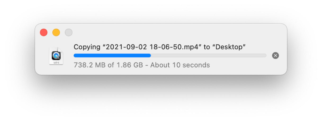
macOS Monterey arrives on Oct. 25, and among many changes and additions, it alters a concept that’s been a part of the Mac since the very beginning.
When you copy a file in macOS Monterey’s Finder, you will see a floating copy window, of course:
There’s just one thing about that window that’s unusual. The red circle used to close windows, inactive in previous versions of macOS, is now active. And what happens if you click it?
The window closes… and the copy continues.
Once you close the window, it won’t reappear for subsequent operations until you choose Show Progress Window from the Window menu. But Finder is still providing you with some feedback that a copy operation is happening. In List views, a circle to the right of the filename slowly fills in clockwise until the copy is done. In Icon views, a progress bar fills from left to right across the bottom of the icon. (These animations aren’t new, but they’re more important now!) An “X” hovers over the top-left corner of the icon, from which you can cancel the file copy.
When I started using the Mac, Finder copies used to be an opportunity to stretch your legs—not only were they slow, but the copy window was modal, blocking out any other use of Finder while the disks grinded away. That hasn’t been true for some time, of course, but closing the window and just letting copies happen in the background is going to take some getting used to.
At the very least, it was worth marking the change. Finder is at the center of the Mac experience (at least if you weren’t born this century), and while faster networks and disks have made waiting for copies a lot less laborious than it used to be, I still frequently find myself copying several gigabytes of an audio or video project and waiting for the copy window to close so that I can get on with my life.
One other related fun addition in macOS Monterey: If a copy is interrupted, the partial file will remain visible, grayed out with a clockwise circling arrow icon to the right of the filename. When you click that icon, you’re asked if you want to resume the copy:
What do you know—they’re still teaching Finder new tricks after all these years.
Eleven months after the release of the first M1 Macs ushered in the Apple silicon era for the Mac, Apple has addressed how it plans to serve the needs of users for whom iPad-level performance, impressive though it might be, just isn’t enough.
With the announcement of the M1 Pro and M1 Max, Apple has connected the dots and revealed two new chips that propel the MacBook Pro to new heights. Two connected dots make a straight line–and that line points to the future of the Mac. Here’s a look at what might be coming next.