In order to provide for development and continued growth, we are transitioning to a $4.99 monthly subscription, starting on May 13, 2020. This fee is designed to be as modest as possible. Your support will enable us to continue providing you with the functionality that you’ve come to rely on, and focus on accelerating new integrations and app features. Should you choose not to sign up for a subscription you will no longer be able to access your Wink devices from the app, with voice control or through the API, and your automations will be disabled on May 13.
Companies should do what they can to stay in business. If Wink goes under, its products will also break. (This is the problem with buying any product that requires an app or service to keep it running—app rot is real.)
Ideally, though, a company would correctly price its products in the first place so that it could keep operating—and maybe consider an ongoing subscription tier from the start if single purchases can’t cover all expenses.
It’s the deadline of a single week that I find incredible. That’s either a sign of desperation or malevolence; either one would make me hesitant to pay them a dime.
“There was a process to figure out exactly how various elements would work together,” Federighi says. “We knew we wanted a very touch-centric cursor that was not conveying an unnecessary level of precision. We knew we had a focus experience similar to Apple TV that we could take advantage of in a delightful way. We knew that when dealing with text we wanted to provide a greater sense of feedback.”
I hadn’t really thought of the connection to the Apple TV’s interface, but now I can’t unsee it.
Jonathan Deutsch released the last version of HyperEdit more than a decade ago. Now he’s released Whisk 2.0, a (renamed) update to the very same app, which he launched in 2004:
With encouragement from that passionate group of beta testers, I was able to bring out version 1.0 a little less than a year later. A few updates followed. Yet HyperEdit was frequently put on the back burner while I focused on my corporate job and subsequently on developing Hype. Some of HyperEdit’s code lived there: the source editor is the same in both apps. I personally kept using HyperEdit and it continued to have a dedicated user base asking for updates. Whisk 2.0 was a labor of love, meant as a fulfillment to the promise of an update for these users.
This is a fascinating look at what has changed in Mac software development—not just on the platform, but with all the tools that now surround it, including notarization, gatekeeper, and even the accepted methods for distributing independent software (like Read Me files)! Also, Deutsch added support for auto-updating in the very last update, meaning he never used that feature until now. Amazing.
The initial releases of Tot didn’t have great accessibility. We knew it needed improving, but experience has shown us the folks who need these features have great ideas and happily share their opinions. Over the years, this feedback has driven our development with VoiceOver. This time around, one of those people was our pal Jason Snell.
Basically, Tot’s launch screen was utterly baffling to me because I’m (mildly) colorblind and it was asking me to do things based on whether a tiny ring was green or red. I couldn’t see it.
As you might expect from the Iconfactory, this led them to carefully consider exactly how to attack this problem to improve the app’s accessibility. Craig’s blog post describes their thought process, discarded options, and the final result.
Apple’s doing things differently this year. The company is making its annual developer conference virtual, and also pushing back the date from the usual first-week-of-June start. It announced on Tuesday that WWDC will begin June 22:
Apple today announced it will host its annual Worldwide Developers Conference virtually, beginning June 22, in the Apple Developer app and on the Apple Developer website for free for all developers. The company also announced the Swift Student Challenge, an opportunity for student developers to showcase their love of coding by creating their own Swift playground.
The later date makes sense, as the company’s no doubt been working on transitioning the whole event online. Apple previously announced that the event would be virtual and start in June. Apple’s press release on Tuesday included a statement from exec Phil Schiller promising that Apple would share further details about the event “as we get closer” to the start date.
Note: This story has not been updated for several years.
Installing, updated, and configuring Homebridge plug-ins via the web interface is easy.
For a couple of years now, I’ve been running Homebridge on my Mac mini server in order to add my non-HomeKit devices, including my Nest thermostat, to my HomeKit network.
I’m really glad I did. It’s great to be able to have a single app to focus on for controlling smart home devices, and Apple’s Home app is deeply integrated into its devices. Adding items to HomeKit also makes them available for automations, another feature of HomeKit that I’ve been tinkering with lately.
Inspired by listener Erick Brough, I recently upgraded to version 1.0 of Homebridge, and it’s a huge leap forward, most notably with a better integration of a web interface for controlling the thing.
To install Homebridge, you’ve first got to install Node.js, and then run a few Terminal commands to get Homebridge and the Homebridge web interface up and running. The details are on the Homebridge GitHub page and they’re pretty straightforward. If you’re not comfortable using Terminal commands, I don’t recommend HomeBridge.
My own upgrade to version 1.0 was a little more fraught, but it was a problem solved by uninstalling my existing version of Homebridge, then following the instructions to reinstall it. (All my existing settings remained intact across the reinstall.)
The web interface for controlling Homebridge really is excellent. It checks to see if your Homebridge plugins have available updates, and offers you a one-click update. You can browse a library of plug-ins and install them directly. It’s easy to update Homebridge itself, right from the same interface. Some settings are editable from right within the web interface, rather than needing to edit a configuration file. But if you do need to do down-and-dirty configuration by editing the JSON file in which the app stores all its preferences, you can even do that from the web interface if you so desire.
I was already a fan of Homebridge, but this update makes it so much better. If you’ve got a bunch of HomeKit-incompatible devices and an always-on server or NAS box (or even a Raspberry Pi), I highly recommend giving Homebridge a try.
Note: This story has not been updated for several years.
If the 16-inch MacBook Pro was too heavy for your liking, but the new MacBook Air too light on power, you’re now in luck: Apple has revamped its 13-inch MacBook Pro with the new Magic Keyboard design, as well as a host of improved processor options. The new models are available for order as of today and start shipping next week.
The most prominent change, aside from the very welcome keyboard, is that Apple has doubled the base storage across the line; higher configurations now use Intel’s 10th generation processors and make 16GB of RAM standard.
As on the 16-inch model, the keyboard includes a physical Escape key and inverted-T arrow key layout, as well as the Touch Bar and a Touch ID sensor.
Aside from the doubling of storage and new keyboard, the $1299 and $1499 models of the 13 inch MacBook Pro remain largely untouched. They feature the same 8th-generation Core i5 processor running at 1.4 GHz as their predecessors. They can be configured with an 8th-generation 1.7GHz Core i7 processor, 16GB of RAM, and up to 2TB of SSD storage.
The $1799 and $1999 models, on the other hand, now feature the 10th-generation Core i5 processor at 2.0GHz. Additional options include a bump to a 10th-generation Core i7 processor at 2.3GHz, 32 GB of RAM, and up to 4TB of SSD storage–the latter two options are available on this model for the first time. This model can also drive an external display at up to 6K resolution; the lower-end models are limited to one external 5K display or two external 4K displays.
All models feature the same wide stereo sound and Dolby Atmos support as their 16-inch counterpart, though the 13-inch models lack the six-speaker array. They also feature the beamforming three-mic setup.
The new models are also slightly thicker at .61 inches instead of .59 inches, and slightly heavier, at 3.1 pounds instead of 3.02 pounds.
These updates mean that all of Apple’s laptops–as well as the iPad Pro–now use the new Magic Keyboard design. Which means it’s just Apple’s desktop Mac line that is now left out in the cold. Here’s hoping an update for the external Magic Keyboard isn’t far off.
[Dan Moren is the East Coast Bureau Chief of Six Colors, as well as an author, podcaster, and two-time Jeopardy! champion. You can find him on Mastodon at @dmoren@zeppelin.flights or reach him by email at dan@sixcolors.com. His next novel, the sci-fi adventure Eternity's Tomb, will be released in November 2026.]
My thanks once again to Rogue Amoeba and SoundSource for sponsoring Six Colors this week. SoundSource is a utility that gives you so much control over all the audio on your Mac, right from your menu bar.
As Dan wrote about SoundSource about a year ago, “It’s one of those apps that you don’t know you need until you use it for a while—then you wonder why it’s not installed on every single Mac you use.”
SoundSource lets you take control of Mac audio on a per-application basis. You can change the volume of any app relative to others, and play individual apps to different audio devices. The app also lets you adjust audio dynamically, so you can hear your audio even in loud environments.
And here’s a cool thing: If you have a DisplayPort or HDMI device that fails to offer volume adjustment, SoundSource can help there too. It gives those devices a proper volume slider, and the Super Volume Keys feature makes your keyboard volume controls work as well.
SoundSource costs just $29, and Six Colors readers can save 20% on SoundSource with coupon code SIXSS. (This offer has been extended through May 15th!) Download the free trial today!
Throughout his life, Fluegelman had a special relationship with San Francisco’s Golden Gate Bridge. “I think it’s a power point,” he said once only semi-facetiously. “I have more inspirations driving across the Golden Gate Bridge…” One day shortly after finishing his program, he was driving across while thinking back to the pledge drive he had seen the night before on the local PBS television station.
Andrew Fluegelman went on to work at PC World and, most notably in my opinion, was the founding editor of Macworld. There are a few nice details in the article about Fluegelman’s enthusiasm for the original Macintosh:
The PC World issue with the landmark review of PC-File was still on newsstands when Andrew Fluegelman had his next life-changing encounter with a computer: he was one of a select few invited to Apple for an early unveiling of the new Macintosh. He was so smitten by this whole new way of operating a computer that he immediately began lobbying for a companion magazine to PC World, to be named, naturally enough, Macworld. Its first issue appeared in time to greet the first Macintosh buyers early in 1984. Fluegelman held down the editor-in-chief job there even as he continued to fill the same role at PC World.
He committed suicide at the Golden Gate Bridge in July of 1985 at the age of 41. Macworld honored him in its masthead for years thereafter.
I’m not a UI designer, but I’d love to tap and hold on “flummox” in the completion bar and it would show all the different available forms (singular, plural, tenses, parts of speech). For a long word or one that is difficult to type, it would save time to make sure I type it correctly.
There are a lot of good thoughts in here about where autocorrect falls down. When we all started using software keyboards 13 years ago, it was a useful crutch, but the more adept we’ve all become at typing on our phones, the more autocorrect seems to get in the way, rather than help. As I said in my above tweet, when it constantly “fixes” my wife’s name, despite the fact that I type it all the time, then something is wrong.
We interact with the iOS keyboard more than anything else in the whole system, and I’d like to see Apple take a comprehensive look at all of this in a future software update.
Note: This story has not been updated for several years.
Back in the mid-’90s, my friend Jason1 and I started up an online magazine devoted to fantasy and science-fiction. We originally set out distributing it on local bulletin boards as a self-contained app generated by a program called DOCMaker, but as the popularity of the web rose, we eventually transitioned there.
One of the things about being a traditionally published author is that your publisher takes care of the actual production of a book: you hand over a Word doc, they turn it into something that people will actually end up reading. As a result, this experiment meant that I needed to learn some new skills, and find some tools to help me along the way.
Duck and cover
Visual art has never been one of my strengths—there’s a reason I deal in words, friend. But whoever said that you shouldn’t judge a book by its cover has never dealt with the reality of sales: one of my former agents was convinced that the only things that really sell books are the first line and the cover.
So, if I was going to put out an ebook, it needed to have a good cover: not just some sort of slapped-on placeholder with the title and my name on it. Something eye-catching that also linked it into the visual identity of my series. The suggestion—from that same friend, Jason, who now has a sideline in creating independent tabletop RPGs—was to take advantage of some stock art.
When we think of stock art, we probably think of things like cartoonish clip art or ridiculous photos of women eating salad. But that, folks, is your parents’ stock art: Shutterstock, the vendor I went to, has a huge catalog of beautiful pieces of art by incredibly talented photographers and illustrators. So I bought an affordable 5-pack of licenses for $50, and picked out a couple of images that I thought evoked the feelings of the stories.
Armed with illustrations far beyond my ability, I turned to my trusty image editor, Flying Meat’s Acorn to help transform them into book covers. While I’ve dabbled in Photoshop, I’ve never been particularly good at it—it’s simply too complex for most of the things I need to do. But I’ve been using Acorn for years2, ever since my early days at the MacUser blog, though mainly for trivial tasks like cropping and resizing. This was a step above.
Acorn’s powerful Path Text feature lets you easily create text that follows a shape.
Mainly I wanted to spend some time crafting title and byline text that looked like the covers of my books and, after taking a very time-consuming approach for my first several attempts, I figured there must be an easier way to design styled text.
That led me to Acorn’s impressive Path Text feature, which lets you simply draw a shape and have the text follow its edge. (Basic stuff for some, I’m sure, but for me it was an Archimedes-in-the-bathtub moment.) I pulled accent colors from the images to make the text pop, and then created some duplicate text for the shadow effect and voila! (Okay, that makes it sound quick, but it took me a few days and repeated stabs until I got something that looked right.)
Despite my years of usage, I came away with a new appreciation for Acorn: for a $30 app, it is an incredibly powerful piece of software, and it puts out a great-looking book cover.
Book ’em, me-o
Of course, the cover is literally just the beginning. It’s what lies within that is the reason for this whole endeavor.
The good news is that I’m no stranger to generating ebooks: when I send drafts to my beta readers, it’s generally in the ebook format of their choice.
There are a few options in this arena. If you’re looking to make ebooks on the cheap, Apple’s own free Pages can not only generate ePub files, but publish directly to Apple Books. On the other end of the spectrum, the $200 Vellum lets you design and tweak to your heart’s content, and includes a handy preview mode.
Scrivener’s novel template works well for creating an ebook.
At $50, Literature and Latte’s Scrivener falls in between the two. It’s not strictly for making ebooks—that’s merely a feature of the app, which I use for the whole process of writing the books themselves, but Scrivener’s robust export tools mean that I can generate everything from a DOC file to an ePub. Previously, it used to even make Kindle books with the help of a command line tool from Amazon, but that tool has been deprecated, as I discovered during my foray into production.
I ended up using Scrivener’s built-in novel template, pasting in the text from the original documents in which I’d written it, and then customizing the various front/after matter sections, such as the “Also By” page, the about the author page, and the afterword that I wrote for each of the short stories. That template worked well, and required only minimal massaging in order to adapt it to a shorter form work.
Good as Scrivener is, it took me several attempts to get everything formatted the way I wanted, which does illustrate one downside of the process: every time you make a change, no matter how minor, you have to export the file, open it in a reader app like Books, and then eventually, when you discover that, say, the indentation is off, delete it from Books and restart the whole process. Vellum’s fancy preview mode would certainly be a big help there.
Amazon’s Kindle Previewer lets you see how your book would look on one of the company’s e-readers, as well as convert formats.
I mentioned that Amazon’s command-line tool had been deprecated—it’s been replaced by a new app, Kindle Previewer, that has some advantages over the old version. For one, rather than simply converting to Amazon’s MOBI (or newer KPF) format, it lets you open a file (ePub, DOC, HTML, and more), and see how it would look on a Kindle. Think of it a bit like Xcode’s iOS simulator, but for Kindles. It’s handy, seeing as how the Kindle is a bit of black box and you want to make sure your file looks as good as it possible can without having to sideload it to a Kindle to check every single time.
And just to check and make sure that the ePubs I generated were correct in every way, I ran them through epubcheck, a free tool that validates the file structure. By default it’s a command line tool, though there are several free GUI versions available as well. I used the free pagina EPUB-Checker, which assured me that Scrivener’s ebook files were up to snuff.
The whole store-y
Ah, those blissful days of ignorance before I had to navigate self-publishing platforms. Turns out: there are a lot of them. I settled on using five of the most popular ebook platforms: Amazon, Apple Books, Barnes & Noble, Kobo, and Google Play Books.
The first problem is that submitting to each of these platforms individually is a pain. There are sites that aggregate much of this, perhaps most notably Smashwords, but there are some limitations to its approach. For one, it distributes the same ebook file to all of the platforms, so you’re out of luck if you want any differences between versions of your books—for example, store-specific links (i.e. you want the Apple Books version of your ebook to include links to Apple Books versions of other books). More to the point, Smashwords doesn’t include Amazon, and there’s no denying just how big Amazon is. (In my stats for the first couple weeks of availability, it accounted for almost half of downloads.)
So I ended up submitting directly to each site, which it had its upsides and downsides. One good point, to take away for the future: all of the stores support uploading ePubs, mostly because that’s the format that all but Amazon use to distribute books. Amazon will convert from ePub to its own proprietary format, but I used the aforementioned Kindle Previewer to do the conversion beforehand, to make sure everything looked right.
Each platform has its idiosyncrasies, such as release dates. Some, such as Kobo, let you actually schedule the date your title will show up in the system. In most others, you can set the “on sale” date, but the books will show up in the system as soon as they propagate, which—in my case—let the cat out of the bag a bit early, as people stumbled across them.
Amazon is the only one that doesn’t allow you to make your ebook free by default: it has to go for at least 99 cents in the U.S., and a commensurate price in other countries. However, you can submit price-matching requests with links from other platforms; the problem there is you have to do it separately for each individual country in which the book is available, which is a real pain.
Uploading books to the Apple Bookstore requires using the iTunes Producer app.
And while Apple lets you manage your titles via a web-based version of iTunes Connect (similar to the system it uses for apps), it took me a while to figure out that actually uploading the book files themselves requires use of Apple’s iTunes Producer app or, as mentioned previously, Pages.
Each platform also differs in terms of the stats they provide, with Amazon, Kobo, and Apple being the best of the batch. Barnes & Noble, for some reason, delays its ebook sales numbers by two days, which is perplexing since one would assume it must have real time information about the transfer of bits somewhere. Google requires you to download a spreadsheet in order to see your downloads, which is just bizarre from a company so dedicated to analytics.
In addition to all of those stores, of course, I also made the files available on my blog3, though it wasn’t until a day or so after I put them up that I realized I had no way to track how many downloads were happening there. I eventually settled on the free version of Never5’s Download Monitor extension for WordPress, which does that and a whole lot more.
Teaching an old dog new tricks
I took a few things away from this whole experience. First up, hoo boy, am I glad I have a publisher to handle all of this. It is a lot of work, and most thankless back-breaking detail-oriented work, at that. I’ve got a whole new appreciation for both the professionals who do that job for publishers as well as authors who self-publish their work.
Secondly—and perhaps even more importantly—I’ve learned that I can do this. It requires moving out of my comfort zone in terms of skills, and finding some new tools, but generally I found that if I forged ahead, I could usually figure out what I was trying to accomplish, albeit with a few missteps here and there. Who knows if I’ll self-publish any of my work in the future—but at least I know I have the option, and with a little hard work and attention to details, the end result can come out looking pretty great.
Updated on 5/1/2020 to add a paragraph about epubcheck validation tools.
In the interests of disclosure, Acorn developer Gus Mueller is a friend whom I’ve also known for years. Also he makes a good-looking pizza. ↩
As a minor update to that post, the ebook was downloaded around 3000 times in the first two weeks, which I consider a roaring success for my first experiment. ↩
[Dan Moren is the East Coast Bureau Chief of Six Colors, as well as an author, podcaster, and two-time Jeopardy! champion. You can find him on Mastodon at @dmoren@zeppelin.flights or reach him by email at dan@sixcolors.com. His next novel, the sci-fi adventure Eternity's Tomb, will be released in November 2026.]
These last several weeks have meant a lot of adjustment for all of us, whether it be working from home, dealing with the challenges of childcare on top of our jobs, or simply not being able to connect with friends, family, and colleagues.
While technology is one resource that can potentially help with these challenges, there are definitely places where it either doesn’t go far enough, or, in some cases, where it just gets in the way.
In dealing with these changes like everybody else, I’ve definitely started to identify a few places in my post-pandemic life where Apple might be able to improve its technology, adapting it even better to this world we’re all living in.
It was an unusual fiscal second quarter for Apple—and for basically everyone else on Earth, too, of course. But on Thursday we got a little bit of a sense of how Apple has weathered the storm so far and what might be in the company’s future, as Apple reported its quarterly results and spent an hour talking to financial analysts.
As always, these federally mandated disclosures are unlikely to generate major news—though analysts often try to use the Jedi Mind Trick on Apple CEO Tim Cook to get him to preannounce new products. (It never works.) Still, there’s usually something useful to be gleaned from Apple’s executives, and this quarter was no exception.
Software is hard to use. This has been true since the moment the first computer was switched on and it’s still true. Yes, my daughter navigates the mind-bending Snapchat interface like a dolphin swimming through warm Hawaiian waters, but the other day I still had to walk her through a complicated cache-clearing troubleshooting session on her Chromebook, which in turn unearthed a DNS-caching problem on our home network. And all because Netflix wasn’t loading correctly.
And isn’t that almost everyone’s experience? You get really good at a few key things, but so much else is complicated and mysterious unless you’re a tech expert, like many of you are.
There was a time when the tech industry recognized that it was making complicated and frustrating software and, in a rare moment of introspection, decided to fix the problem. The result, unfortunately, was a wave of stuff that has either been forgotten or is remembered ruefully. Microsoft’s Clippy assistant and Microsoft Bob. A slew of “Wizards” to walk you through tasks. Anyone remember Apple Guide? These were all attempts to have software hold a user’s hand and walk them through places where software had previously failed them. Shock reveal: The new software also failed the users, for the most part.
The worst of it is that it seems like everyone’s just given up. Designers try to make their products usable and discoverable when they can, but the bar is pretty low. People love apps in part because they’re (generally) so simple, but even they can be confusing and obscure.
We need to try again, not give up. Sometimes technology is so complex that it can’t be boiled down into a simple, discoverable interface. To use that technology effectively, someone has to teach you how to use it. If you don’t have a teacher at hand, our technology should offer to teach us. We’ve tried it before, but it’s time to try it again.
We’re all still trying to figure out just what the Touch Bar on the new MacBook Pros is for, but the other week it struck me that it might be a great interface for teaching people how to use software. It’s interactive, so it can customize itself as it watches you work. It can work in concert with tutorials to show off different ways to use software. Every button can be labeled with clear text explaining what will happen when you press it. I don’t think I’ve seen any examples of the Touch Bar being used to help teach people how to use more complex software, but there might be an opportunity there.
An even bigger opportunity, in the long run, might be the intelligent assistants that are being stuffed into almost every device we own. The most useful interactions I have with these assistants come when they save me steps—in other words, when they take complexity and boil it down to simplicity.
When I hold down my iPhone’s home button and say, “Set an alarm for 5am,” I’m saving a trip to the home screen to find the Clock app, switch to the alarm tab, make a new alarm, and spin the clock dials to get the right time. When I press the crown of my Apple Watch and say “start outdoor run,” I’m avoiding a visit to the Apple Watch honeycomb to figure out which green icon represents the Fitness app. When I stand in the kitchen and say “Alexa, set a timer for 15 minutes,” I’m keeping my hands free to cook rather than needing to wash them off and then try to navigate a touchscreen interface with damp fingers.
There’s a lot of potential here—not just to teach, but to eliminate the need to teach. If I get an email from a bozo, shouldn’t I be able to say, “Hey Siri, send all emails from this guy to the trash.” And if the assistant needs more information, it should ask until it has enough! “Do you want me to filter past emails from this bozo, future emails, or both?” In the end, do I need to know about email filtering interfaces? No, I just need to give orders to my phone. (By the way, Apple Mail for iOS still doesn’t offer mail rules? Come on!)
This can extend deep into complex systems. Apple brought Siri to macOS last fall. In the future, shouldn’t I be able to say, “Siri, when I use Logic I want the Strip Silence command to use Control-X as a shortcut” and have my preference noted automatically? And consider automation. I might never write a script in my life, but if I ask Siri to resize a photo, save it as a JPEG, and open it in Photoshop, shouldn’t it be able to figure out what I want? And if I do it more than once, shouldn’t it remember that this is a series of steps I often perform? And if I don’t use Siri, but I perform a repetitive task enough times, shouldn’t Siri offer to create some sort of shortcut to get my work done faster?
I realize this is all complex stuff. But isn’t this the promise of technology? I’ve bodged together AppleScripts and Automator actions with the best of them, but in the end I don’t really care about the method by which my work gets simplified—I just want it to be as simple and frictionless as it can be. Right now, I have to build some of those tools and connections myself. But these are things computers should be good at. Apple, Microsoft, Google, and others should always be striving to improve simplicity and usability and eliminate complexity. Clippy may have sucked, but that’s no reason to give up. We can, and should, do better.
These days, so many brands are concerned with “engaging” with you online, earning your “loyalty,” and being your “friend.” Not Apple, though: if life were indeed an ’80s high school movie, as I always assumed it would be, then Apple is that cool kid who eats in the cafeteria alone and wears a leather jacket and doesn’t like it when bullies beat up the nerds.
But I digress.
All of which is to say that in this era of social distancing, Apple is the perfect candidate for the job. Its aloof image has prepared it for this exact moment in history, and as it brings its technological prowess to bear on matters like contact tracing and building face masks, it’s only begun to scratch the surface of what it can do. Here are just a handful of other features that Apple is no doubt planning to roll out for the benefit of not just its users, but for all mankind.
Proximity Warning: How close is too close? Personal space boundaries have been reset in recent weeks, and it can be tough to tell when someone else encroaches on your bubble in a meaningful way. That’s where the new Apple Proximity Warning feature comes in. By using Bluetooth signals to detect nearby phones, it can warn you when somebody is too close by piping the music that they’re listening to on their device directly into your AirPods, with the volume proportional to their distance, thus giving you plenty of time to cross to the other side of the street.
Spaces: Remember when you used to go…out? I know, I know: anathema. But bear with me here: what if you could go out without going out? That’s the idea behind Apple’s new Spaces feature—a name that, in time-honored tradition, was pilfered from an older Mac feature. Spaces leverages augmented reality—aha, we finally found a use for it!—to let you use your Apple device to step into a world of class and polish, where everything is carefully designed and the soundtrack is impeccable. I speak, of course, of the world of Apple commercials. Want to relive the classic “dancing silhouettes” as a 360° virtual panorama, rotatable and truly immersive? Or perhaps drop in on PC and Mac and see what they’re up to these days. And, of course, who could resist having their face smashed with a hammer?
Mask ID: Yes, it’s a pain that FaceID can’t recognize you without your mask on—this is a problem that Batman’s been having for years, people—but here’s an even bigger problem: which mask is yours?! Well, Apple’s Mask ID system is here to help. Just point it at a mask and Apple will use its machine learning technology to analyze whether the mask has been shaped for the contours of your face. Slap it on, and since Apple knows the mask is yours, you’ll have no trouble unlocking your phone ever again!
Zoomimoji: Virtual backgrounds may be all the rage in Zoom, but how about virtual foregrounds. Well, okay, I guess those sort of exist, if you want to turn yourself into a potato. But a partnership between Apple and the most popular videoconferencing software out there will finally result in the ability to bring your Animoji and Memoji into Zoom. Who can resist a meeting full of sharks, lions, and monkeys? WHO? I mean, the World Health Organization? Probably. But it definitely goes a long way towards keeping those interminable discussions engaging, and it’s a real boon on those quarantine hair days.
The Void: Apple keeps this for only the most extreme cases of isolation, but now that Jony Ive has left the building, there’s an opening in his featureless white void. You haven’t been socially distanced until you’ve been socially distanced into a monchromatic pocket dimension cut off from the rest of the universe. Any takers? Hello? Hello?
[Dan Moren is the East Coast Bureau Chief of Six Colors, as well as an author, podcaster, and two-time Jeopardy! champion. You can find him on Mastodon at @dmoren@zeppelin.flights or reach him by email at dan@sixcolors.com. His next novel, the sci-fi adventure Eternity's Tomb, will be released in November 2026.]
As you might have gathered from my Magic Keyboard for iPad Pro review, I spend a lot of time writing on my iPad these days. The iMac Pro is my computer when I’m at my desk; the iPad Pro is my computer everywhere else.
I don’t want to use this space to debate the strengths and weaknesses of the iPad and the Mac. For a long time, I’ve been “Team Both”—someone who uses both devices to get work done and sees the strengths and weaknesses in both. But something that happened to me this week did remind me that those who suggest that it’s the Mac that has all the power and the iPad that’s wanting are definitely a few steps behind.
Since I do so much writing on my iPad, I’ve tried to build up some tools to make the process a bit easier. One of them, which I detailed back in 2018, lets me post directly to my ancient Movable Type blog system from within my iOS text editor.
While Dan and I are the only people likely to use that Movable Type shortcut (unless Daring Fireball’s John Gruber really gets into iPad productivity), another shortcut I built for my writing could be useful in a few contexts beyond my own.
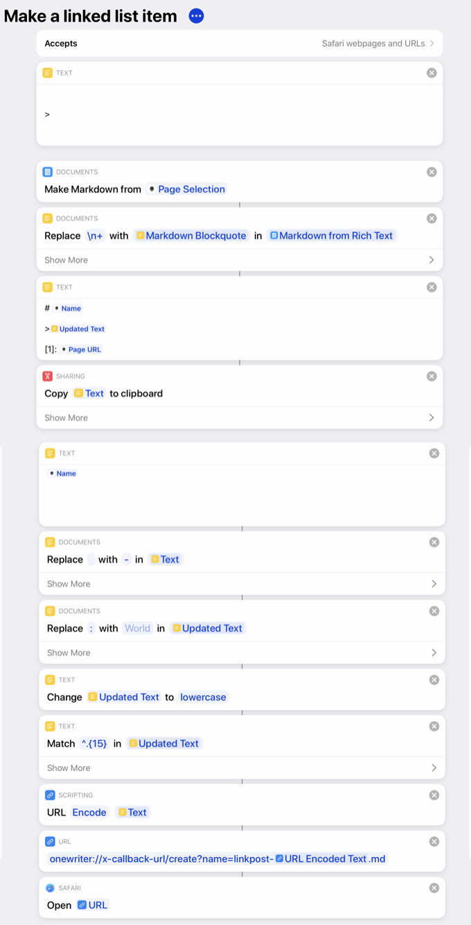
I do most of my web reading on my iPad, and when I see a story I’d like to write about at Six Colors, I usually want to grab a juicy excerpt from the story to quote. So, inspired by a shortcut from Matthew Cassinelli, I built a shortcut that takes the text I’ve selected in Safari on my iPad and generates a new document in my text editor, formatted and ready to be converted into a post.
Shortcut before and after
It works really well. The shortcut grabs the title of the webpage and makes it the title of the post—ready for me to edit it into whatever I want. It takes the selected text and makes it the body of the post, already converted to a blockquote in the Markdown formatting that I prefer. And at the bottom, it’s taken the URL of the page in question and formatted it as a named link, ready for me to reference directly when I write my story. (If you’d like to see what that Shortcut looks like, click here.)
I like this shortcut so much that I decided to replicate it on my Mac. And this is the surprising part: It was hard. The Mac will let you do anything, but it can sometimes take a lot of effort.
I ended up “solving” this problem by building a multi-step Keyboard Maestro marco that creates a new window in BBEdit, pastes the raw HTML I’ve copied from Safari, selects it, runs an HTML-to-Markdown converter service written by Brett Terpstra, selects the result, cuts it, closes the empty window, and pastes the result into my existing document. (I ended up simplifying this further by asking Bare Bones if they could add a “Paste HTML and select” command, since they offered both “Paste HTML” and “Paste and select” commends. They obliged in a beta version I got today, and they are awesome.)
What I’m saying is, this is the sort of automation that is possible on the Mac because the Mac really can do just about anything. And it’s true that even today there are sometimes you run into a brick wall on the iPad and there’s nothing you can do.
But in this case, the iPad and Shortcuts offer built-in functionality that handled this situation in a few easy steps, while the Mac demanded that I dig up third-party plugins or create complicated AppleScript scripts or automate a series of keypresses with Keyboard Maestro.
I did it. I have it. It works. But it really makes me grateful for the power of Shortcuts on my iPad, and makes me want a more modern take on user automation on the Mac side, too.


