If there’s two things that we here at Six Colors love, it’s putting data in our Macs’ menu bars and the weather—also, of course, combining those two things.
Netatmo provides an API to let you retrieve data from its weather stations, and its documentation page even allows you to test it out with your own device (you’ll need to log in to your Netatmo account first).
The standard Netatmo system is composed of two modules: one that sits inside your house and one that goes outside. I was more interested in the outside temperature, though I may adapt it in the future to provide information from both. However, the outside module collects relatively little information: just temperature and humidity.1 (The inside module, by comparison, also measures noise and CO2 levels.)
Writing the script itself proved to be fairly straightforward; it was largely built on a similar script that I’d made to display the current UV level. Like many APIs, Netatmo’s can be accessed using a variety of programming or scripting languages. Data is returned in JSON format, allowing you to pick out the specific information you want.
But the real challenge came in dealing with authentication. The example code shown on the API page includes an authorization token…but that token is only temporary. Netatmo uses a framework called OAuth, which not only requires a more complex process to obtain an authorization token, but also provides tokens that expire after a certain amount of time. So I couldn’t simply hardcode in the tokens used in the example page—instead, I had to add code to request a token.2
Once I had the script working, I added a few additional refinements. In addition to the current temperature, the Netatmo API provides information about the temperature trend, in terms of whether it’s going up, down, or is stable; this is reflected in my script by an up arrow or down arrow next to the temperature (I opted to show nothing if the trend is stable, for simplicity).
I also added a battery level gauge, including a handy icon to show you if it’s good (above 50 percent), moderate (between 10 percent and 50 percent), or low (10 percent or lower). And since the data from the module refreshes every 10 minutes, I added a timestamp to say when it was last updated.3
Finally, I used SwiftBar’s link feature so that if you select any of the information from the dropdown portion of the menu, it will take you to your Netatmo web dashboard, which includes historical data and other metrics (mostly gathered from sources other than your weather station).
I may continue to refine this over time, but for the moment, I’m making it available for download, with the following configuration information.
Configuration
Note that this script is written in PHP, which I believe is no longer included in the operating system as of macOS Monterey, so you’ll need to install it via Homebrew. Also note that Homebrew installs on different locations whether you’re using an Apple or Intel processor; this version of the script expects PHP in /opt/homebrew/bin/php, which is the default installation location on Apple silicon.4
You’ll need a handful of details to configure the script, including the username and password for your Netatmo account, and your module’s MAC address (probably easiest to obtain via your Wi-Fi router).
In addition, you’ll also need to create an application via Netatmo’s developer page. Once you do, it will provide you with two key pieces of information: a client ID (a string of static characters identifying your app), and a client secret (essentially a password). These two pieces of information are used to retrieve the authorization token, as described above.
Once you’ve entered your information in the script, drop it in your SwiftBar plugin folder, and it ought to retrieve the necessary info.
Note that the script is being provided as is for your entertainment; I welcome feedback, but I can’t necessarily accommodate troubleshooting requests for particular setups. Best of luck, and enjoy!
Somewhat confusingly, the API page claims that the outdoor module also monitors pressure, however, in practice that information only seems to be returned by the indoor module? I’m not sure how significant the difference would be, but I haven’t yet bothered to add support for it in the script. ↩
As a result, my system requests a token every time the script refreshes—which works, but actual web developers will know isn’t really how the system was designed. In theory, it should use a different refresh token to request a new authorization token when the earlier one expires, but that would require caching persistent information on disk, and, as far as I can tell, SwiftBar’s plugin architecture isn’t really designed for that. ↩
This ended up being weirdly complex, thanks to the fun that is timezones. ↩
If you’re running on Intel, this should probably be /usr/local/bin/php instead, but you can clarify by running the command which php in Terminal and using the resulting path. ↩
[Dan Moren is the East Coast Bureau Chief of Six Colors, as well as an author, podcaster, and two-time Jeopardy! champion. You can find him on Mastodon at @dmoren@zeppelin.flights or reach him by email at dan@sixcolors.com. His next novel, the sci-fi adventure Eternity's Tomb, will be released in November 2026.]
Jason’s spent the last week with the new 14-inch MacBook Pro with M1 Max processor, and we’ve got his in-depth review. And at last, Jason and Myke both review the new Apple Watch Series 7.
The new 14- and 16-inch MacBook Pro models usher in a new era in Apple laptops. These are the first high-end Macs to be powered by Apple-designed processors, and that’s a big deal—but they also reject the minimalist design mid-2010s Apple, which achieved design simplicity by forcing complexity and frustration on users.
These new MacBook Pros are a success story not just because of Apple’s custom-built processors, but because Apple has admitted (in deeds, if not words) that the previous generation of laptops were a misstep. When you’re designing a tool for professionals to use—and make no mistake, these MacBook Pros are serious tools for serious jobs and priced accordingly—function should always win out over form. There’s a different sort of elegance to be found in versatility.
I’ve spent the last week with a 14-inch MacBook Pro with an M1 Max processor with 32 GPU cores and 64 GB of RAM. And I’m happy to report, it’s true—all of it. Apple has undone its mistakes of the past few years and created a laptop that’s essentially a Mac Pro you can slide into a backpack.
A flatter look
They’re separated by 20 years, but the MacBook Pro’s similarity to the Titanium PowerBook G4 is remarkable.
With this revision, Apple has admitted that it’s okay to stick a few extra ports on a laptop to please professional users. But just because function has won a round over form doesn’t mean Apple has abandoned its sense of design. At a glance, you can tell that this isn’t the same MacBook Pro1 design that we’ve seen over the last decade or more. The corners are noticeably curved, but the edges are much tighter, eliminating the feeling of gentle, gradual curves. The result is a laptop that looks more like a stretched-out version of an app icon—a flat roundrect.
The result is that, when closed, the top of the MacBook Pro bears a striking resemblance to the Titanium PowerBook G4—it’s a flat expanse, without a leisurely curve at the edge of the shell. The keyboard also reminds me of the Titanium PowerBook and other early Mac laptops, in that it’s got black keys placed in a black key well—in contrast to Apple’s previous design, in which the metal between the keys was the same color as the rest of the shell.
Even the screen reminds me of the Titanium PowerBook—it’s thin, but feels solid, and the borders around the screen are much smaller than on previous MacBook Pros. (Apple has even migrated the name of the product, previously labeled right below the screen, to an etched area on the bottom of the computer.)
A gorgeous display, plus menu bar
The notch lives in the menu bar, which gets it out of the way (of everything but menu bar items).
In another laptop, the display would be the entire story. Apple has moved the MacBook Pro to the same technology it’s using in the 12.9-inch iPad Pro. In other words, this is a 120-hertz ProMotion display with a wide color gamut, backlit by mini-LED display technology that allows it to run bright and peak even brighter, while also maintaining black levels that contribute to a remarkably extended level of dynamic range.
It looks incredible. HDR images that I’m used to viewing on my iPhone or iPad now display just as well on this screen. Movies and TV shows made in HDR consistently surprise me with extra-bright peaks.
It will probably take a little while for Mac apps to be updated to support the ProMotion display. I found that some apps scrolled text in the same buttery-smooth way that apps do on my iPhone and iPad, but others didn’t. I was able to find a few Catalyst-based apps that have already been written to support 120Hz displays on iPad and iPhone, and they looked spectacular.
The display is curved at the top corners, like an iOS device. The curve matches the curve of the laptop itself, as well as all the windows in macOS Monterey and macOS Big Sur. Meanwhile, the bottom corners of the display are still right angles.
Why the inconsistency? I think it has to do with how Apple approaches everything beneath the menu bar. If you ignore the menu bar for a moment, the rest of the display has a 16:10 aspect ratio and right-angled corners. When you put an app into full-screen mode, the content fills this perfectly rectangular, 16:10 screen space. The space above the 16:10 area, where the menu bar lives, feels almost… extra.
This brings us to one of the quirkiest aspects of the 2021 MacBook Pro: it’s got an iPhone-style display notch, a cutout area in which the laptop’s webcam is housed. It’s not very big—a little more than 180 points wide and 30 points tall—but it’s smack in the middle of the menu bar.
You could imagine this notch being a major pain point for developers and users alike, but it’s not. And that’s thanks to the menu bar, a Mac convention since day one that provides the perfect place to hide a display cutout. The menu bar has been given a little extra height to completely encompass the notch, and menu items automatically move to the other side of the chasm if there isn’t room for them to fit.
It takes no time to get used to having a notch at the top of the display. And it’s a good use of space since moving the menu bar up into what would otherwise have been unused bezel means that there’s more room downstairs for everything else. (I see now why Apple changed the metrics on the menu bar in macOS Big Sur—it was clearly laying the groundwork for this display. Add in the curved-edge highlights that appear when you click on a menu-bar item and the whole approach really looks great.)
I would be remiss if I didn’t mention that inside that notch is a new 1080p webcam that’s the best one Apple has ever shipped in a Mac laptop. That’s not saying much; Apple’s front-facing cameras on its iPhones and iPads have been far superior for some time now. Yes, the quality of this webcam is equivalent to that of the 24-inch M1 iMac released earlier this year—it’s good. But we live in a world in which the iPad mini has a 12-megapixel wide-angle camera with Center Stage, and by that comparison, this webcam just doesn’t measure up.
Remember keyboard drama? It’s over.
When it comes to the keyboard, Apple decided to stick with the classics.
For several years, the MacBook’s keyboard was a huge topic of discussion. The “butterfly” mechanism offered reduced key travel and keyboard reliability. In late 2019 Apple set about replacing it, and as it fades into the rearview, we’re left with variations on the Magic Keyboard instead. (I guess rolling back to an older keyboard style was a hint of things to come?)
In any event, this is a good keyboard. The big change is in the top row, which used to be populated by an iOS-inspired OLED touchscreen called the Touch Bar. It was introduced in 2016 and… never really went anywhere. A more aggressive set of software updates from Apple might have turned it into something, but that never happened.
Now it’s gone, replaced instead by a very traditional row of function keys. There’s an extra-wide Escape key—do you think Apple still remembers how many people yelled when the first Touch Bar models omitted the physical Escape key?—along with twelve square function keys and a power/Touch ID key. Yes, the row is full height, not half-height, which is a treat. This keyboard works and works well, right down to the proper “inverted t” arrow keys. Stick with the classics.
Ports: Utility over minimalism
What’s the point of a pro laptop?
Clearly, during the last decade there’s been a lot of debate within Apple about this issue. At some point, the idea that somehow aesthetics were more important than utility won the day. Or, if I’m being charitable, people with an overly optimistic view of the future (and of Apple’s power to force that future into being) were given the opportunity to implement their vision.
So in 2016 the MacBook Pro was stripped of a lot of its functionality. While a lot of the ire at the time was directed at forcing users to migrate from the older USB-A port standard to USB-C—an entirely predictable, understandable, and even unavoidable issue—Apple also removed HDMI video and the SD card slot. At a time when Apple was already going to force its users to adapt old USB-A devices to USB-C, it also forced them to adapt for projectors and conference room TVs. As for any device that bore a memory card, that would either need to be done via a slower cabled connection or a separate card reader would be thrown in the mix.
Tech transitions are hard. But this was a lot, and too much of it was down to Apple’s decision to shift the burden from its own hardware onto its users. Even the most forward-looking pros can’t really change the world when it comes to their working conditions and requirements. No matter how much we might prefer AirPlay, there will still be HDMI. No matter how much we’d like a recorder or camera with fast, reliable wireless transfer, there will still be memory cards. Apple’s vision wasn’t realistic, and pros suffered because of it.
The 2021 MacBook Pro is a sign of Apple making things right. HDMI is back on the right side of the laptop, making it far less likely that anyone will need a dongle to project in a random hotel conference room. An SD card slot is back on the right side of the laptop, transforming a painful hunt for a card reader or the right cable for a slow USB transfer into a quick plug-and-copy experience.
I can’t fully explain Apple’s decision in 2016 to eliminate MagSafe, its charging port that prevented your laptop from getting yanked onto the floor when someone tripped over the power cable. Apple spent years explaining how superior it was as an idea, only to jettison it the moment that charging via USB-C was possible. (My guess is that Apple felt it couldn’t use USB-C charging and MagSafe simultaneously and decided that the versatility of USB-C charging was more important.)
In any event, MagSafe is back, and I couldn’t be happier. One snap of that magnetic cable took me back to the mid-2010s. There’s even a LED on the cable to indicate charging status. But there’s one huge difference with this new iteration of MagSafe: the cable.
The worst thing about MagSafe on Mac laptops was that the charger was hard-wired into the power brick. If your cable frayed—and they sure did!—you had to replace the whole brick. You also couldn’t plug the cable into some other power source, like a battery pack. With MagSafe 3, all that goes away. Apple ships a standard USB-C charging brick with the MacBook Pro, along with a very nice woven USB-C-to-MagSafe charging cable. If it frays, just get a new one. If you want to plug into some other USB-C power supply, go for it. It’s up to you.
And, happily, Apple also allows you to charge the MacBook Pro from any of its three Thunderbolt 4/USB 4 ports. So if you have a dock or monitor that you like to plug into and get power and data in a single cable, you’ll still be able to do that.
M1: The Next Generation
The M1 Pro (top) and M1 Max (bottom) are variants with their own variations.
At the heart of the new MacBook Pro is a new, Apple-built processor. Apple’s actually offering two different variants of its new pro-level chips, each with its own set of configurations, so there’s a spread of performance options available. Put this down to the vagaries of chip manufacturing, in which some chips are manufactured with minor flaws. Rather than waste those chips, chipmakers lock out the flawed portions and sell those “binned” chips at lower prices.
In any event, if you’re buying a new MacBook Pro you actually have a lot of choice. The two chips, the M1 Pro and M1 Max, have the same set of CPU cores, with a maximum of 10 total—eight high-performance cores and two power-efficiency cores. This differs from last year’s M1 processor, which offered eight CPU cores—four tuned for performance, four tuned for power efficiency. Apple’s different approach here enables the MacBook Pro to run a lot faster than any M1 Mac when it comes to CPU-focused tasks. While there’s a trade-off in terms of sheer power efficiency, it can be overstated—Apple’s “efficiency” cores are pretty fast, and the “performance” cores don’t consume massive amounts of power.
In regular operation, the M1 Max-based laptop I reviewed tended to use the efficiency cores to their fullest and very occasionally use a performance core for a moment or two. Unless I was doing something to really stress the system, the two efficiency cores were capable of handling most of the load.
The 14-inch MacBook Pro has a greater range of options than the 16-inch model, but can be configured with all the same high-end chip options as the 16-inch, which is a victory for people who want all the power they can get, but don’t need a bigger laptop. At the base of the line, for $1999 you get an M1 Pro chip that’s only got eight CPU cores (six performance, two efficiency), a 14-core GPU, and 16 GB of unified memory. But the M1 Pro architecture maxes out at 10 CPU cores, 16 GPU cores, and 32 GB of unified memory—you’ll just have to pay more than the base price in order to get it.
The M1 Max differs from the M1 Pro in the speed of its memory transfer, in its larger maximum GPU count—32 (24 is a lower-cost option), and in its support for up to 64 GB of unified memory. Basically, more graphics, faster memory, and more memory in the M1 Max.
Unsurprisingly, the MacBook Pro Apple sent for me to review is the maxed-out 14-inch model, with 32 GPU cores and 64 GB of memory. As a result, all of the tests I performed are going to indicate the top-of-the-line configuration of this range, not the base model. Obviously, a $1999 laptop won’t perform at the same level as one that costs nearly twice as much.
Still, the speed of this computer is eye-watering. It’s Mac Pro-level performance in a laptop. (At least until Apple builds an Apple silicon-based Mac Pro, which will probably blow the lid off of all of our performance charts.)
The first round of M1 Macs were fast, but as someone with an eight-core iMac Pro, they were still clearly slower than my iMac on many tests. Even separated by a few years, a $5000 desktop computer should probably be faster than a $1000 laptop. But my last vestige of iMac Pro superiority has finally crumbled. The MacBook Pro soundly defeated my iMac Pro in every test but one.
And in that test, some intense audio processing that stressed out all the processor cores, the MacBook Pro still tied my iMac Pro—and did it all while running Intel-native in Rosetta. The Xcode project for the app Dice By PCalc built twice as fast as on my iMac Pro.
Disk reads and writes were more than twice as fast as either the iMac Pro or my M1 MacBook Air, with writes topping out at 6278 MB/s and reads at 5422 MB/s, according to the Blackmagic Speed Test app. It’s an important reminder that, even in the SSD era, a lot of a computer’s speed is determined by how fast it can read from and write to a disk—and the storage access on these MacBook Pros is so much faster than on any other SSD-based computer I’ve used.
Apple has also used its advantage as its own chip supplier to build several customized blocks into M1 processors that affect performance in specific areas. The Neural Engine, of course, optimizes machine-learning-based calculations across all of Apple’s products. The M1 includes dedicated blocks for encoding and decoding media formats, and the M1 Pro and Max add in blocks for ProRes, the pro video codec preferred by Apple.
As a result, just measuring CPU and GPU scores doesn’t tell the whole picture. If you edit video using a ProRes workflow, you’ll be able to take advantage of a part of the M1 Pro or M1 Max processor that’s designed just for you. Yes, this means you can play back a staggering number of simultaneous 8K video streams… on a laptop.
Most MacBook Pro users probably won’t use this feature, but Apple has built it in because it knows this computer will appeal to video pros. And it will. But even my non-8K, non-HDR workflow was made drastically faster than my current systems, and even a little faster than a friend’s 12-core Mac Pro.
Thanks to Apple’s historical focus of maximizing power efficiency in its mobile products, even the M1 Max manages to not be a voracious consumer of battery power. While I didn’t do any systematic battery testing, I can tell you that I worked the MacBook Pro hard, and found it very hard to drain the battery. Of course, if you’re really taxing it, the fans will turn on, the bottom will warm up, and the battery will drain. But it was hard to tax this computer, and when I did, the battery still didn’t drain at anything resembling the rate I expected.
A whole new world
I have confidence that in 2022, Apple will release new high-end desktop Macs that will blow the MacBook Pro away in terms of performance. It’s only a quirk of the product roll-out schedule that has led to Apple’s laptops being faster than its high-end desktops… but here we are, and as of late 2021, that’s where we are.
The new MacBook Pro brings power previously only available to a high-end Mac Pro to the form of a laptop. Its ports give it versatility. Its display offers extended dynamic range and high frame rates, all in a clamshell you can close and stuff in your backpack.
It’s not cheap. No, it’s not. But that’s okay. In fact, even that fact follows from one of the most important lessons Apple has learned in the last five years: The MacBook Pro is a tool for professional users, and it needs to be built with their needs in mind.
Whether you’re a photographer, video editor, developer, podcast editor, or in any other of dozens of niches that require serious computing power, your computer has arrived. I know you may have been waiting a long time. But your wait is over.
From now on in this review I’ll be specifically referring to the 14-inch model I have in hand. ↩
To celebrate, I want to show you something you’ve never seen before.
Now, there are a lot of mysteries in the Panic Archives (it’s a closet) but by far one of the most mysterious is what you’re seeing for the first time today: an original early iPod prototype.
We don’t know much about where it came from. But we’ve been waiting 20 years to share it with you.
It’s both surprisingly huge and surprisingly yellow.
Since its first release five years ago on October 23, 2001, the iPod has become one of the most recognizable products in the world. It has transformed Apple’s business and its public image, and is probably responsible for a “halo effect” that has improved the Mac’s image and fortunes as well. Whether you’re a rabid iPod lover or someone who just doesn’t see why the iPod’s such a big deal, it’s hard to dispute the gigantic impact the iPod has had on our technological world.
The iPod burned bright and then faded away. In the end, it is probably better seen as a precursor to the iPhone. It changed Apple’s fortunes forever.
The beginning of Apple’s turnaround has been pegged to a lot of dates: when Steve Jobs returned to the company as part of its acquisition of NeXT in 1997, the debut of the original iMac in 1998, even the release of Mac OS X in 2001. But if you’re looking for the date that Apple truly charted its course for the market-dominating position it finds itself in today, you’ll have to go to October 23, 2001, on the calendar—or exactly 20 years ago.
That was the day that Apple took the wraps off a most unexpected product, but one that would go on to change everything for the company: the original iPod.
My thanks to Daylite, the award-winning CRM and productivity app made for Mac-based small businesses, for sponsoring Six Colors this week.
Daylite is ready for macOS Monterey! It seamlessly integrates with Apple devices—not just the Mac, but the iPhone and iPad. It also integrates with Apple’s built-in apps, including Apple Mail, so you and your team can capture all your email communication in one place. And you can create opportunities, appointments and tasks in Daylite from right within Apple Mail.
Daylite improves team efficiency and makes collaboration easy—everything is organized, searchable, and accessible, even offline. It’s easy to access information and segment data, manage and share schedules and product status, and more—all within a familiar and intuitive Mac-focused interface.
macOS Monterey arrives on Oct. 25, and among many changes and additions, it alters a concept that’s been a part of the Mac since the very beginning.
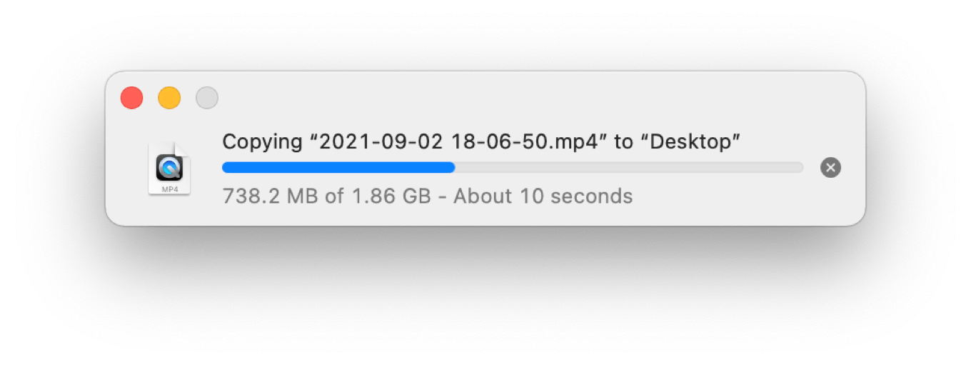
When you copy a file in macOS Monterey’s Finder, you will see a floating copy window, of course:
There’s just one thing about that window that’s unusual. The red circle used to close windows, inactive in previous versions of macOS, is now active. And what happens if you click it?
The window closes… and the copy continues.
Once you close the window, it won’t reappear for subsequent operations until you choose Show Progress Window from the Window menu. But Finder is still providing you with some feedback that a copy operation is happening. In List views, a circle to the right of the filename slowly fills in clockwise until the copy is done. In Icon views, a progress bar fills from left to right across the bottom of the icon. (These animations aren’t new, but they’re more important now!) An “X” hovers over the top-left corner of the icon, from which you can cancel the file copy.
When I started using the Mac, Finder copies used to be an opportunity to stretch your legs—not only were they slow, but the copy window was modal, blocking out any other use of Finder while the disks grinded away. That hasn’t been true for some time, of course, but closing the window and just letting copies happen in the background is going to take some getting used to.
At the very least, it was worth marking the change. Finder is at the center of the Mac experience (at least if you weren’t born this century), and while faster networks and disks have made waiting for copies a lot less laborious than it used to be, I still frequently find myself copying several gigabytes of an audio or video project and waiting for the copy window to close so that I can get on with my life.
One other related fun addition in macOS Monterey: If a copy is interrupted, the partial file will remain visible, grayed out with a clockwise circling arrow icon to the right of the filename. When you click that icon, you’re asked if you want to resume the copy:
What do you know—they’re still teaching Finder new tricks after all these years.
Eleven months after the release of the first M1 Macs ushered in the Apple silicon era for the Mac, Apple has addressed how it plans to serve the needs of users for whom iPad-level performance, impressive though it might be, just isn’t enough.
With the announcement of the M1 Pro and M1 Max, Apple has connected the dots and revealed two new chips that propel the MacBook Pro to new heights. Two connected dots make a straight line–and that line points to the future of the Mac. Here’s a look at what might be coming next.
There’s a lot going on right now at Netflix, which is trying to manage growth, changing how it reports viewership, and facing internal criticism for some of its programming.
What Apple’s new MacBook Pros are lacking, much consternation over “the notch,” how often we use noise-canceling headphones, and the excitement of pivot tables!
By all accounts, Apple’s MacBook Pro announcements this week have been a home run: the return of a veritable smorgasbord of ports, fantastic new displays, and more power than you can shake a log at.
But even though what Apple did announce seemed to strike a chord with its audience, the event left a few head-scratching questions about what Apple chose not to do. It seemed like there were a few opportunities that the company decided not to move on—but, as always, there’s probably a rationale at work, even if it’s not immediately obvious.
Exit, Center Stage
While the addition of a 1080p webcam on the MacBook Pro is a welcome improvement from the piddling 720p version in previous models, it’s still a far cry from the 12 megapixel front-facing camera that Apple’s been adding to its latest iPhones and iPads—heck, even the $329 iPad has that ultra wide lens with Apple’s innovative Center Stage1 feature. So why not the fancy new Apple silicon-powered MacBook Pro?
Even the new iPad mini has Center Stage, but no Mac has gotten the feature yet.
Round up the usual suspects: space, logistics, and money. While the new 14-inch and 16-inch MacBook Pros are undeniably thicker, at .61″ and .66″, than the svelte .25″ of the latest iPad Pros and iPad mini (and even the .25″ thickness of the ninth-generation iPad), we don’t yet know exactly how thick the lids of the new MacBooks are, nor what else Apple had to cram in there to accommodate the new mini-LED display.
On the logistics front, it seems clear that these models were destined to arrive earlier this year, back when Center Stage was exclusive to the latest iPad Pros. We don’t know the relative development cycles of MacBook Pro versus iPad Pro, but given that the new notebooks are a much more substantial redesign than the latest iPad Pro, it’s quite likely that its been in development for a longer period, and that the camera module was already locked in at 1080p even as Center Stage was still being finalized.
And, of course, you can never overlook good old fashioned money. It’s possible that Apple simply made a cost-benefit analysis and decided that the extra amount it would cost to put in those camera modules just didn’t make sense.
Or it could be some combination of all of those factors. Most interesting to me will be whether the next iteration of the MacBook Air that’s already been rumored to appear next year will incorporate a Center Stage-compatible front-facing camera. This will be the second iteration of Air to arrive since the Apple silicon transition has begun, and seems like a more plausible time for this newer technology to make the jump to the Mac.
Color me bad
Setting aside the colors on the latest iPads and iPhones, Apple made a big splash with the new 24-inch iMacs earlier this year, dousing them in a variety of bright colors. But the MacBook Pro is available in the same old staid silver and space gray that it’s sported for years. What gives?
The colors of the 24-inch iMac have yet to make it to the rest of Apple’s lineup.
To my mind, there are two major possible suspects here: our old pal logistics, or Apple’s own design decisions. The former follows the same pattern as the webcam issue—even though the MacBook Pro was appearing later than the iMac, it’s possible that the company was just out of sync enough in its development cycle that the new colors weren’t ready for the MacBook Pro line.
But also possible—and perhaps more likely—is that Apple has decided that pro models don’t get those fancy colors because these are serious machines for work. The iPad Pro, iPhone Pro, and even high-end Apple Watch all come in only a few muted tones, even though I wouldn’t necessarily call them all “professional” devices. Moreover, one could easily argue that adding colors to the line-up doesn’t necessitate the removal of the more subdued options (case in point, the silver 24-inch iMac).
The real indicators will probably come with the next stage of Apple’s silicon transition. Will the larger iMac come in the same colors as its smaller sibling, or will it eschew the pastels in favor of the more boring options of the MacBook Pro? The next MacBook Air, meanwhile, is rumored to come in colors more like the iMac’s, but it’s also a more consumer-focused machine. And what of the Mac mini?
Yes—what of the Mac mini?
Gettin’ mini with it
There was a lot of speculation that this week’s Apple event would not only see a MacBook Pro redesign, but also a replacement for the Intel Mac mini, which remains a product in Apple’s lineup. But when the 50-minute event came to a close, the Mac mini was left woefully untouched, with nary even a mention in the company’s press releases.
The M1 Mac mini is still lacking more powerful options.
Looking at the M1 Pro and M1 Max chips that Apple rolled out this week, it seems likely that the company could have probably plugged those into the existing Mac mini chassis and had at it. But I can think of two potential reasons why the company may have held off.
The first is that perhaps the company is rethinking the Mac mini. That could mean a variety of things. Perhaps Apple wants to do a more thorough redesign, à la the iMac and MacBook Pro. It doesn’t necessarily mean bright colors (see above), but perhaps a refinement to the industrial design, some adjustment of ports, a new form factor—who knows? The Mac mini may not be the most lauded computer in Apple’s lineup, but it fills a valuable niche, and Apple is definitely aware of that, even if it only revamps the computer every few years or so. But perhaps this is the time it’s going to give the Mac mini some love.
On the other side of the coin, we’ve been hearing for a while that the next Mac Pro revision may be smaller than the current hefty model, and could provide a greater degree of customization, both upwards and downwards. Could the mythical mid-range desktop Mac in fact be happening? It’s possible that, given its forthcoming Mac Pro plans, Apple has elected to replace the mini’s niche with a smaller version of its high-end desktop, leaving the mini itself as a more entry-level option (a role it was initially intended to fill back when it was first introduced).
I’m not sure I buy this, personally: the Mac mini, as I said, has a lot of value in its small size and versatility. Like the Mac Pro, however, it may not be the most popular desktop Mac.
And that’s where my second—and, I think, more likely—theory comes into play. We’ve already seen the Apple silicon-based MacBook Pros arrive later than expected, and, unless you’ve been living disconnected from the Internet for the last year2, you’re aware of the substantial problems currently impacting the global supply chain. Based on what I’ve heard so far from folks ordering MacBook Pros, ship dates have already slipped pretty far, with many models not arriving until December.
So I think Apple gauged its ability to roll out multiple computers models powered by scant supplies of its M1 Max and M1 Pro chips and decided that it wanted to prioritize sales of the MacBook Pro, which are both more popular and, I’d presume, higher margin products. There was a lot of pent-up demand for the new MacBook Pro as it was, and probably far more customers who were going to be disappointed if they couldn’t get one than those waiting on a higher-end Mac mini. Just your classic triage situation: put as many of your supply-limited processors as you can into MacBook Pros, then update the Mac mini when it’s convenient.
If that reasoning does prove true, I wouldn’t expect to see a new high-end Mac mini until next spring at the earliest—possibly alongside the launch of the new larger iMacs. Granted, that all depends on what shape the world is in by that point—and if this past year is any indication, it could be a bumpy ride.
I do love that Apple spells the feature “Centre Stage” in the UK and other countries. ↩
In which case, welcome and do not read the news. ↩
[Dan Moren is the East Coast Bureau Chief of Six Colors, as well as an author, podcaster, and two-time Jeopardy! champion. You can find him on Mastodon at @dmoren@zeppelin.flights or reach him by email at dan@sixcolors.com. His next novel, the sci-fi adventure Eternity's Tomb, will be released in November 2026.]
It was around 2016 on the edge of the desert when the Touch Bar began to take hold. I remember saying something like “I’ll need several adapters for that…” And suddenly there was a terrible roar all around us and the sky was full of what looked like huge butterflies, all clicking and sticking around the laptop, which was going about 2.8 gigahertz with the top down to Dongletown.
If Mac laptops come in eras, one just ended.
It started in 2016 with the release of MacBook Pro models featuring butterfly keyboards, the Touch Bar, and a minimal selection of USB-C ports. It ended on Monday with the announcement of new MacBook Pro models that roll back most of the major changes introduced in 2016, putting the MacBook Pro in a new state of grace that recalls the middle of the last decade.
If you can, cast your mind back to the 2015 MacBook Pro. It had all of these features, due to be deprecated in 2016:
MagSafe charging port
HDMI port
SD card slot
2 Thunderbolt and 2 USB-A ports
Physical function keys
Now consider the 2021 MacBook Pros, which have:
MagSafe charging port
HDMI port
SD card slot
Three Thunderbolt 4/USB 4 ports
Physical function keys
Although Apple removed the dreadful “butterfly” keyboard in 2019-2020, the rest of the issues with this era of MacBook Pro remained. They’re largely gone now.
Return of the MagSafe.
MagSafe: Adding USB-C as a charging port was good in a lot of ways. It was non-proprietary, unlike the first two generations of MagSafe, which basically couldn’t be used with anything but Apple’s power brick. With USB-C, you could attach a laptop to a dock, and it would charge, too. With MagSafe, you always needed two cords—one for charging, one for data.
Adding USB-C also added flexibility. If you had a higher-end MacBook Pro with ports on both sides, you could charge from either one.
Unfortunately, Apple had spent years selling MacBook users on the enhanced safety of a magnetically-attached breakaway cable, and it was completely right. So much so that many of us ended up buying third-party alternatives. My M1 MacBook Air has a magnetic-charging thing permanently stuck in one of its two USB-C ports, so I can charge it with a magnetic cable that attaches to a USB-C power brick. Not ideal, but it was worth it to get MagSafe back during the dark ages.
Finally, using USB-C as a charging port means that you’re losing one of your ports for peripherals whenever you want to charge. On MacBook Pros with only a port or two, that was a brutal loss. The new MacBook Pros can charge and still have three open ports—but they used to have four ports, so essentially the MagSafe port has swallowed one. Probably fine on a system with three other ports. But if MagSafe ate one of the ports on a future two-port model, I would be disappointed.
(Here’s a quirk of the new MacBook Pros. On the 14-inch models, the larger 96W USB-C power adapter is required for fast charging. You can fast charge either via MagSafe or via a standard USB-C cable attached to that adapter. However, on the 16-inch models—all of which come with a 140W adapter—you can only do ultra-fast charging via MagSafe. While there’s a new specification that allows for much higher power delivery levels over USB ports, the Thunderbolt 4/USB 4 ports on the MacBook Pro don’t support it. You can still charge via those ports, of course—just not at the ultra-fastest speed.)
HDMI: If there’s a video cable more universal than HDMI these days, I haven’t seen it. While your favorite conference room may be equipped with a USB-C cable or adapter, it’s very hard to count on finding one when you wander into a room with a projector or big screen, sight unseen. An HDMI port on a MacBook Pro means never having to be sorry when you need to plug in.
HDMI haven’t seen you for a while. Good to SD you again.
SD slot: Apple’s argument for getting rid of the SD slot was that the future would be wireless, and we wouldn’t need to use cards to transfer data anymore. It wasn’t true back in 2016, and it’s still not true. Sure, some devices equipped with SD cards now offer wireless data transfer, but let me tell you—it’s not as fast or reliable as just plugging in a card and transferring the data! And a lot of our non-Apple devices still rely on slow USB ports to transfer data if you have to copy the data directly. The SD slot is just convenient whether you’re a pro transferring photos, audio, or video.
And as my podcast partner Myke Hurley pointed out to me just after the event on Monday, that slot is also a great place for extra “internal storage” on your MacBook Pro. Pop in an SD card, and while it might not be the fastest or most robust long-term storage, it’ll give your MacBook extra storage space without a USB drive or cable sticking out and flopping around.
Thunderbolt 4/USB 4: Apple’s not going back to USB-A. And yet, this is much less painful than it was five years ago. So many devices are moving or have moved to USB-C, and even for devices using older connections, you can usually buy a new cable with USB-C on one end. If I graphed my use of USB-A-to-USB-C adapters over the years, it would be a steady downward slope reaching almost zero today. I’m okay with Apple leaving this one where it is. Still, Dongletown abides. Computer users will always need hubs and adapters to keep everything plugged in properly. That may never, ever change.
Touch Bar no more.
Function keys: When the Touch Bar arrived, I thought it had a lot of potential. Unfortunately, there were two big problems: a lack of tactile feedback and software support. In a world where video streamers and others swear by accessories like El Gato’s Stream Deck, which puts a screen behind keys so that you can customize them, it feels like the Touch Bar might have worked better if it wasn’t completely featureless in terms of feel. The surface perpendicular to the screen on a laptop is a touch surface—it’s largely operated by feel. The Touch Bar demanded that you look at it, and that was asking a lot. I wonder if a Stream Deck-style Touch Bar might have been a better approach.
As for the lack of software support, that comes from the top: After the launch of the Touch Bar, Apple did almost zero to help the hardware fulfill its potential. Third-party apps like BetterTouchTool showed that the Touch Bar could be made much more usable with some clever software upgrades, but macOS never added a single major Touch Bar improvement over its entire life. I don’t know if Apple’s software team just never bought what the hardware team that designed the Touch Bar was selling, or if the whole company knew the feature was dead after a few months, or if the emperor always had no clothes and it took years for everyone to admit it. Regardless of its potential, the Touch Bar never had a chance because even its creator failed to show it any love.
What’s new in 2021
Of course, the 2015 15″ MacBook Pro also featured a 15.4-inch 2880-by-1800 pixel display with 300 nits of brightness, an Intel Core i7 processor configurable up to 2.8GHz quad-core, graphics configurable up to an AMD Radeon R9, 16GB of memory, measured 14.1 x 9.7 x 0.71 inches, weighed 4.49 pounds, and offered up to nine hours of wireless web browsing battery life.
Today’s 16″ model, in contrast, features a 16.2-inch 3456-by-2234 display with 1000 nits of consistent brightness (with 1600 nits at peak), an M1 Pro or M1 Max processor with 10 processor cores, Apple GPUs with between 16 and 32 cores, up to 64GB of memory, measures 14.0 x 9.8 x 0.66 inches, weighs 4.7 pounds, and offers up to 14 hours of wireless web browsing battery life.
Or, to put it another way: Today’s laptops are still six years newer. They’ve got a state-of-the-art mini-LED display (with a new menu bar area bisected by a camera notch—more on that some other time!), Apple’s cutting edge processors, much better battery life, and are roughly the same size—albeit a tiny bit heavier.
If you prefer the smaller 14-inch model, the story is more or less the same. In fact, in terms of 2021, it’s exactly the same. I can’t remember the last time this was true, but both models of MacBook Pro can be configured to the same heights if you want to—every single built-to-order option from the more expensive, larger model is also available in the smaller one. Want a 14-inch model with an M1 Max processor with a 32-core GPU, 64GB of memory, and 8TB of storage? That’ll be $5899, please. (The 16-inch model is $6099 with the same specs.)
You pay for what you get
Oh yes: the pricing. Apple has hiked the base price of the smaller model to $1999, and that’s just the start of it. For $1999, you get a model with eight CPU cores rather than ten, 14 GPU cores rather than 16, and a 67W power adapter in the box. $200 more gets you all 10 CPU cores, but only 14 GPU cores. To get an M1 Pro that fulfills its destiny, that’ll be $300 more, or $2299. These are not cheap computers, and the more of them you want, the more you’ll pay.
I am also left wondering about the role of the 13-inch MacBook Pro. Starting at $1299, it’s doing a lot more work in holding down the bottom of the line than it used to. But it’s definitely a MacBook Pro of a different era, despite its M1 processor. I have to imagine Apple will update it at some point, perhaps just to get rid of the Touch Bar and add MagSafe. It’s hard to imagine it would disappear altogether, given that then the MacBook Pro line would start at $1999, but it’s an outlier that’s still a bit too much like the MacBook Air and too little like the 14-inch and 16-inch MacBook Pros.
Speaking of the MacBook Air and all of the M1 Macs Apple has rolled out in the past year: It’s exciting to see the Apple-silicon-on-Mac story have a second chapter. The M1 processor was rightfully greeted with a lot of praise, but it is still a low-end chip running in Apple’s lowest-impact Macs. It takes two points to make a line. Now that the M1 Pro and M1 Max have arrived, Apple’s post-Intel product line is starting to take shape.
The new MacBook Pros are here! Jason and Myke break down what’s new with Apple’s pro laptops, welcome the M1 Pro and M1 Max chips, and even devote a little time to new AirPods and colorful HomePods. Also, Myke’s wallet is a little bit lighter.
It’s official: As of the latest macOS Monterey beta—version 12.0.1, which makes me wonder if they’ve locked version 12.0 on the new MacBook Pro models and everyone else will jump straight to 12.0.1—Safari tabs have been reverted to their original “tab” appearance, instead of being a bunch of floating lozenges.
I feel bad for everyone at Apple who worked hard on building a new Safari design only to see it entirely reverted just before shipping. That said, it was the right decision, and I’m glad it never made it into the final version.
(And it’s not completely gone: If you opt for the Compact tab layout in Safari’s Preferences, you’ll get the original narrow lozenge-style tab design.)
Also gone, apparently: That colored toolbar that shifts based on the design of the currently active tab. If you scroll down when you’re at the top of a page, you’ll get a glimpse of that color, but it appears to have vanished from the chrome at the top of the window.
Apple’s Unleashed event wrapped up in under an hour on Monday, and it wasn’t short on news: new MacBook Pros, brand new Apple silicon processors, new colors of HomePods, and, uh, some music announcements.
But for all of that news, there were still a few things here and there that the company didn’t talk about in its 50-minute spiel, which some perusing of the Apple website—and some eagle-eyed readers—picked out. Let’s run through a few.
Core strategy
With the M1 processor, Apple provided a single choice across all the various models: there were versions with 7 cores of GPU, and versions with 8. Every single model had the same 8 cores of CPU.
With the M1 Pro and M1 Max, those options have changed a bit. Every model of the new MacBook Pro has the option to customize your choice of processors, which seem to be available in five configurations.
Processor
CPU cores
GPU cores
Pro*
8
14
Pro*
10
14
Pro
10
16
Max
10
24
Max
10
32
*Available on the low-end 14-inch MacBook Pro only.
It seems likely that both the 8-core CPU option and the 14-core GPU options are binned1 versions of the “standard” M1 Pro configuration: 10 CPU cores and 16 GPU cores.
The costs to upgrade to the better processors vary across the lineup: for example, upgrading to that top of the line 10/32 M1 Max chip in the base 14-inch MacBook Pro will set you back $700; on the mid-range 16-inch MacBook Pro, it’s $400.
You got the option
All MacBook Pro configurations start at 16GB of RAM, with a 32GB upgrade costing $400 and a 64GB upgrade $800—but the latter will require an M1 Max processor, since the Pro doesn’t support more than 32GB of RAM.
There are a variety of storage options; the base models for both the 14-inch and 16-inch start with 512GB SSDs, while the higher end versions are 1TB. But you can upgrade to 2TB, 4TB, or 8TB for varying costs, with that 8TB upgrade costing at least $2200.
The power, the power!
Apple has offered different power adapters with different wattages before, but there’s a lot going on here.
Big, bigger, biggest.
Most 14-inch MacBook Pros ship with a hefty 96W power adapter—however, if you opt for that low-end M1 Pro 8/14 configuration, it defaults to a more compact 67W adapter, slightly more powerful than the 61W version that ships with the 13-inch M1 MacBook Pro. (It’s also available on its own for $59.) The 96W version is also available for purchase, for $79.
All the power adapters have a USB-C plug on the brick2, and if you buy them by themselves they do not include a charging cable. However, you can opt for either a standard USB-C cable, plugging into the MacBook’s Thunderbolt 4 ports, or Apple’s new MagSafe-to-USB-C cable, which does come with the new MacBook Pros, or is available for purchase for $49.
Also worth noting: that impressive 21-hour battery time that Apple cited in the keynote is specifically for the 16-inch MacBook Pro and its beefy battery, while the 14-inch clocks in at a still impressive 17 hours. However, the quoted times are for “Apple TV app movie playback,” which is usually a strong point for Macs. “Wireless web” performance, by contrast, comes in at 11 hours for the 14-inch MacBook Pro and 14 hours for the 16-inch model, both of which fall short of the 17 hours of wireless web offered by the 13-inch model.
Keyed up
The full-size function keys on the MacBook Pro are the first to appear since…well, actually I don’t remember if a Mac laptop has had full-size function keys in the modern era. Even my PowerBook G3 had half-height versions. The keys replace Apple’s foray into touch controls with the Touch Bar; doubtlessly, some will be sad to it go, but many if not most users will suggest it not let the door hit it on the way out.
In addition, there’s also a Touch ID button, as on the M1 iMac’s Magic Keyboard, and—unlike the Magic Keyboard—an inverted-T arrow key layout. (This makes the iMac’s Magic Keyboard the only one in Apple’s line-up not to feature that layout, which is just odd.)
macOS Monterey
Though not mentioned during the presentation, macOS Monterey ships next Monday, October 25th as a free download. The release candidates have appeared already, and as developer Steve Troughton-Smith pointed out, images on Apple’s site point to the return of the classic tab appearance, prompting sighs of relief from around the world.
That is to say, versions where some of the cores didn’t pass tests and were disabled. ↩
[Dan Moren is the East Coast Bureau Chief of Six Colors, as well as an author, podcaster, and two-time Jeopardy! champion. You can find him on Mastodon at @dmoren@zeppelin.flights or reach him by email at dan@sixcolors.com. His next novel, the sci-fi adventure Eternity's Tomb, will be released in November 2026.]
One of the most interesting aspects of moving from an apartment you rent to a house you own is the freedom it gives you in terms of what smart home tech you can adopt. There are some things that just don’t fly in many rental units, like devices that require hardwiring, or anything that requires you to make lots of holes in walls.
And so you make do with alternatives, imperfect as they sometimes are. Take lighting, for example. Smart bulbs and smart outlets go a long way, but they also come with their share of frustrations—cue the numerous stories about people who’ve had to put tape or sticky notes on wall switches so that they don’t get turned off, thus rendering a smart bulb useless.
In my apartment, I had an assortment of Philips Hue bulbs around the place, letting me remotely control lights in my living room, kitchen, bedroom, and office. But in making the jump to a house that I own, I got the chance to revisit and, yes, upgrade my smart lighting setup.
I opted for Caseta Lutron dimmer switches to control the recessed lighting in my kitchen and living room (which are basically one large space), as well as a pair of pendant lights over our kitchen peninsula. The main advantage of the Caseta switches is that they are still, ultimately, switches, meaning that regardless of whether you turn them on or off from the wall or via an app or automation, they always reflect the correct power state and can still be controlled via all those other methods. No more tape or sticky notes here!
If there’s a downside to the Caseta switches, it’s that I find them only okay as far as physical switches go. They are, unavoidably, push button switches, lacking some of the tactile satisfaction of flipping a switch on or off. (They always feel a little bit cheap to me.) They support dimming, which is nice, though it’s possible that my recessed lighting only gets so dim, because the lowest level is, honestly, not very low.
And while they come with a remote switch to let you control lights from multiple locations, the remote design is a little different from the main switch, which ends up feeling inconsistent.
They also, perhaps most frustratingly from a technical standpoint, require the use of a wired hub. This has increased the proliferation of these wired dongles in my home, and certainly made me wish that there were a central device that could handle all of them. (Maybe the Thread radio in the HomePod mini and new Apple TV, combined with the forthcoming Matter standard will make a difference here some day, but it’s likely to be a while.)
That said, I’ve still found a home for many of my existing Hue bulbs elsewhere in my house. Three now live in the overhead light fixture in my office, grouped into one accessory and controlled by a Hue Dimmer Switch, which is currently magneted to the file cabinet next to my desk. That doesn’t exactly make them easy to turn on when going into a dark room, but perhaps I’ll affix it next to the real overhead switch one of these moments.
Likewise, a couple of my floor lamps, one in my office and one in the living room, are also using Hue bulbs. The one in my office is controlled by the same dimmer switch for the moment, though long term I may change that up (perhaps to my Stream Deck?). The one in the living room, however, is controlled almost exclusively by time-based automation.
With my smart lighting situation more or less stable, my next big foray is to finally get into creating more scenes. This is something I only ended up dabbling with in my apartment; with a space so small, it often seemed like spending the time creating them didn’t make a lot of sense. But now, with two floors to deal with, being able to control a variety of devices around the house seems like it could have some measurable benefits.
[Dan Moren is the East Coast Bureau Chief of Six Colors, as well as an author, podcaster, and two-time Jeopardy! champion. You can find him on Mastodon at @dmoren@zeppelin.flights or reach him by email at dan@sixcolors.com. His next novel, the sci-fi adventure Eternity's Tomb, will be released in November 2026.]