

By Jason Snell
October 16, 2019 3:47 PM PT
How many outs? Baseball playoff graphics compared
Note: This story has not been updated for several years.
[Content warning: Baseball.]

Ever since Fox introduced the status box overlay in NFL games a couple of decades ago, I’ve been paying attention to how televised sports imparts information to viewers. My recollection is that the “Fox Box” was somewhat controversial at the time, but if you watch old televised sports today it’s mind-boggling that the score and game status isn’t visible at all times. It’s hard to watch old football games without a yellow first-down stripe superimposed on the field, a feature that seemed like witchcraft when it was introduced in 1998.
The past few years, as the baseball playoffs have played out, I’ve been watching how the various networks present in-game information… and occasionally complaining here and on Twitter about it. This year I thought I’d check back in on the postseason baseball broadcasts and judge how they’re doing in terms of presenting information on screen, rated from worst to best.
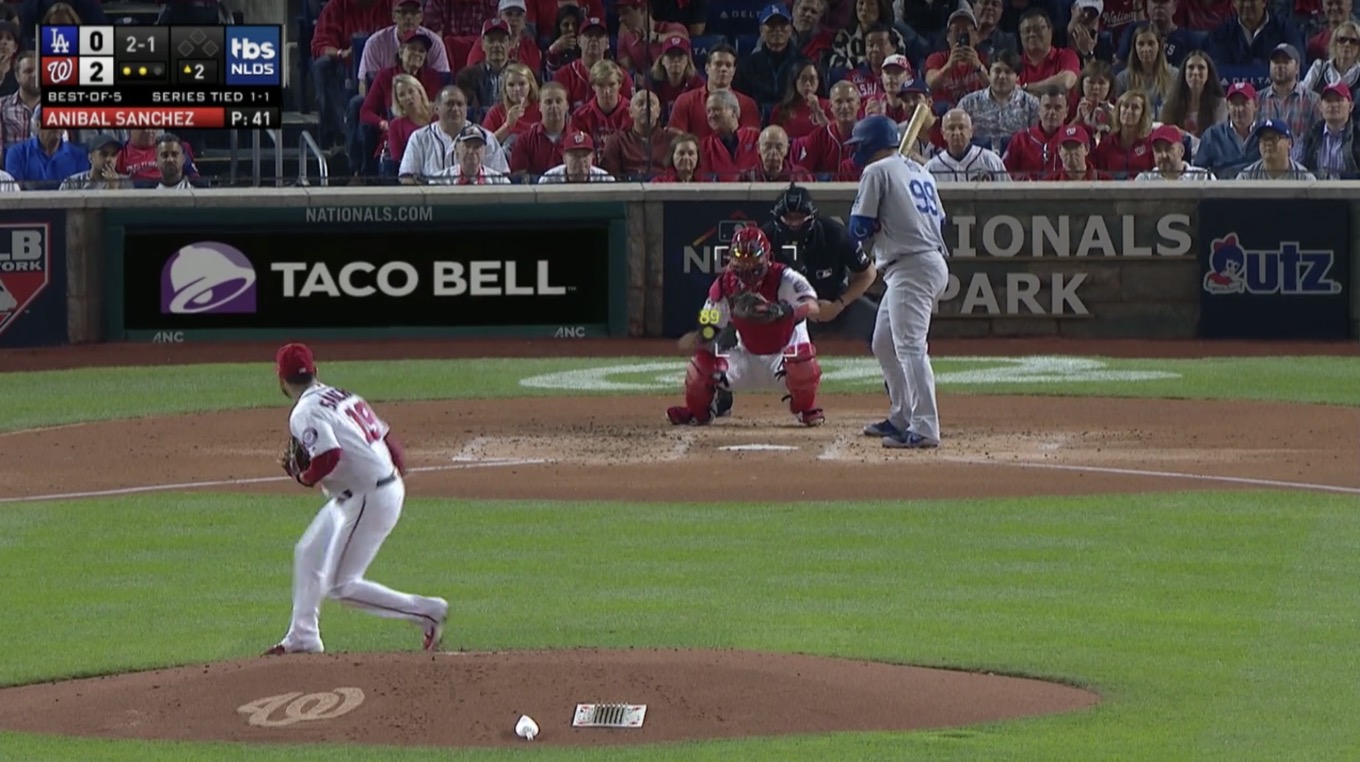
MLB Network

The league-owned MLB Network gets to broadcast an early-round game or two, when there are just too many games to air on the standard brodcast partners. This lets Bob Costas, who is Dick Clark-like in his agelessness, have a chance to broadcast postseason baseball.1
In any event, MLB Network’s graphics were the worst of the four postseason TV networks. They didn’t display the name of the current pitcher or batter, and offered no overlay of the actual strike zone with feedback about pitch location.
And then there are the out dots.
This is one of the delightfully stupid controversies that comes up when you write about baseball graphics. In a nod to skeuomorphism and old ballpark scoreboards, many networks display the number of outs in an inning not as a numeral, but as dots. These dots generally appear as gray circles that are filled in with a bright color as the inning progresses.
The controversy is this: How many dots should there be? There are three outs in an inning, so you’d think the answer would be three. But some folks will point out that since getting the third out ends the inning, having a third dot would be superfluous. Once the third out is made, the inning is over and there are no outs at all.

I get the argument, but I firmly reject it. Outs come in threes, not twos. If you must represent it by a series of faux light bulbs, you should have three bulbs. Better, I think, to light up that third bulb momentarily, then turn it off and indicate the end of the inning. It improves the clarity of the graphic at the expense of a few pixels—and gives you the opportunity to make a fun animation at the end of the inning.
What I’m saying is, MLB Network uses two dots and that seems only fitting for a graphics package that also doesn’t overlay the strike zone or tell you who’s pitching or hitting. It’s almost 2020, MLB Network. Last year’s graphics won’t cut it. Time to pay the software upgrade fee.
TBS
Full credit to TBS crew for providing a competent graphics package for its coverage of the National League playoffs this year. If you watched a game on TBS, you saw a score box featuring team logos, the status of the current series, the name of the pitcher with his pitch count, three out dots, and a visible strike-zone overlay that also displayed the speed of the pitch.
My quibbles with TBS’s graphics are minor. I wonder about the practice of displaying only team logos in the score box. It saves a lot of space, but not every team’s logo is understandable at a glance, especially to a more casual fan. Other networks have also added the name of the current batter to their score boxes, and I think it’s a good addition, but TBS hasn’t gotten there yet.
ESPN

ESPN broadcast the two wild-card games this year, and I rate their graphics package as almost a dead heat with Fox2. What I like best about ESPN’s graphics is their choice to display both a team logo and a two or three-letter name for the team—for example, the Oakland A’s were represented by their big “A’s” logo as well as the three letters OAK. I think spending the space for clarity about the teams who are playing is a fair trade.
ESPN’s score box displays the pitcher’s name and his current pitch count, the batter’s name, position in the order, and a statistic about his performance (generally his in-game performance after the first at-bat). I approve of the use of three out dots, of course.
What makes me rate ESPN just below Fox is its idiosyncratic use of its pitch overlay, which the network has spent many years branding as “K Zone.” Unlike Fox and TBS, ESPN doesn’t display a pitch’s speed within the overlay, but in the score box. I think that based on context, placing the pitch speed in close proximity to its location is a better move.

I need to give ESPN big credit for offering regular overlays displaying the previous pitch moving through a 3-D space as a camera swoops around the strike zone, so you can get a sense of how the pitch moved through the strike zone. The problem with flat strike-zone overlays is that they hide the fact that pitches move while in the strike zone, and ESPN’s 3-D graphic adds a lot of clarity on questionable pitches.
Now to my pet peeve about ESPN’s overlay. When a pitch is a strike, the on-screen mark includes the letter K. In baseball the letter “K” represents a strikeout (for various historical reasons, because S was being used for Sacrifice or Single or something). A strike is not a strikeout. If you want to represent pitches with letters, that’s great—put an S for strikes and a B for balls. But a strike is no more a K than a ball is a BB (base on balls).
Fox

Much to my surprise, Fox’s graphics package is the best. (Maybe I should mute Joe Buck and John Smoltz3 and just focus on the graphics.) Compared to the other networks, the Fox graphics choices show some uncharacteristic restraint. There are no team logos in the score box, just letters. And Fox isn’t going to get caught up in your argument about how many out dots there should be—it displays outs with a good, old-fashioned numeral. (It used to be a two-dot offender, but has reformed by avoiding the question entirely.)
Pitchers and hitters appear in the box with the current pitch count and in-game statistics, and there’s a live pitch location overlay that includes the speed of each pitch. Fox ticks all the boxes.
I have two quibbles about Fox’s presentation. As much as I appreciate the restraint in using only letters, adding team logos to the box does make it a bit prettier. But what really baffles me is Fox’s choice about how to shade the box for each team. During the Twins-Yankees series, Fox colored both boxes the same shade of navy blue, which allowed no differentiation at all. The Twins are red and blue; Fox should’ve shaded the Twins box red. Why color the boxes if they can’t be differentiated?
What have we learned?
The state of baseball graphics is pretty good! Most of the networks have decided that overlaying the pitch location, displaying pitch velocity and pitch count, and labeling the pitcher and batter and good ideas, and I agree. Most of them have even agreed that you should use three dots—or numerals!—to represent the number of outs. With the exception of MLB Network, which needs to go back to the woodshed, these are all graphics packages worth applauding.
- I have always liked Costas, but what was once his charming appreciation for the history of the game has transformed into into cranky complaining about how the game isn’t as good as it used to be. ↩
- They did another “Statcast” broadcast this year with Jason Benetti, Eduardo Perez, and Mike Petreillo, and it was The Best. ↩
- I think sports announcers should be enthusiastic about the sport they’re covering. Buck seems like he’d rather be doing football, and Smoltz can’t stop complaining about modern baseball strategy. I want someone who understands the modern game, not someone who heckles it. ↩
If you appreciate articles like this one, support us by becoming a Six Colors subscriber. Subscribers get access to an exclusive podcast, members-only stories, and a special community.