

By Jason Snell
October 5, 2014 2:40 PM PT
How many outs? Design and the Fox Box
Note: This story has not been updated for several years.
Design is everywhere. Even in sports. Last night on Twitter, as I watched the Giants-Nationals playoff game, Todd Vaziri pointed out an interesting design decision:
Today in MLB coverage: this graphic is dumb.
The OUTS graphic should have three dots, not two. @gruber @jsnell pic.twitter.com/TST8xE2RGa
— Todd Vaziri (@tvaziri) October 5, 2014
Put simply, there are three outs per team per inning, but Fox Sports 1’s score box displays only two circles, filling them in as the inning progresses. It led to an interesting conversation on Twitter, which I’ve Storified.
Reasonable people can differ about whether Fox Sports 1’s design decision is a good one. It’s true that there are never three outs during a team’s half inning; once you get a third out, that half of the inning is over. However, I’d argue (and did last night) that not showing the third out as a circle to be filled in suggests that there are only two outs, and not three, in a batting team’s half of the inning. (If there weren’t empty circles to be filled in, implying a maximum number, it would offend me less.)
This is hardly a design catastrophe. In fact, I suspect that the designer only displayed two circles because there just wasn’t room for a third. (J.D. Davis on Twitter did point out that Fenway Park’s scoreboard only has two light bulbs to track outs. I suspect that decision was more about saving money on light bulbs and wiring, rather than being a philosophical statement about when an inning truly ends.) For the record, Major League Baseball’s own app, MLB At Bat, displays three circles.
Does anyone who’s watching a baseball game not know that there are three outs per side in an inning? Probably not. That’s why this is not a major design foul. But still, it grates. Outs is a concept that adds up to three, but the outs graphic adds up to two. As John Gruber wrote, the better decision would be to show all three outs, fill in the third out at the end of the inning, and then fade out the entire graphic as you go to a commercial break.
The entire genre of the on-screen score box, which was introduced to America twenty years ago as Fox Sports’s Fox Box, is a fascinating design playground. Before 1994, American sports broadcasts didn’t feature a persistent indicator of the current score and game status. (The box apparently was invented in 1992 for English soccer.) These days, it’s hard to imagine a televised sport without it. The boxes vary by sport, obviously, but also by individual broadcaster—each one has its own idiosyncratic take on how best to present dynamic information in a small space.
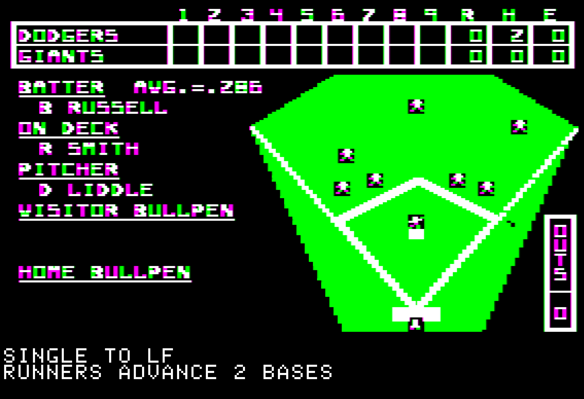
Some boxes are animated—ESPN actually shows numbers flipping over when a score occurs, as if the score counter has to rotate through consecutive numbers like an old clock radio. Fox used to attach an annoying sound effect to every single animation. This baseball postseason, TBS and MLB Network have both tried to show baseball defensive positioning, with varying success. (TBS’s looks like they’re trying to explain where the shortshop plays to people who have never before seen baseball; MLB Network’s is compact, but sort of resembles my old SSI Computer Baseball game on the Apple II.)
If you’re not a sports fan you might not notice these on-screen displays or the interesting challenges they offer for presenting complex information in a compact space, but I find them endlessly fascinating. Televised sports are richer for having them, even if fans sometimes quibble with some of the design decisions.
If you appreciate articles like this one, support us by becoming a Six Colors subscriber. Subscribers get access to an exclusive podcast, members-only stories, and a special community.