

By Jason Snell
July 13, 2026 1:49 PM PT
First Look: macOS Golden Gate Public Beta
Let’s just get this out of the way: I liked macOS 26 Tahoe. I liked it because it marked the first time in years where Apple seemed to embrace the fact that Mac users deserve productivity improvements, not just syncing up with whatever (often useful, yes) new features were being introduced to iOS.
I didn’t like the interface changes, especially the way the redesign handled toolbars and sidebars. It actually felt like macOS dodged a bullet by being treated as an afterthought, because pouring more Liquid Glass atop macOS would have made the situation even worse. But over the last summer, I got used to the interface offenses and instead focused on all the improvements.
Turns out that at least some of my friends and colleagues decided that Tahoe’s interface offenses were too great to bear, and despite all those tasty new productivity boosts, they would sit this one out and hope that Apple came to its senses with macOS 27.
Good news for them: While they’ve spent a year without Apple’s first native clipboard history, Shortcuts automation and AI access, and an improved Spotlight, their upgrade to macOS 27 Golden Gate will net them last year’s features as well as a host of other improvements, all wrapped in an interface that is an unequivocal improvement over what Tahoe wrought.
To those folks, welcome back to the current OS version. To those of us who spent a year floating on the glassy surface of Tahoe, welcome to Golden Gate. Available today as a Public Beta and arriving on every Apple silicon-based Mac this fall, it’s an update I’m not going to have to spend a year apologizing for liking.
Design takes a step forward
The fact that there are more design changes in macOS than any of Apple’s other 27 updates speaks volumes about how broken many of the Tahoe design decisions were. Apple describes the design as “even more refined,” because in Apple marketing-speak, broken features are never remedied or fixed—past features are just improved. The truth is, Apple has rolled back numerous missteps and made changes to others to mitigate the issues they caused.
Floating glass sidebars inset from window edges—a choice that made sense metaphorically, but looked awful—are gone, essentially reverted to their previous design, sitting at the left edge of windows, with a darker background for contrast and colored icons to boot.

Toolbars, one of the most important interface conventions of macOS, were flattened and ghostly in Tahoe. In Golden Gate, they pick up better shading and are more legible, though (strangely) the toolbar in inactive windows offers more contrast and legibility than in active ones! In Photos, toolbars are actual bars, not horizontal areas of floating glassy buttons—which means the system no longer has to attempt to add shading behind those areas in order to improve legibility. They’re just legible.
In Golden Gate, windows generally just feel… a bit more square. Apple has made window corners more consistent, and not having the curved corners of the sidebar right inside the curved corners of the window edge also helps make it feel a little less like you’re under the tyrannical rule of the Circle King.

Icons look better across the board in Golden Gate, probably because of a new layered icon compositing approach Apple is taking across its platforms. Unfortunately, apps that dare stick any of their extremities out of the mandated squircle shape are still put in a featureless gray box of shame, which makes it harder to identify icons, especially in appearance modes like Clear and Tinted that remove color as an identifier.
To hear Apple tell it, users are split on the transparency effect of Liquid Glass: some people despise it, and some people can’t get enough of it. As a result, all of Apple’s OS 27 updates introduce a slider—it’s in the Appearances pane of Settings on macOS—that lets you customize the transparency from sort-of-mostly-transparent to sort-of-mostly-opaque. Given that this update rolls back a lot of Apple’s decisions from a year ago, I’m inclined to believe that there really are two camps when it comes to Liquid Glass. Giving users an option to adjust the setting is probably fine, though I’ve currently got the slider right in the center. We’ll see how that goes.
Siri AI takes the Spotlight
Siri has been a part of the Mac experience for a decade now, arriving on the platform five years after it debuted on the iPhone. While I’m sure that many Mac users have embraced it over the years, it has always been an afterthought at best for me. When I’m sitting at my Mac, I’ve got a keyboard and trackpad to get my job done, so I don’t generally feel the need to talk to my computer. And while you’ve been able to type to Siri for a while now… well, the other problem with Siri has always been that Siri’s results are rarely as useful as the results of typing those words into a search engine or some other tool.
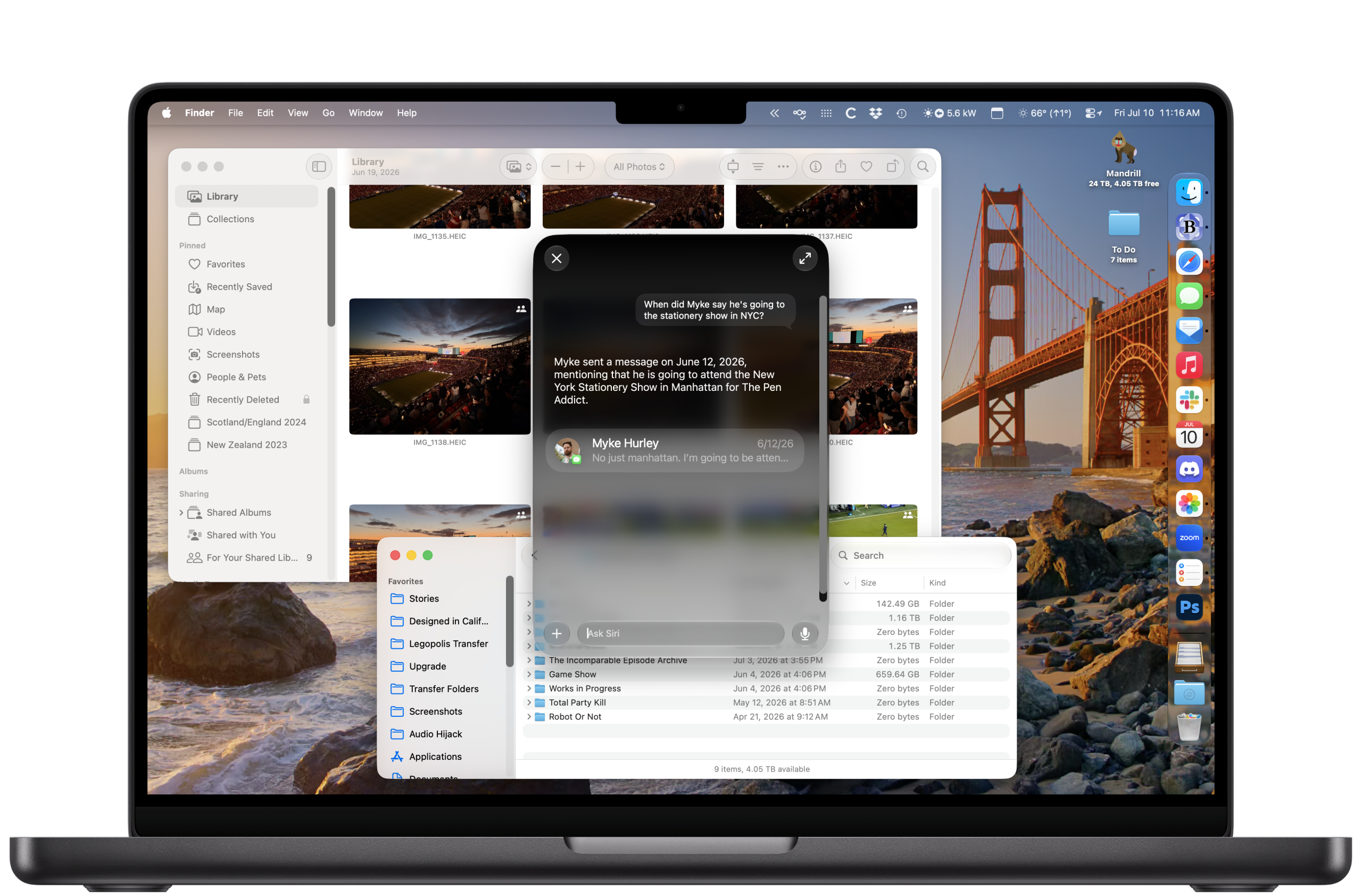
In macOS Golden Gate, as with all the other OS 27-era releases, Apple has upgraded Siri to become Siri AI, with LLM-derived features that promise much better results. On top of that, Apple has finally done what it should have done long ago and merged Siri and Spotlight, so there are no longer two separate “type to find things” interfaces on the platform.
The result is… still a work in progress, at least so far. Siri AI is a beta feature inside a beta operating system. Betas within betas. First off, it’s a struggle to remember that Siri is actually useful and I should take advantage of it. Years of training myself never to consider Siri have to be untrained, and that’s going to take some time.
Thus far, I’ve found Siri AI’s responses to general-knowledge queries to be very good. But part of the appeal of Siri AI is its integration with your personal on-device data. This is where things start to fall apart, though this is not surprising—it’s an early beta, and many third-party apps will need to update to better integrate with this system. I don’t use Apple’s default calendar or email apps, which puts me at a disadvantage. It frequently failed to answer fairly basic questions about files on my system—”where’s that PDF that contains my company’s tax ID number?”—that I’d hope that a smart assistant with access to my entire Mac should be able to find.
There’s also the question of Siri/Spotlight choosing the right context. When you type Command-Space, Spotlight comes to the fore—and that’s good, because if you want to use it as an app launcher, you want instant responsiveness. When I typed a question that’s more appropriate for Siri, however, I found I needed to wait a few seconds for “Ask Siri” to appear so I could ask my query.

There’s a new Ask Siri entry that’s been added to the top of every contextual menu, and while I don’t mind the idea that Siri can act on just about any context you can think of on the Mac, I don’t love how it’s implemented. The contextual menu used to open with all of its contents down and to the right of the pointer (unless you were too far to the right or bottom of the screen); now it starts shifted down a little bit, as if the old context menu was being drawn and then an Ask Siri item was being overlaid right at the top of the menu, sticking up over it. It’s darker than the rest of the menu. If you click on it, it floats forward, the rest of the menu disappears, and you can type in the resulting box. It’s disconcerting every time I right-click on something.
The most useful actions tend to be placed at the top, and I’m not convinced that even a fully functional Ask Siri would always be the most useful command in a context. This feels more like a weird add-on to existing context menus, and all to promote the new Siri features. Apple, if a feature is good, users will use it. Distorting the geography of context menus on the Mac to promote them feels aggressive and almost desperate.
Touchscreen Macs, at last?
One of the most remarkable features of macOS Golden Gate does not really make sense if you take it at face value: Apple has given a major upgrade to Sidecar, the feature introduced in 2019 that allows Macs to use iPads as external Mac displays. As someone who always travels with a 13-inch iPad Pro, that’s a nice feature, though since the 2022 introduction of Universal Control, which lets me use my Mac’s keyboard and mouse on an iPad still running iPadOS, I’ve found very little use for Sidecar.
The big update is that Sidecar, which previously only supported the Apple Pencil, now works with the iPad’s touchscreen. Apple has updated its own apps and supplied third-party apps with the appropriate tools to support full touchscreen support. You can now scroll Mac browser windows with a finger and drag windows around on screen… but only on that iPad you’re using as an extra display.
It’s not hard to read between the lines: As numerous reports have suggested, Apple is planning on releasing its first touch-enabled MacBooks late this year or early next year. Using Sidecar as a way to demo the technology and allow developers to test their apps in advance is really clever.
Beyond that, this feature is delightfully boring. It just does more or less what you’d expect. Adding touch to macOS isn’t going to be revolutionary—it’s been on Windows for ages, and iPads have had optional trackpads and keyboards for six years now. But it’ll be a nice incremental benefit. I still use touch gestures when I’m working on an iPad in laptop configuration, because sometimes it just makes ergonomic sense. If my hands aren’t on the keyboard and I need to scroll something or tap something, a quick poke with my finger does the job. It feels natural—and once you’ve spent some time with that configuration, it’s jarring to use a Mac laptop and realize that you’re poking the screen to no effect.
After a moment’s glee in being able to scroll a Finder window with my finger, using Sidecar with touch to drive the Mac interface just became… normal. Apple has done a good job implementing the feature. Menus drop down reliably. Buttons are tappable. Scrolling works. There’s just not a lot to report, and that’s just fine. It works.
Shortcuts, reduced and enhanced
The Shortcuts app, the cornerstone of Apple’s cross-platform automation technologies, gets a notable upgrade during this cycle. Most of it is probably due to the needs of Describe a Shortcut, a remarkable new feature that lets you input some text and then watch as your device converts it into a Shortcut. As I wrote in June:
This is as close as we’ve come, across 40 years, to the original dream of putting computer power in the hands of everyone. You can literally tell your device what you want it to do, and when—”every morning show me my to-dos and calendar events for the day”—and it will generate a program to do it and a schedule to run it…
But when it works, which is most of the time, it’s magical. And perhaps its best feature is that you can iterate on your Shortcuts. If there’s something it doesn’t do quite right the first time, you can specify changes you’d like to see—”only show me items from my Personal calendar”—and it’ll rewrite the Shortcut to take those changes into account. In that way, it’s emulating the back-and-forth conversations that can make vibe coding so remarkable.
Describe a Shortcut is limited, but it really works quite well. I hope it continues to grow and improve, because it lowers the bar for user automation across Apple’s platforms in a delightful way.

For those of us still building Shortcuts with our own fingers like animals, some of the other improvements will help that work get done. There’s a new Otherwise If statement that can be added to If-Else blocks (you get to it by control-clicking on the Else block and then choosing Add “Otherwise If”), making the structuring of branching shortcuts logic much, much simpler.
There’s also support for persistent data storage, which is kind of huge. You can save data, which syncs via iCloud and is accessible across your devices, and Shortcuts can both access it and update it! That will make Shortcuts capable of behaving more like other apps, all without having to rig up other ways of storing data in iCloud Drive or elsewhere. (Yes, this canonizes Simon Støvring’s Data Jar in Apple’s OS, and that’s a good thing.)
The arrival of Describe a Shortcut has unfortunately distorted the Shortcuts interface in some unfortunate ways. On the Mac, there’s a new three-paned interface, where the third pane is a giant preview of a shortcut’s color, icon, and (this is fun) an AI-generated summary of what the shortcut does. The pane exists because of the text box at the bottom, which lets you type input to Describe a Shortcut to make changes to whatever shortcut you’ve got selected. Which is fine, except it’s an enormous amount of screen space devoted to something that may be entirely irrelevant. Somehow, Shortcuts won’t let you hide this pane.
New horizons for Photos
During WWDC week, I wrote about the changes to Photos this year, but just to reprise:
Apple has finally updated its Shared Albums feature, which had been compromised since it launched because it didn’t offer the ability to share full-resolution images. Over the years, Apple added other methods of sharing groups of photos via iCloud, and those could include full-resolution images, but this one prominent feature felt stuck in the past.
Now it’s getting a proper upgrade, with support for full-resolution images and allowing for full collaboration with people on other platforms so that everyone can contribute to a shared photo album. I’m relieved that I will soon have to stop explaining the differences among the various ways to share items in Photos and warning people away from Shared Albums.
As for the three AI-powered features in Photos, they’re a mixed bag. I have high hopes for a much improved Clean Up, which was already okay but could be a lot better. The new version is much more adept at artfully clipping unwanted items out of an image and filling those areas with in-context imagery, though of course it’s not perfect.
The other two features, Extend and Spatial Reframe, require the use of an advanced diffusion model that’s only available via Private Cloud Compute, and as a result, they take time to execute, since Photos will need to upload your photo, wait for a result, and then download the result.

Extend feels like a good feature, since there are plenty of scenarios where your image needs just a little more headroom or width. It’s also going to be great for straightening images, since Extend can fill in the slivers of unknown image that are exposed when you rotate, which otherwise require that your image be cropped as you rotate.
However, every pixel you expand the selection increases the jeopardy that what’s going to be generated is weird or fake. Everyone’s mileage may vary, but I found that I was much more comfortable expanding a photo a little bit to gain some headroom than doing it a lot, forcing the AI system to invent more objects or scenes. I was occasionally frustrated that I couldn’t slightly extend the bottom of some images, where subjects’ legs or feet were cut off. Also, you have to be aware of incredible fabrications—extending a graduation photo added a gigantic floating tassel and an invented piece of furniture, and extending a stadium shot added a roof where there isn’t one. Judicious use, carefully analyzed, is my advice.
Then there’s Spatial Reframe, which brings together a load of existing Apple technologies, including the spatial scanning algorithm it used to create spatial photos on Vision Pro. This feature works by scanning your photo locally using that algorithm, inferring a depth map that is then used to build a 3-D version of the image that you can pivot a bit, up and down, and left and right. This is the effect that allows you, on the Vision Pro, to feel like you can move your head and see parallaxes shifting, even though, if you look closely, the exposed content behind a subject is just a simple generative fill. It all happens so quickly, and in service of a live 3-D effect, that it’s often not noticeable, and even when it is, it’s not that big a deal.
The bar is a lot higher for a fixed, 2-D photo at full resolution. So after you use Spatial Reframe to slightly move the perspective of a shot, all the data is sent up to Private Cloud Compute, where a new version of your shot is rendered—including much more advanced generation of all of those pixels that are revealed by parallax or at the edges of the frame.
Some results are more synthetic than others. Unlike Extend, Spatial Reframe changes the entire perspective of the picture, which requires everything visible to be re-rendered at full quality. The result sometimes feels artificial. Again, my first impression is for people to use this feature with care and caution.
There are a handful of other nice, new Photos features, including new Captured By Me and Identity Documents sections (quick, find that photo of my passport!), and a triumphant return of star ratings for individual photos.
Wait, there’s more…
There are so many small enhancements in Golden Gate that it’s hard to mention them all, and every time I turn around, I keep bumping into more of them. Keeping in mind that we’re entering the long cruise to the fall release of the final version, here are some other highlights so far:
- Apple has added some light menu-bar management, specifically to deal with items that overflow the notch on some MacBook models. I’m glad that it’s taken this tentative step, though I wish it were more—it’s okay, Apple, you can sherlock all those menu-bar-management utilities out there1—and of course, it should’ve happened back when the notch first appeared (checks notes) nearly five years ago. Better late than never, I guess.
-
Safari’s now got an AI-driven tab organizer, so if you’re someone who keeps a zillion tabs open, you can have Safari group them into smaller, more navigable clusters. I’m not a zillion-tabs person, but I noticed that this approach is also being applied to the Start Page, where recently viewed pages also now appear clustered by topic.
-
The Passwords app gets an injection of agentic AI through a new feature that offers to change your compromised or easy-to-guess passwords for you, navigating various websites and generating new, high-security passwords automatically. It’s a clever idea, but the most unfinished of any feature in the beta. It managed to change three of the 39 passwords it attempted. If you were trying to break into my Ikea account, well, you’re going to need to order more Kallax shelves on someone else’s dime now.
-
Both Finder and the document save option in the menu bar will scan the contents of a file and offer up naming suggestions. I didn’t love the suggestions it offered, but your mileage may vary. I’d like to see this feature applied to auto-generated filenames like screenshots, though!

A note about stability
This summer, the vibe has been that Apple’s 27 releases are very stable for betas, which is not surprising since improved stability and reliability have been key Apple goals. And I would agree, I’ve been running the developer beta on my main Mac since the week after WWDC, and it’s been mostly fine.
But don’t be fooled: These are betas, and they will do weird stuff. I have to occasionally reboot my Mac to get things working normally. Shortcuts just stop working, and then start working again, willy-nilly. Third-party apps frequently quit unexpectedly, or refuse to quit at all and hang out in my Dock forever! And as I mentioned above, my menu bar manager is busted, though the developers are working on it.
If you’re willing to put up with the quirks in exchange for a glimpse at the future of the Mac, jump in. If you refused Tahoe entirely, you are in for an extra treat. And if you’d rather just wait… relax. Fall will be here before you know it.
- It’s worth noting that Apple’s changes to the menu bar seem to have broken compatibility with existing menu bar utilities. They’ll need to be updated. If you rely on them and want to jump into the Public Beta, be warned. ↩
If you appreciate articles like this one, support us by becoming a Six Colors subscriber. Subscribers get access to an exclusive podcast, members-only stories, and a special community.