

By Joe Rosensteel
August 28, 2025 10:00 AM PT
A better camera app? Reflections on Adobe’s Project Indigo

I appreciate what Adobe is doing with Project Indigo. It’s a free iOS camera app, but it is heavily disclaimed as being experimental with unique features you can’t find in other apps. But Adobe also says they’re targeting “casual” photographers, which seems misguided.
A few people I know have even been evangelizing Project Indigo because they love it so much, especially when they compare it to photos from Apple’s Camera app. My enthusiasm for this product doesn’t match their own. It’s neat but it’s not great.
It isn’t all-purpose (it can only take still photos), and it can’t do panoramas or portrait mode. It doesn’t have the compressed storage of the editable HEIC files Apple introduced with the iPhone 16 Pro, or the new photographic styles pipeline that lets a user control tone mapping and certain processing, both before the photo is taken and after the fact.
There are still a few noteworthy tricks it pulls off that are worth a look.
Watch your tone
One of the highlights (wink) of Project Indigo is its tone mapping. The Camera app, and nearly all other camera apps, combine multiple photos taken at different exposures into one image to produce a single image with a wide amount of dynamic range from the brightest brights to the darkest darks. Project Indigo combines “up to 32” images to produce its result. They’re producing an image that is a RAW DNG file and a JPEG.

You can’t adjust the tone mapping like you can with Photographic Styles. You’re supposed to take it into Lightroom and treat it like the RAW output of a DSLR or mirrorless camera.
The default result tends to be much more naturalistic than the Camera app.

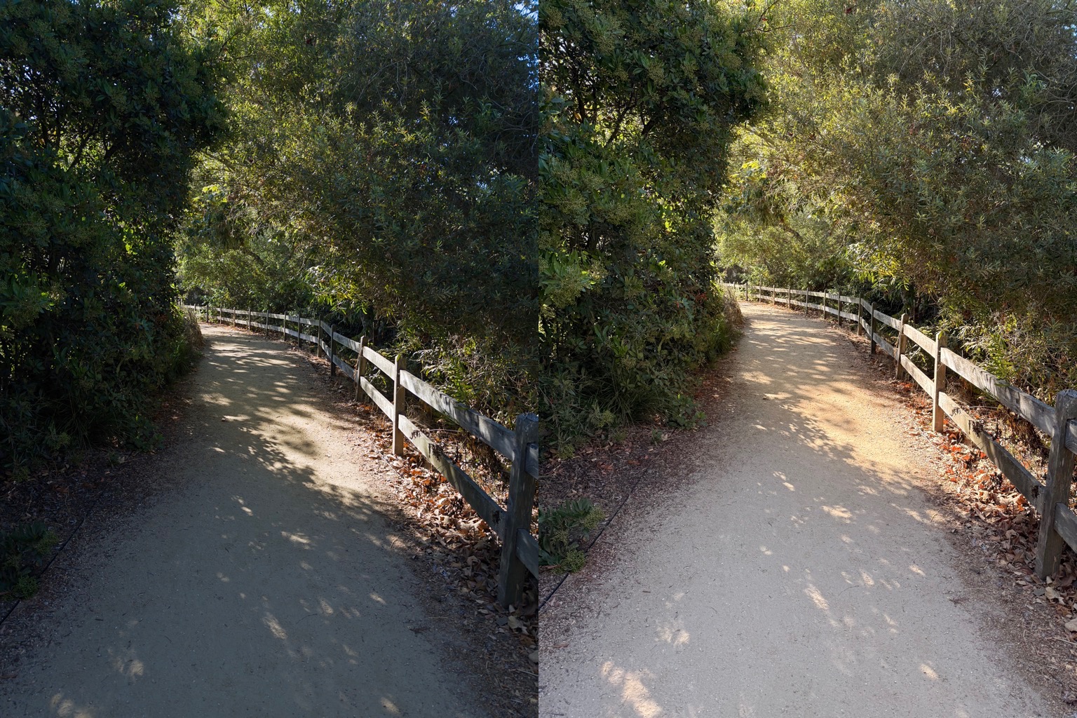
In some cases, you can approximate what Project Indigo is doing with the tone control in Photographic Styles on an iPhone 16 Pro. However, both Project Indigo and the Camera app have semantic masking to alter different parts of an image to different degrees. You might lift the shadows in one area and flatten out all the midtones, or push things too far into brightness. It’s not one-to-one.

One immediate drawback to all the exposures Project Indigo is taking is that it takes a while to process the photo when the shutter button is pressed. The app doesn’t lock up, but you need to keep the app open until the circular progress indicator finishes.1
It’s not like it takes minutes, but it isn’t anywhere near as fast as the Camera app, which we all take for granted. Sometimes you want to take a photo and immediately check it to see if you got what you were aiming for, and you don’t get that kind of turnaround. Obviously, it’s doing a lot of work in a tiny span of time, but it makes the app feel sluggish. This can be a particular pain for photographing a transient moment in time, like wildlife, children, vehicles, sports, etc.
While in “Photo” capture mode, the app is constantly capturing data before you push the shutter button, but when you switch to “Night,” it tries to use longer exposure times if the phone is relatively stable, and thus the process and processing are slower still.
All that processing does look “more natural” when you look at the resulting images from far enough away, but up close, you’ll always see some degree of softness.

There are occasionally artifacts like doubled edges or fine patterns that can just turn into mush. When you combine these exposures, you reduce things like noise —but unless you have your iPhone on a tripod, and the subject matter is perfectly still, pixels are going to be blended not just in time, but spatially.

I can’t speak to the details of the Camera app’s multiple exposure combination, but it’s not as prone to ghosting a bunch of overlapping detail like Project Indigo. Some of that might be that it’s combining fewer exposures, or it’s how Apple has tuned the image processing to isolate regions with movement. Adobe also does semantic processing to mask things when it’s combining images, but whatever it’s doing, it’s always soft and fringy.
Project Indigo seems to be allergic to having any noise, so I’m baffled about why there’s an AI Denoise feature included in the app. What would you remove noise from?
Super resolution
When you try to capture a photo at a resolution other than the native ones, Project Indigo tags them as Super Resolution, or SR. On my iPhone 16 Pro, that’s 2x and 10x. There’s no way to turn off this processing and tell the app that you’d rather have the noise.


It’s a classic “six colors of one, half-dozen colors of the other” situation. What’s the advantage of Super Resolution when the output is this blurry? Detail doesn’t resolve, which is what the word resolution is for.
Clumsy controls

iOS 26’s big innovation for photography is to hide many of the controls in the Camera app. Project Indigo has a lot of manual controls you can get to but they are not at your fingertips. Instead, it relies on the submenus found by tapping icons that show at the top and bottom of the screen.
The file format is self-explanatory, and the camera icon is just a pop-over menu to access the same “Photo” and “Night” mode toggles at the bottom of the interface. If you tap on the histogram, you can choose between a histogram display format with the ISO and shutter or one without, but if you swipe the histogram, you get all the display overlays like levels, grids, and the app’s settings.
The thing that looks like a settings icon (two sliders in a circle) in the bottom right of the interface is the “Pro Mode” set of controls to adjust focus, ISO, aperture, exposure compensation, white balance, and —if you’re in Night mode— the number of frames to merge. I would argue that these are common enough tools that they should be pinnable to the main view.
They can each be set independently to a manual setting or to auto, but you need to tap each one individually, and then slide the horizontal slider.2
In the Camera app, you can do exposure compensation by tapping in the photo viewing area and dragging up or down near that point on a vertical slider overlay. There’s no quick access mechanism like that in Project Indigo.
As far as manual controls go, there are better apps for this. Third-party apps like Obscura, Halide, etc., provide more intuitive arrangements of controls or gestural elements. Project Indigo is much more like the complex, nested interface of the pre-iOS 26 Camera app —just differently complex, and differently nested.
Reflecting on removal
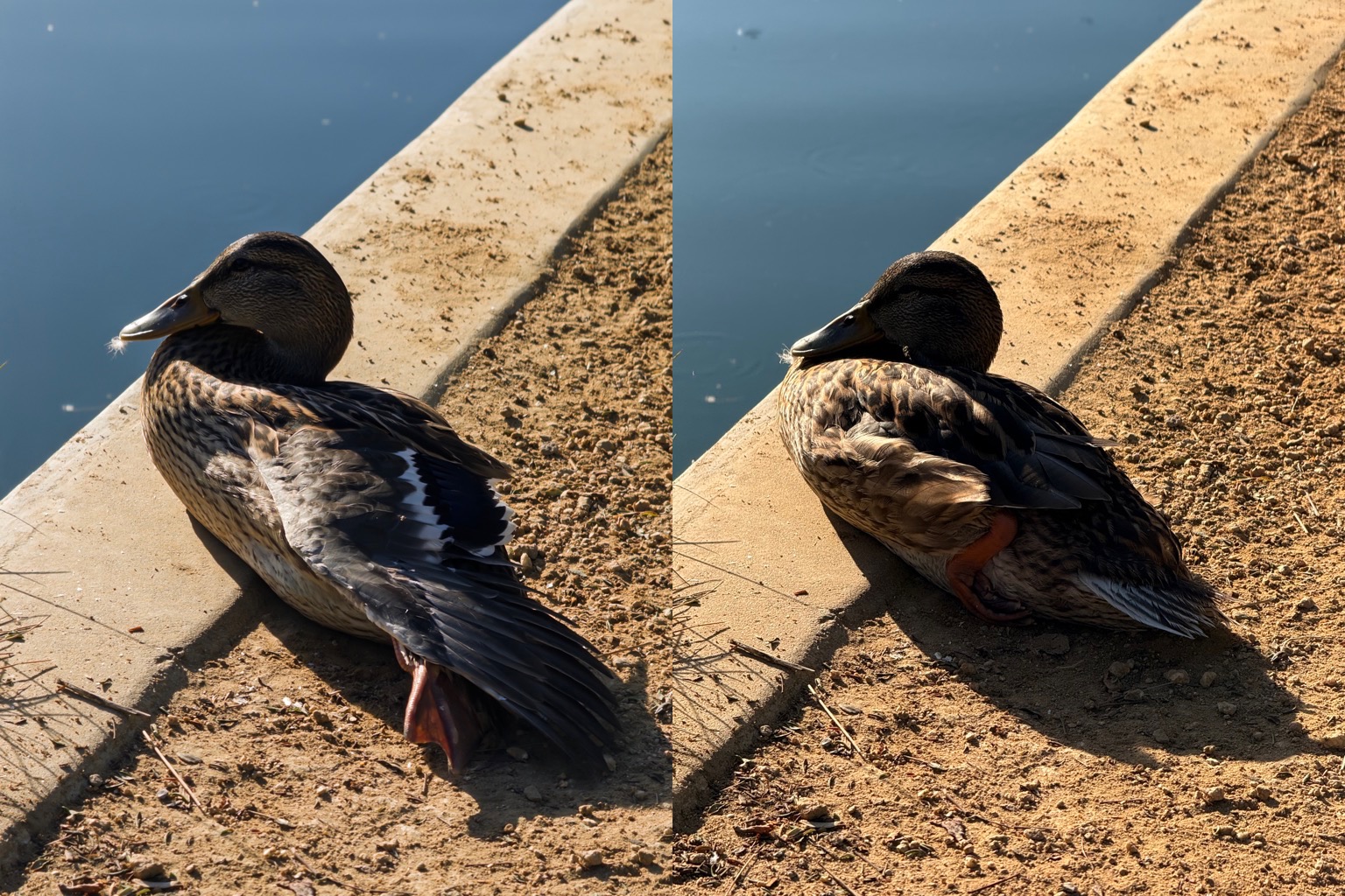
Reflection removal is the show-stopping feature that made me rush to download the app when it first launched. I often use a circular polarizer on my DSLR and mirrorless camera. Those filters can reduce reflections and glare, and improve contrast. There are companies that will sell you circular polarizer attachments for smartphones, but they are clunky. To be able to get a similar function from software would be handy.
Adobe announced reflection removal first for Adobe Camera RAW, but you needed to use the Bridge app on a desktop computer and the files had to be a certain way, blah blah blah. Project Indigo made it a one-stop shop where any photo you took with Project Indigo was available.
Unfortunately, in reality, reflection removal is not like using a circular polarizer. It spits out three images: The original, the image with the reflection removed, and what it thinks the reflection was. Reflections are additive light, so Adobe trained a model to figure out how to recognize patterns and subtract them. It’s very clever, but it is remarkably easy to make it all fall apart.

Almost all the test images I have taken over the past three months and run through Remove Reflections have had notable artifacts. In several cases it gets confused by what is a reflection and what is refracted through a surface — like a completely still pond where it eliminates things in the water, or a set of multiple glass surfaces.

There’s no way to dial back detail, or get the model to guess again (like you can do with content-aware fill/removal). You’d need to take your image results into some other kind of image compositing app to bring some amount of the reflection back. If you had a circular polarizer, you’d just turn it before you took the photo to remove less, but obviously, it can’t work like that.

This really feels like a research project more than any other part of Project Indigo, but it’s also the boldest thing that this computational photography app can do. I would like to see another iteration of this, with better semantic masking to ignore frames, walls, and underwater elements.
Maybe they can save motion vectors from the camera movement to calculate perspective shifts, or use the depth sensors to figure out surface vs. see-through for segmentation. I don’t know, I’m just an idea guy.
Let’s see where this Indi-goes
Since Project Indigo isn’t as all-purpose, responsive, or crisp as the default Camera app or the other third-party camera apps, it’ll remain an experimental curiosity—one that’s worth checking in on only occasionally. I don’t want to open an app and only then remember it can’t take a video, and that photos of text will be a fuzzy mess.
It seems like it would be a better idea to build a fully featured camera app that happens to include experimental features, rather than an app that only has experimental features. It’s great to develop ideas out in the open, but if it’s convenient to use, then more people will spend time using the app. I also worry that Project Indigo might be another novel testbed that just fizzles out and doesn’t produce any follow-on product. Adobe’s graveyard of dead iOS apps is massive.
Conversely, it would be nice to see other developers get inspired by some of the problems Adobe is trying to tackle with Project Indigo. I would hope that the people working on Apple’s Camera app feel emboldened to tweak their tone mapping and think about how they can approach reflection removal. There’s plenty to do in the world of computational photography that isn’t just about hiding controls.
- You won’t lose data unless you open the Camera app while Project Indigo is already processing a photo. That’s only noteworthy for people making comparison shots. ↩
- Horizontal sliders are the least possible ergonomic slider you can have on a phone because your thumb doesn’t naturally move that way. The tip of your thumb can go up and down pretty easily for vertical sliders, but your thumb arcs side-to-side. ↩
[Joe Rosensteel is a VFX artist and writer based in Los Angeles.]
If you appreciate articles like this one, support us by becoming a Six Colors subscriber. Subscribers get access to an exclusive podcast, members-only stories, and a special community.