

By Dan Moren
July 12, 2023 2:27 PM PT
First Look: watchOS 10 Public Beta
Note: This story has not been updated since 2023.

Every year the big betas roll around—iOS, macOS, iPadOS—but only in recent years has Apple started offering public betas for some of its smaller platforms.
But I’m glad it does, because this year, the action is on watchOS.
As I wrote several months back, watchOS 10 is a big update that really spends its time re-thinking how we interact with our smartwatches. And now that I’ve spent several weeks using the beta, I can say with some confidence that I’m very excited about this reinvention.
Atomic widgets
Apple’s played around with a few different interfaces for the watch since its inception, and in watchOS 10, it’s taking another crack at it with widgets.
Apple tried something like this with the Siri watch face back when the Apple Watch Series 3 debuted, but as interesting as the idea of a contextual display was, the problem was that it required you to replaced the watch face you’d carefully tailored to your own liking and style.

So instead, in watchOS 10, Apple’s essentially stapled that Siri interface below whatever watch face you select, plus given you the ability to customize it as well.
To access the widgets, you can swipe up on the screen to scroll through the list, which is fine. But, far better, Apple has repurpose the Digital Crown for the same purpose. The Digital Crown is the Watch’s best interface element—and, to my mind, one of the best physical controls Apple has ever created—and it was, frankly, being wasted on the Watch’s main screen ever since the demise of the Time Travel feature several years ago.1
(It’s not the only physical control that’s been repurposed either: pushing the Watch’s side button used to bring up the Dock of your applications, but now shows Control Center instead, a far more useful feature, in my opinion. The Dock, such as it remains, is now available via a double-click of the Digital Crown.)
Some watch faces did use the crown for limited purposes—Metropolitan allowed you to adjust the height of its numerals, the Astronomy face let you zoom through a little virtual orrery. To access those features now, you can tap on the watchface and then rotate the crown. It’s a little tricky to discover, but it’s still there!
Also gone is the ability to swipe left or right to change your watch face—instead you have to press and hold to bring up the watch face editing screen, and then swipe to change your watch face. Cumbersome? A bit, and I don’t entirely understand why this change was made, but if it’s a trade off for the widget view, then it’s one I’ll take.
The widget stack is well designed, and lets you choose from first- or third-party options, arranging them in whatever order you like, and even pinning your favorites to the top. They’re well designed, and make information easily available at a glance. Relevant widgets can float to the top if, for example, you’re currently playing audio.
My personal favorite, however, is the Complications widget which, true to its name, lets you add up to three circular complications within the widget. This makes it easy to access apps you might want quick access to like Timer or Workout, and it even features interactive options like a battery gauge or a delightful miniature real-time compass.
More to the point, by adding the ability to move your complications to the widget stack, it frees you up from feeling like you have to have them on the watch face, which means if you—like me—have ever wanted to use one of faces that offers only a few or no complication slots, you can now do it secure in the knowledge that your complications are just a spin of the Digital Crown away.
If I’ve got a gripe it’s that I can apparently only add a single Complication widget. I can think of half a dozen complications I’d like to have quick access to in my widgets, but watchOS seems to limit you to a single set of three.
Either way, I’m looking forward to more third-party apps bringing widgets to this party—it finally gives me a reason to install more of them on my phone.
Redesigned and it feels so good
Most of Apple’s own apps have gotten a makeover in watchOS 10, as per the company’s WWDC session. There’s a focus on single-screen interfaces in apps, rather than endless scrolling lists.

Even the Home Screen has been redesigned, refining the beehive of app icons into a fixed-width grid of alternating three- and four-icon rows that’s easier to use and rearrange (you can still choose to see all your apps as a list if you prefer—personally, I’m team grid).
Apps pop more with colors now, and take better advantage of the space available to them. There’s now an emphasis on moving controls to corners, a decision afforded by the larger screen sizes of more recent Watch models.
Overall, this makes apps easier to use and glance at, even if they are occasionally a bit busy. And it doesn’t hurt that it gives everything a fresh new look—after almost nine years of the Apple Watch, a fresh coat of paint is nothing to sneeze at.
Feature presentation
Of course, watchOS 10 brings its fair share of new features to the table and, as usual, a lot of them are about activity and fitness.
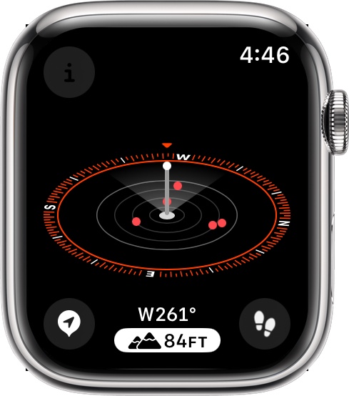
There are new hiking features that can show you topographical maps in the Maps app (only apparently available in some parts of California at present), you can set elevation alerts for when you pass a certain altitude, and the Compass waypoints now tell you the last place you had satellite or cell signal.
Apple’s also beefed up the cycling features, and as I’ve recently gotten back into biking more, I’m looking forward to giving these a more thorough look. Now you can get Power Zones for your cycling workouts, connect to third-party Bluetooth accessories, and even see get your active workout metrics mirrored to your phone’s display in a big easy to read interface.
I do appreciate some revisions to the Maps apps, including the addition of a walking radius, as well as the option for a transit map view. Offline maps downloaded on your iPhone are also available on your Apple Watch, which can be especially handy for hikers.
Snoop, there he is
Perhaps I’m burying the lede, but I couldn’t help but devote a section of this preview to my favorite new watchOS 10 feature: the Snoopy watch face.2 I have very fond memories of the yellow Snoopy watch my mom had when I was growing up, which had the beagle playing tennis, with his arms as the watch hands.3

The Snoopy watch face is just plain fun. Every time you lift your wrist, you get a different Snoopy animation, many of which even interact with the watch hands—I must have seen more than two dozen at this point, and I still catch a new one from time to time. When you put your wrist down, you’ll still have a static image of Snoopy lying atop his doghouse.
You can choose a single color for the background or, in a further bit of fun, opt for the Sunday Surprise: the background is gray during the week, and on Sunday picks a random color every time the display comes on.
It’s a simple bit of joy and whimsy that feels perfectly in keeping with the Apple Watch. And, thanks to my widget stack, I don’t even care that it doesn’t have any complication options.
Updated on 7/14 to clarify how to access watchface features.
- In case you’ve forgotten, this was a feature that let you dial the watch forward or backward in time and would even update complications accordingly. It was demoted to an optional feature for a while, then summarily killed off. ↩
- Okay, there is another new watch face called Palette, which is pretty but doesn’t really do it for me. Because, come on, Snoopy! ↩
- I was glad to find out, when showing her the Snoopy watch face the other day, that she still has it. ↩
[Dan Moren is the East Coast Bureau Chief of Six Colors, as well as an author, podcaster, and two-time Jeopardy! champion. You can find him on Mastodon at @dmoren@zeppelin.flights or reach him by email at dan@sixcolors.com. His next novel, the sci-fi adventure Eternity's Tomb, will be released in November 2026.]
If you appreciate articles like this one, support us by becoming a Six Colors subscriber. Subscribers get access to an exclusive podcast, members-only stories, and a special community.