

By Jason Snell
October 24, 2022 10:00 AM PT
macOS Ventura review: A work in progress
Note: This story has not been updated since 2022.
In recent years we’ve had some macOS releases that were disruptive, in the worst way. Whether it was bugs or incompatibilities or broken features, nothing makes the excitement of a new OS update evaporate faster than not being able to use your Mac as you’d prefer.
So here’s the good news about macOS Ventura: In using it the last few months as my primary operating system, I’ve found it to be not appreciably different than macOS Monterey. It looks the same, software acts the same, I haven’t noticed any bugs… it’s been solid. Upgrading to macOS Ventura will probably not be particularly dramatic for those who do it, and that’s a good thing.
But you do need a reason to upgrade to a new OS version. Motivation can come from small quality-of-life improvements, or major new features. macOS Ventura offers both, and many of them are quite welcome. From Mail to Safari to FaceTime, there are small upgrades that will delight.
In terms of the cornerstone features of this release, however, it’s more of a mixed bag. The new Continuity Camera instantly gives any Mac user with an iPhone access to a remarkably high-quality webcam (if you can find a way to mount it). Seven years after introducing iCloud Photos, Apple’s new iCloud Shared Photo Libraries feature finally lets people curate a shared photo collections with their loved ones. Both are huge updates, and huge improvements to the Mac experience.
But some other key features feel unfinished. Stage Manager, a new way of grouping windows together, creates too much window-management busy work to make it worth the trouble. The new System Settings app replaces the long-in-the-tooth System Preferences app that’s been with macOS since OS X 10.0, but lacks coherent organization and offers an inconsistent and frustrating interface.
Stage Manager: Another window manager on the pile
Managing multiple overlapping windows has been a defining feature of using a Mac since 1984. For decades, it’s been a huge productivity boost to savvy Mac users, since it allows multiple panes of information of arbitrary sizes to be arranged arbitrarily on a user’s screen. But for some users, the Mac’s windowing metaphor has led to confusion and frustration, whether it’s windows covering other windows or hidden or minimized windows being unfindable.
You, an expert Mac user, may be fine with the way things are. But Apple’s got a broader audience to serve with the Mac—there are more Mac users today than ever before, and the Mac installed base just keeps growing—and it’s never really been satisfied with the available window-management tools on the Mac.
I have to admire Apple’s insistence on this topic. Over the decades it’s tried windowshades, a floating application bar, Dock minimization, single-window mode, Exposé, Spaces, Mission Control, Full Screen, and Split View, and while many of those features have been embraced by some Mac users, the company still doesn’t think that it’s cracked it.
So here comes the latest attempt to refine window management on the Mac: Stage Manager, which makes its debut with macOS Ventura (and iPadOS 16, but that’s another story). Stage Manager is best thought of as a way to create arbitrary groups of windows that you can quickly switch between.

The best I can figure, Stage Manager’s creators believe that Mac users still struggle with too many open windows and spend too much mental effort opening, closing, and moving windows around. (If I get out of my “this-is-how-it’s-always-been” mindset, I suspect that they’re right.) But rather than building something like a tile-based organizational system, Apple has decided that the right solution is to create sets, sort of like Spaces—but have them all exist in a single space, with different sets collected in a new shelf that’s kind of like the Dock but different.
On one level, the Mac is approaching a level of interface-management complexity that threatens to bend in on itself and require some sort of manager for interface managers. The Dock contains running apps, but also other apps, but also minimized windows. And then there’s the Stage Manager shelf, which holds window groups. And you can group windows together in Stage Manager groups, or alternately group them in separate Spaces, or both. You can put some apps in Full Screen or Split View, which will themselves generate their own Spaces.
(Stage Manager also feels a bit like an admission on Apple’s part that Full Screen mode, which strives to create an iPad-like experience on the Mac, misses the mark. I never use Full Screen mode, even on apps that would benefit from the utter takeover of my Mac’s display, because it really doesn’t work well with Finder. I’m dragging files into Logic Pro and Final Cut Pro all the time, and every time I try to use them in Full Screen mode I end up getting frustrated by all the mode switching and give up. Stage Manager, on the other hand, lets you display your desktop items in the background, or you can click on the Desktop to switch to the Finder and go grab what you want.)
It’s a lot, and while I applaud Apple’s insistence on giving Mac users more tools to manage the Mac’s interface, this bricolage of features probably needs a top-down organizational rethink.
And yet on another level, I think I understand what Apple’s getting at here. While I might frequently have seven or eight windows open at once on my Mac, I’m never using all of them. Most often I’m using one. Very rarely am I furiously clicking back and forth between even two, let alone three or more. The others are there to be glanced at, or to be switched to when I’m performing a different task.
There’s something to be said for trying to place each of those tasks in its own set, and then quickly flipping between them—rather than having to float individual windows to the top when you move from task A to task B. (If you’re saying to yourself that this is what Spaces is meant to accomplish, I agree with you to a point—but I never could get the hang of Spaces, mostly because once a space was out of sight, it was out of mind. Stage Manager groups are much more present, and that’s a good thing.)
One of the features that I appreciate about Stage Manager is that it isn’t a reinvention of how Mac windows behave, beyond the grouping and the toggling between them. It doesn’t enforce a specific size, location, or even layering order on windows—everything feels natural and Mac-like.
Unfortunately, Stage Manager trades in the drudgery and confusion of managing multiple windows for the drudgery and confusion of arranging windows and stages in Stage Manager. I can’t go more than a few minutes in Stage Manager without clicking on something and being whisked away to a new stage, even when the most logical thing would be to assume that if I’m clicking on an item in one workspace, I want to add items to the same workspace.
Far too often I end up opening a new window, switching back to my previous space, dragging that new window into the existing space, and then positioning it appropriately. (This isn’t helped by a startling lack of Stage Manager-focused keyboard shortcuts and trackpad gestures.) The end result is that while Stage Manager feels like it should be saving me time and offering me clarity about what I’m working on, more often than not it ends up feeling like an exercise in clicking and dragging windows around on my screen rather than getting work done. That’s a misfire.
I still think Stage Manager has potential. But I’m starting to worry that it’s just too fiddly to be a solution for regular people, because to use it properly you’d still need to learn lots of gestures and keyboard shortcuts. Apple can address a lot of this by setting proper defaults and evangelizing to the developers of third-party apps about the proper ways to deal with Stage Manager, but that’s a process that will take a while.
I hope I’m wrong, but right now Stage Manager feels like another well-intentioned shot at window management that will just accumulate with all of the other not-quite-successes Apple has tried over the years. For that not to be the case, Apple needs to aggressively improve it during this OS cycle, rather than letting it atrophy in its currently unfinished state.
A shared Photos library, at last
Let’s face it: Ever since Apple introduced iCloud syncing of photos back in 2015, the next obvious step was to allow people to participate in a shared photo library. The company’s policies very clearly want every individual to have their own Apple ID, and a host of family sharing features have been introduced around that concept. And yet a family couldn’t place photos in a single shared library. (Apple has offered other photo-sharing features before, but they’re generally offering lower-resolution images with limited metadata and can require some complicated steps to create.)
Obviously, there are plenty of complications to creating a shared library, as Apple has finally done in macOS Ventura and iOS 16.1 with the new iCloud Shared Photo Library feature. Not everyone, even within a family, wants to share every photo they take with everyone else. (My daughter, for example, would love to contribute pictures of cats and vacations, but is strangely not interested in sharing pictures of college parties with her parents.) Apple clearly intended to build a feature that gave users more control over what gets shared, so that it wouldn’t be a nonstarter for a large proportion of potential users.
I get it. But at the same time, it’s been seven years since Apple introduced iCloud Photos, and every December I have to borrow my wife’s phone, attach it to my Mac, and import a year’s worth of her photos into my library so that we can search for holiday card images and build a calendar. So while I’m excited that iCloud Shared Photo Library is finally here, forgive me for being a little frustrated that it took this long.

At least the wait has allowed Apple to conceive of many ways to share portions of your library without sharing everything. You can choose to share all photos after a certain date, or all photos containing certain people’s faces, or nothing at all. At any time, you can contribute photos to the library, or yank them back. The iOS Camera app includes a feature that lets you toggle whether new photos are contributed to the shared library or just saved to your own. And Photos will do some work to make guesses about when members of a group are together, and suggest that you contribute those photos to the shared pool.
A shared library can be shared with up to five other Apple IDs1, and while they don’t have to be members of an Apple ID family group, you can only be a member of a single shared library at a time. In the Photos app, Apple has implemented a filter that allows you to view your personal library, the shared library, or both libraries together—with an optional icon indicating which images are a part of the shared library. The expectation is clearly that you’ll spend most time in the “view both” mode.

By making the shared library a full-on iCloud library, not some sort of half-measure sharing system, it means that it works completely as you’d expect. If someone adds caption or edits a photo, that photo updates for everyone using the shared library. If someone deletes a photo, it deletes everywhere (but if you contributed it to the library, you’re given the option to copy it back into your library instead). And the photos appear everywhere, even in Memories and widgets.

When I was testing this feature out over the summer, I was frustrated by its apparently inability to detect duplicates between libraries. It turns out that duplicate detection is triggered when you join a library for the first time, not on an ongoing basis. There’s probably still room for improvement here—Photos can now detect duplicates in a library, which is a great feature, but it should probably be applied on an ongoing basis, too.
Continuity Camera: Embracing the iPhone’s optics
The new Continuity Camera feature lets Macs use an iPhone camera as a webcam. This makes a lot of sense, since Apple’s iPhone camera game is as strong as its built-in Mac camera game is weak. Even though third-party apps like Reincubate’s Camo have let users repurpose their iPhones as as Mac cameras for a while now, I have to admit to being surprised that Apple decided to make this an OS-level feature. It is, after all, an admission that Macs don’t have very good built-in cameras—but that admission is tempered by Apple’s pride at the quality of those iPhone cameras. Maybe that’s what helped this feature slip through?
In any event, it was the right thing to do. I love Camo, but most people would never think of using an app like that—and because third-party developers don’t have access to the deepest levels of Apple’s operating systems, there are things they can’t do that Apple can. To use Camo, you have to launch an app on your iPhone, and then make sure you don’t accidentally quit it while you’re mounting your iPhone on a stand or tripod and pointing it in the right direction. Apple can just detect the presence of a Mac, wake up the iPhone (XR or better) camera, and start streaming camera data wirelessly. There’s no app to launch, nothing to configure, no awkward attempt to mount a phone while not touching the wrong button or the wrong place on the screen. That’s pretty great.

Apple won’t use Continuity Camera as the default in all instances. It’s using the iPhone’s sensors to detect that the phone has been placed on its side and is not wiggling around (i.e., being held by hand). In all other instances, Continuity Camera is simply available as an additional video input, which you can aim anywhere—you’ll just need to switch your software to use that camera as the input source.
Continuity Camera also takes advantage of features Apple has already used elsewhere. It supports Center Stage (on iPhone 11 and later), which automatically pans and zooms in order to keep people in frame. If you use Center Stage, then Continuity Camera will use the iPhone’s ultrawide camera in order to have the widest possible coverage area. (If you don’t use Center Stage, it’ll use the iPhone’s main camera instead.)
I found the image quality of the iPhone’s main camera to be appreciably better than that of the ultrawide in Center Stage mode. Using a small crop from an ultrawide camera image to emulate a little camera operator via Center Stage is very clever, and I like Center Stage as a concept. But the bottom line is, it’s still a crop from a lower-quality camera, and it’s noticeable when directly compared to the high-quality image straight from the main camera. If you’re trying to replace the soft Center Stage image from your Studio Display’s camera with an iPhone, don’t use Center Stage mode or you’ll have just recreated the problem.
Apple’s also lifted Portrait Mode and a smart lighting effect, Studio Light, and put them into Continuity Camera. Studio Light lightens the subject in the foreground and darkens the background (on iPhone 12 and later), and Portrait Mode fuzzes out the background (on iPhone XR and SE 2 and later).
While I’m enthusiastic about Apple bringing this feature to the Mac, I’m disappointed in the limited controls Apple provides to users. We’ve now got the ability to turn off Center Stage, Studio Light, and Portrait Mode in Control Center, but I’d like the ability to crop an image and adjust the image to look better in cases where Apple’s automatic adjustments just don’t get it right. (Also, it’s frustrating to discover that for some reason you can’t use Continuity Camera if you’re using AirPlay. Just… what?)
For me, the most exciting part of Continuity Camera might be that it has prompted Belkin to make a MagSafe mount to attach an iPhone to the top of a display as a webcam. I got a chance to use an early version of Belkin’s mount on an M1 MacBook Air and it worked pretty well, though the iPhone (a 13 Pro in a case) was heavy enough to pull the laptop’s screen completely open if I tipped the screen angle over a little too far.

An additional offshoot of Continuity Camera is Desk View, which uses the iPhone’s ultrawide camera to provide an image of what’s on your desk by rotating and de-distorting the edges of the camera’s field of view to display the area right below.

Cleverly, Desk View is implemented as an app, so it can be shared using the screen-sharing mode on most videoconferencing apps—you just share the Desk View window instead of a window in Microsoft Word or Numbers or whatever you might share with the Zoom crowd.
The problem Desk View faces is geometry. If you are using a laptop on a desk, you need to push that laptop way back on the desk—essentially out of arm’s length—just to give it enough desk surface to shoot. And you’ll probably need to tilt the screen down, to give the camera a better view of the desk. You can get pretty great results out of Desk View, and the app itself seemed very fast and responsive. The question is if you’ll want to bother.
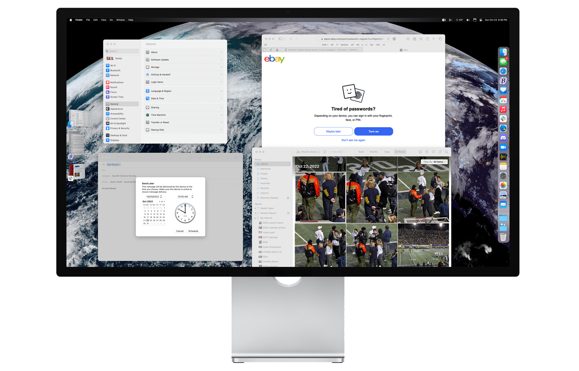
System Settings: A wasted opportunity
With macOS Ventura, Apple has tossed away the old System Preferences app (and I mean old, it hasn’t changed very much since it was introduced in Mac OS X 10.0) and replaced it with a new System Settings app. Here’s the good: In renaming the app as Settings and introducing a new hierarchical look, Apple is unifying its settings apps across its platforms, which is a good thing since so many people come to the Mac from iOS.
Now here’s the bad: Apple finally addressed its old, outmoded System Preferences app by replacing with a new app that isn’t any better, just bad in different ways. It’s not just a misfire, it’s a frustratingly wasted opportunity.
I detailed my complaints with System Settings earlier this year, and while Apple has seemingly spent all summer trying to tinker with Stage Manager, nothing much has changed on that front.
The app is organized around a scrollable sidebar of top-level settings items and a medium-sized panel to the right with the controls for whatever item you selected. If only it were that simple, though. The top level of settings has more than two dozen items to choose from, and there’s a hidden second level of hierarchy beneath it that is essentially hidden from the interface, making it difficult to figure out where you are.
Apple has also failed to take advantage of the fact that most Mac screens are wider than they are tall, so the app window can only get taller, not wider. (Extra width would help expose the second level of hierarchy, for instance.)
Just these choices make System Settings a usability disaster. It’s good that there’s a search box at the top of the settings list, because the best way to use the app is forget that it has any organizational structure and search for what you want. It would actually be less confusing if Apple removed all pretense of a structure and just had the app feature a single pane with a search box and nothing else.
Some of this confusion could have been resolved with a clear re-think about which settings go where. Someone at Apple could have sat down and outlined a sensible hierarchy for settings, but that clearly didn’t happen. Settings are scattered all over the place, in locations that make very little sense, frequently because they got attached there 10 or 15 years ago in System Preferences.

I’ll give just one example: the Privacy & Security section includes, all the way at the bottom after you scroll past every imaginable security setting, an option to manage Extensions. This is where you can configure things like Automator and Shortcuts actions in the Finder, book and calendar plug-ins in Photos, and a grab-bag of other extensions, very few of which are remotely related to the primary topic—especially in the eyes of the user.
Many sections, like Privacy & Security, rely on very long scrolling lists that are full of long lists of settings. It’s really unpleasant to scroll through them all to find what you want, and if we’re going to have 30-plus top-level settings sections, perhaps it wouldn’t hurt to make them a bit more atomic and easier to search for? There’s also inconsistent interface design throughout.
In the end, does a badly designed System Settings app really matter? Only when a user is at their most vulnerable, when they need to figure out why their computer is not working the way they want. And then, they’ll be offered a confusing set of hierarchies. At least there’s that search box. Someone give the person who designed the search box a raise, I guess.
What a waste. System Preferences needed to get better, but System Settings isn’t better—just different. If Apple wants to give the impression that it’s a company that sweats the details, it’s going to need to do better than this version of System Settings.
Editing and deleting messages (for some)
With the release of iOS 16, iPadOS 16.1, and macOS Ventura, Apple is making some major changes to the infrastructure around its iMessage service. You can now edit and delete messages within the Messages app—within a brief editing window. It’s a fantastic, welcome addition.
There’s just one problem: anyone who hasn’t updated to these versions on their devices won’t stay in sync. An edited message will simply be posted as “Your Name edited the message to read ‘Message text‘.” Deleted messages won’t actually delete.
Sure, in a year or two this won’t matter—and let’s be honest, most people update their devices almost immediately to new versions, though it happens less quickly on the Mac than it does on iPhone and iPad. But right now there’s a real issue of “messages fragmentation.” While I admit that it’s a big job, would it have been too much to upgrade the final versions of iOS 15 and macOS Monterey to be able to display these changes?
In any event, while the changes Apple has made to iMessage are nice, they’re also incredibly conservative. Tapbacks are great, but there’s a whole emoji set they could use for them—and instead we’re still left with the six reactions Apple started with. (The Messages App store interface at the bottom of the iOS interface also needs to be thrown away, but at least the Mac doesn’t have to deal with that.)
Safari: Tab Group improvements and Passkeys
Every macOS update is also for Apple to update its built-in apps, and of course Ventura brings a slew of changes to those apps.
Safari, which last year gained Tab Groups, this year gains the ability to share a Tab Group with other people. This is potentially a fun, collaborative feature—but I have to be honest and admit that I just don’t find myself using Tab Groups regularly. I have created shared Tab Groups with some people I collaborate with, but they have yet to get regular use. I think they’re probably better suited to shorter, intense projects than for longer-term collaborative efforts.
But I’ll say this: I’m very happy to see Apple take a feature it introduced a year ago and make substantial improvements to it the next year. Too often, Apple releases new features and then forgets about them. Not only are Tab Groups now shareable, but you can also set a custom image for each group’s start page, as well as pin tabs in a tab group.
There are a bunch of new features in macOS Ventura that need a lot of follow up, not just in further updates to Ventura but in subsequent years. I hope they get the same ongoing attention that Tab Groups has.
In the long run, though, this year’s Safari update will be most notable for its official support for Passkeys which threaten to make passwords obsolete. In a few years, you really won’t need passwords for most of the sites you log into. Passkeys are supported by Apple, Google, and Microsoft, so the operating-system support is there. Read our article about Passkeys for more detail about how this will work. It’ll take time. But in the end, I think it will be a milestone that will change how we use the web.
Mail: It’s a start
Mail, a pretty vital app that seems to have been on autopilot for the last decade, shows signs of awakening from its slumber. There’s a new full-text search engine, which provides much better results than the old version did. There are also a bunch of new sending features, including the ability to schedule a message to be sent later, and an “unsend” feature (which really just makes Mail wait a few seconds after you’ve marked the message to be sent, in case you have second thoughts).
If ever there was an argument to never shut down your Mac and only put it to sleep, it’s the scheduled send feature in Mail. Yes, if you schedule a message for 4 p.m. and then shut your laptop at 3:50 and go for a run, it will still send at the appointed time! Apple’s using the same technology that allows sleeping Macs to partially wake up and do network tasks (including iCloud sync and Time Machine backups) to also send out queued email. It’ll also send your mail out even if the Mail app itself isn’t running. I do wish it would warn you that mail was queued before you shut down your Mac, though.
This is a good start. But I hope Apple doesn’t stop here (sense a recurring theme?), since Mail could really use more proactive tools to handle mail management. Other companies have spent the last couple of decades trying to reinvent or at least mitigate the Inbox; Apple has done nothing. I’d like to see the company give it the ol’ college try.
See me after class
macOS Ventura is far from a failure. It’s got a number of good new features, including iCloud Shared Photo Library, Continuity Camera, and improvements to Mail and Safari. However, it’s also not a success. The new System Settings app and Stage Manager could generously be described as works in progress. And another app that Apple promoted heavily when it unveiled its operating systems, Freeform, is nowhere to be found.
I’ve used macOS Ventura for the past few months and haven’t had any issues. It seems like a pretty safe upgrade. And yet I can’t shake the feeling that Apple is rushing some of its features out the door before they’re fully baked. I hope the company spends the rest of this product cycle improving what it’s shipping as macOS 13.0. For now, I’d give it an incomplete grade and attach a note that it requires more effort to keep it out of the red zone.
- All photos in the shared library count against the iCloud space of the person who created the library. ↩
If you appreciate articles like this one, support us by becoming a Six Colors subscriber. Subscribers get access to an exclusive podcast, members-only stories, and a special community.