

By Jason Snell
November 12, 2020 10:46 AM PT
macOS Big Sur Review: Third age of Mac
Note: This story has not been updated since 2020.

Mac OS X was no less than a rebirth of the Mac, 16 years after it first appeared on the scene. The code it originated with, and many of the software managers and programmers who built it, came to Apple in the same transaction that brought Steve Jobs back to the company. We remember the G3 iMac and the iPod and ultimately the iPhone as the products that brought Apple from the edge of failure to being one of the biggest companies in the world, but it wouldn’t have happened without Mac OS X.
But here we are, at the end. Mac OS X, having been rebranded twice and reconstituted to run on Intel processors over its two-decade run, is shucking off its cocoon and emerging as something new. It’s macOS 11.0 Big Sur, which takes the familiar OS X and transforms it by importing a bunch of features from its long-lost relatives, iOS and iPadOS, including support for Apple-designed processors.
Last year’s macOS Catalina felt like a release designed to settle old scores and clear the field for future advancement. It broke a lot of old software, frustrated a lot of users, and generally had the worst reputation of any macOS update since Mac OS X Lion in 2011. Did Apple use Catalina as a patsy so that Big Sur wouldn’t be blamed for all the changes required for the transition to Apple silicon? That’s probably a conspiracy theory too far, but I will say this: Good Cop macOS Big Sur fills me with excitement about the future of the Mac in a way Bad Cop Catalina never did.
The OS X era is over. Now here’s macOS Big Sur, getting ready to ring in the dawn of the third age of Mac.
The new macOS design
When Apple makes major operating-system design changes, they tend to start out a bit extreme and then get beaten into shape over time—until they become boring and are replaced by a new design. There are definitely some aggressive, challenging changes in the macOS Big Sur design that will throw long-time Mac users for a loop. And I expect that some of them will end up getting re-thought by Apple’s designers over the next couple of releases.
That said, a lot of aspects of the Big Sur felt comfortable to me after a week or two—probably because I also use an iPhone and an iPad, and Big Sur is picking up aspects of the design of those devices. Big Sur’s design has rough edges and will need to be reined in a bit, but it also has a lot of potential.
High-contrast windows

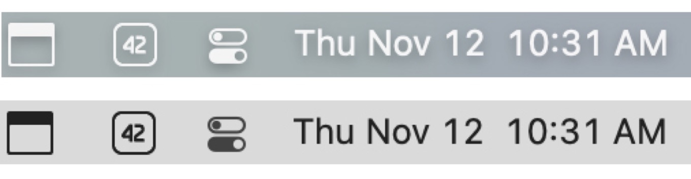
If the atom of the Mac interface is the window, then Apple has split the atom in Big Sur. The first time you look at a Finder window in Big Sur, you will realize that the Mac you have known for years is gone. Let’s start with the sheer lightness (or in Dark Mode, darkness) of it all: the gray gradient of the title bar and toolbar is gone, replaced by a light (or very dark) gray space that’s populated with the contents of both the title bar and toolbar, collapsed into a single row of items. Toolbar icons are simple glyphs that only gain an outline when you mouse over them. The title, once centered, has been aligned to the left and made bolder, with its icon hidden (until you mouse over). The Back and Forward buttons are perched on the extreme left, even beyond the title of the window. On narrower windows, The Search box is now gone, collapsed until you click the Search icon.
Apple has also altered the geography of the window itself, in a move that was telegraphed with the design of several apps, including Music, Podcasts, Reminders, and Maps, in macOS Catalina. Previously, a normal Mac window was best thought of as a single space with a title bar and toolbar spanning its entire width, and within it could be a content area or a sidebar and content area. But if you have a window with a sidebar in Big Sur, the geography is different. The window is instead sectioned in two, with the sidebar and the red/yellow/green “traffic light” buttons on the left (with a slightly translucent background), and the title bar, toolbar, and content area on the right.

SF Symbols, Apple’s library of glyphs, has been added to macOS with Big Sur, and it lends an air of consistency to toolbars and sidebars. The appearance of colored glyphs in sidebars—favorites in the Finder are blue, for example—is a pleasant addition. Even the venerable “disclosure triangle” that you can click to reveal the contents of a folder has been reduced—it’s lost its third edge and its gray fill color, and is now just a carat. (It also appears in sidebars as a way to collapse or expand lists of sub-items, replacing the word “Hide” that appears in Catalina.)
While the density in the toolbar has gone way up, the rest of the window has spaced out. There’s much more space between the red/yellow/green “traffic light” buttons and the edge of the window, and the same is true of the additional white space above and to the right of the title bars/toolbar.
The windows of apps that haven’t been updated to support this new format will receive a more minor makeover. The title bar will be white (or dark gray), and the title font is now bold, but the title is still centered and there’s none of the additional padding that’s been added to new-style Big Sur windows.
Make room for Big Sur
Adding more padding is a recurring theme in Big Sur. Apple has also made the menu bar taller (as well as making it distractingly translucent). The menus themselves now sport curved edges at the top (which seems wrong metaphorically?), and there’s additional space between each menu items.
The big question is, does this mean that Apple is preparing for a future where Mac screens also support touch input, so that you could navigate a menu with your finger in a pinch? It’s possible, but it’s just as likely that Apple thinks our displays are big enough that they can afford to look a little less cramped. I wonder what this design decision means for the future of tiny Apple laptops—or if it places hard size limits on how small a Mac screen can be. I know I’d be frustrated if my old 11-inch MacBook Air was this inefficient with space.
It also feels that everything in Big Sur is rounded at the edges, from windows to menu items to alerts to the Dock to the icons… it’s consistent, and in keeping with most of Apple’s hardware designs, which eschew sharp edges. It makes me wonder why Apple didn’t just mask the corners of the screen in Big Sur (as they were on the original Mac) to make them feel equally curved. The right angles at the corner of my display seem awfully jarring when I’m using Big Sur.
Speaking of icons, I should mention that Apple has redesigned all of its app icons and appears to be all in on making the iOS-style rounded rectangle the standard on macOS as well. Every single Apple icon is a roundrect, and given that future Macs will be able to run iOS and iPadOS apps, perhaps it makes sense to strive for some sort of icon harmony.
That said, Apple’s icons are peculiarly inconsistent when it comes to items placed in front of the roundrect, such as the (outmoded) hard drive in Disk Utility, the loupe in Preview, and the chess piece in Chess. Not only do these items break the silhouette of the roundrect shape, which spoils the entire point, but they’re not even placed consistently—they’re all viewed from somewhat different perspectives.
If you happen to be someone who designs app icons, though, you should be cheering. One look at the Dock in Big Sur will tell you who has gotten with the program and who is, in the words of Steve Jobs, a “laggard app.” Circles? Random shapes? They stick out like sore thumbs. Apps with existing iOS counterparts will probably just use versions of those icons; every other Mac app is going to need an icon update to avoid looking hideously out of step with the times.
The Dock itself has, of course, also gotten a makeover. It’s more translucent (which is fine, since there are no legibility problems with icons like there are with text in the menu bar), it’s floated away from the edge of the window (there’s that trend toward more padding again), and of course the corners are aggressively rounded.
I need to take a moment and mention just how annoying the new menu bar design is. Apple is attempting to intelligently sense what’s behind the menu bar and adjust the appearance to match. But I’ve got big iMac Pro display and my background image is a satellite photo of a large expanse of our planet. This means my menu bar frequently has darkness at one and and bright white at the other. Big Sur doesn’t know what do do. I end up with white text in the menu bar, which works great on the dark side but becomes nearly illegible on the lighter area. This is really a usability own-goal on Apple’s part, because the aesthetic benefits of a translucent menu bar are never going to outweigh legibility.
Fortunately, there’s a workaround for Apple’s misguided decision: Open the Accessibility pane in System Preferences, click Display, and then check the Reduce transparency box. The Menu Bar and Dock and Finder sidebars will snap into sweet, soothing gray, and you’ll be able to actually read things.
Revolution in the menu bar

Another major change to macOS is happening in the upper right corner of that menu bar, where Apple has introduced Control Center and redesigned Notification Center. Both of these moves have a lot of potential, but I’m less impressed with the execution.
When you click on the new Control Center menu bar item, you’ll see a Mac expression of the Control Center concept that’s been on the iPhone and iPad for a while now. Essentially, Apple is grouping a bunch of common device controls in a single sub-menu, rather than putting them all under individual menu bar items. If you do want an individual menu bar item for a particular control, you can drag it out of Control Center and into the menu bar to add it. (But it remains in Control Center, too.)
Control Center offers controls for Wi-Fi, Bluetooth, AirDrop, Do Not Disturb, keyboard brightness, AirPlay Display, display brightness and related controls, volume level and other sound controls, fast user switching, battery status, accessibility shortcuts, and a Now Playing item for media control. Many of these controls are simple sliders and buttons, but when you mouse over them you’re offered a carat symbol that leads to more in-depth settings.
It’s a nice idea, but the execution is a mixed bag. You can remove some items from Control Center (via the Dock and Menu Bar section of the System Preferences app), but not others. I like the idea of pulling a lot of stray icons out of the menu bar, and giving users a single place to go to adjust a lot of device settings. But there needs to be more customizability and consistency.
To access the new Notification Center, you click on the clock in the menu bar, rather than the previous Notification Center icon. I’m all for reducing menu bar clutter, but this doesn’t make sense to me. Notification Center isn’t related to the clock in any way. This is Apple attempting to cut corners and hide one thing underneath another in order to save space. There should be a Notification Center menu bar item, separate from the clock.
Appearing underneath the clock when you click on it (or if you swipe from the right edge of a trackpad) is a remixed Notification Center that’s a lot better than the previous version. Gone is separation between Today and Notification views—there’s a single view with notifications at the top and widgets below. Notifications are now grouped by app and they’re limited to a few slots, with a button to view more notifications below them, so they don’t consume all the space. It’s a more iOS-like approach, and it’s an improvement, though I feel like I’ve never really properly used Notification Center on the Mac and I’m not sure this will improve matters.
Below the notifications is where the fun really begins, though. The new-style widgets from iOS 14 and iPadOS 14 are also present in Big Sur. Widgets come in three sizes and you can configure them to display how you like. I doubt that the Mac will ever be as big a home for widgets as iPhone or iPad, but I’m glad they exist. It might be nice if you could choose to drag widgets out of Notification Center and plop them on your Desktop, too. But it’s a nice addition to macOS that also brings across some family unity with Apple’s other devices. If you like that weather widget you’ve got on iOS, you can get in on your Mac, too.
App changes
As always, a new operating system means changes to many of the apps Apple includes with the operating system. This year Apple has made a bunch of changes to Safari—which, for those of us who don’t use an alternate web browser, might just be the most-used app on our Macs. There are also new apps that have been imported from iPadOS via Mac Catalyst, and a raft of other changes. Here are some of the highlights.
Catalyst moves ahead
Two years ago, in macOS Mojave, Apple began the migration of iPad apps to the Mac with four stock apps. Last year, Apple opened up the technology used to make that migration possible, Mac Catalyst, to all app developers. The results in the past year have been mixed. While a few interesting apps have come across, it’s been a relatively quiet migration. Developers I’ve talked to have cited the limitations of Catalyst, and expressed hope that it would be improved in Big Sur.
And indeed, it has been improved quite a bit. Perhaps this, combined with the arrival of iOS apps on new Macs with Apple-designed processors, will finally bring a much larger number of iPad-only apps to the Mac.
Perhaps one reason for the improvement during this cycle is Apple’s replacement of two prominent Mac apps with new Catalyst versions: Maps and Messages. Apple might’ve been able to sneak by with an iffy implementation of Catalyst for a bunch of apps that hadn’t existed before on the Mac, as was the case with previous Catalyst apps, but with Maps and Messages each feature regression would be an indictment of Catalyst.
I’m happy to report that my experience with both apps is good. They feel like Mac apps, albeit with an iPad sort of flavor. Catalyst now supports multiple windows, so you can pop out a chat from Messages into a separate window without any trouble. The date and time pickers have been redesigned to accept keyboard input rather than being merely spinning wheels, which was perhaps the most glaring example of Catalyst’s unfinished nature.
And then there’s the upside: Apple’s been adding features to both Maps and Messages over the years—and just not bringing them to macOS. With the move to Catalyst in Big Sur, we finally get access to those features on the Mac. If someone on an iPhone sends you a message with lasers, you will see the lasers. And can respond with balloons. This isn’t just the case where the Mac is getting this year’s Messages improvements (like pinned chats, threading, and mentions)—it’s getting those, and last year’s improvements, and the previous year’s, too. The same is true for Maps, which gets this year’s feature additions like bike directions, but also previous iPad features like street view.
Now, let’s be clear: Getting this version of Messages is only a cause for celebration because Apple essentially abandoned the Mac app for several years. And the same is true, to an extent, to Maps. I don’t want to praise Apple too much for these new apps, because it was shameful that these core system apps (especially Messages) were kept in stasis, buggy and behind the times, for so long. But at least now, they will move in lockstep across Apple’s platforms—and that’s fundamentally good for the Mac.
This is really a glimpse into the future of the Mac, too. Mac Catalyst really exists because Apple doesn’t want to (or can’t afford to) maintain separate apps for the Mac and iPhone/iPad. Now Apple—and any other developer who wants to take advantage of Mac Catalyst—can start looking at the Mac as an additional place for their iOS development work to go. I think in the end this will be a net benefit for the Mac.
Safari

I am a loyal Safari user, across all of Apple’s platforms. And I’ve got an admission to make: I use the Start page. That page that feels like the web-browser equivalent of a super-uncool, AOL-start-page, MySpace-using, “gateway to the ‘Net”? That Start page. I don’t use it exclusively—on the Mac, at least, I also keep a row of toolbar favorites visible at all times. But I have gravitated toward using it, especially on my iPad.
In Safari 14—which, as is generally the case, will appear not just on Big Sur but will also be available for macOS Catalina and macOS Mojave—the Start page has gotten a nice upgrade. You can now customize it with a background image of your choosing, which is fun, but you can also click on an icon in the bottom corner of the screen and choose which sorts of items you want to see in the Start page: Favorites and Frequently Visited, of course, but also Siri Suggestions, Reading List, and the new Privacy Report feature that sums up what Safari has been doing to prevent anyone from tracking you from site to site.
Privacy Report also appears in the Safari toolbar by default. Click on it when you’re on any webpage and it’ll give you a report about how many cross-site trackers that Safari encountered. There’s not really anything you can do with this information, so it’s more of an advertisement for Apple’s laudable attempts to guard the privacy of its users than an actual feature unto itself.
And to be clear, Safari’s tools prevent trackers from following you across websites—they are “prevented from profiling you,” as the Privacy Report interface states it. It’s not actually preventing the “trackers” from working. And many of the “trackers”, like Google Analytics and ChartBeat, are arguably not trackers at all.
I’m also a bit disappointed that Apple didn’t go the extra mile and have the Privacy Report widget display a score or grade for the privacy features of any particular website. That’s what DuckDuckGo’s Safari extension does, and while the user can’t really do anything with that information other than complain or choose not to go to that website ever again, at least it would have some name-and-shame value that might motivate websites to be better citizens.
Safari is finally catching up to Google Chrome with the addition of in-place translation across seven languages. Once Safari detects a foreign language, it will display a translation icon in the search bar. Once you’ve clicked to see a translation, any additional pages you visit on that site will automatically load in translation while you’re there. Apple is launching with support for seven languages, including English, Spanish, Simplified Chinese, French, German, Russian, and Brazilian Portuguese.
Safari 14 also completely embraces the website favicon in browser tabs. If you don’t remember the debate about this feature from back in 2017, the short version is that for ages now Chrome has included a small website icon in its browser tabs, along with the name of the page. Safari didn’t used to show the icon, though it now lets you optionally display it. In Safari 14, favicon display is on by default, and Apple has improved legibility when you’ve got a lot of tabs open by collapsing tiny tabs down to only display the icon. Apple has also added a quick page preview when you hover the pointer over a tab, letting you see what’s there before clicking.
Finally, Apple is adding support for the popular WebExtensions API that’s used by developers to write plug-ins for other browsers, such as Chrome and Firefox. Theoretically, this will allow Safari users to finally take advantage of all of the cool extensions written for those other browsers. But of course, there’s a catch. For an extension to work in Safari, the developer may need to make some changes in order to meet Apple’s security standards. They’ll also need to use Xcode (which means they’ll need to buy a Mac if they don’t own one), and they’ll need to submit their extension to the App Store.
That’s a lot of barriers just to reach Mac users running Safari who could just as easily open a different browser to get that functionality. It feels like the big inducement here is to be ready with Safari extensions for macOS and then rush into iOS and iPadOS the moment Apple supports these extensions on those platforms, too. But if you’ve got a favorite Chrome extension that you’d like to see come to macOS, you may need to write to the developer and try to convince them.
I hope Apple makes this work and Safari gets a much richer extension library out of this, but there’s also a scenario where plug-in developers just don’t bother with Safari. That would be a shame. We’ll see.
Make way for Apple Silicon—and iOS
Of course, perhaps the biggest change in macOS Big Sur won’t be available until later this month: the ability to download some iOS and iPadOS apps via the Mac App Store and run them on the newest Macs powered by Apple-designed processors.
It’s an interesting idea that has huge potential to broaden the Mac’s app base, especially when it comes to games. But there are a lot of questions, too. How natural will iOS apps feel on a Mac? Will too many popular developers just opt their apps out of the Mac? (Apple’s announcement this month that the HBO Max app will run on the Mac gives me pause, because if that’s the biggest video app you can announce, the implication is that Netflix and Hulu and the rest won’t be there.) And will the addition of iOS apps on the Mac kill off all developer enthusiasm for Mac Catalyst, or will it encourage Catalyst use to make those apps better on the Mac?
When Macs running Apple-designed processors arrive next week, we’ll start to get answers. But I suspect it will be a while before we’ll be able to gauge the impact of this feature.
Macs running Apple Silicon (all of which run Big Sur) also have a refined boot and recovery mode engaged by pressing and holding the power button at startup. It’s a better approach than remembering a billion different keyboard combinations, and I’m glad Apple has used this moment of platform transition to redesign the startup process.
And the rest

If you regularly use any of Apple’s stock apps, you’ll find an assortment of upgrades across the board.
Reminders gets a bunch of new features, including the ability to assign items to people in a shared list.
Photos has added a machine-learning-aided retouch tool that seems to do a better job of fixing facial blemishes and removing stray people from your gorgeous family photos than the old version did. It’s still not as good as the same feature in Pixelmator Photo for iPad, but it does seem way better than it was before.
If you use a laptop with Big Sur, you get access to the very nice Battery system preferences panel, which displays some graphs of your battery level and usage in the last 24 hours and 10 days. (Desktop users will instead see the classic Energy Saver panel.)
Apple has revamped the system sounds, both beeps and other sound effects. We went over many of them in a summer episode of Upgrade, and while some of them are improvements, others feel like real downgrades. Over the summer I got used to some, but not all, of them.
How big is Big Sur?
This is an exciting time to be a Mac user. Yes, Big Sur looks and feels very different from the Mac we’ve all come to know. But that’s part of the excitement. I’m excited that Apple is shaking up the Mac after many years of complacency. If you’re not excited by this, I understand it—and Catalina (and let’s be honest, Mojave) is there for you in the meantime. There’s no need to update to Big Sur right now if you’re happy where you are. It will be here for you when you’re ready—or when you buy a new Mac. Many users will probably first experience Big Sur when they buy their first Mac with an Apple-designed processor inside, and that seems about right.
I’m happy that the Mac has more life left in it, and Big Sur feels like the start of the next phase. With it, Apple is redefining how we use our Macs and the software on them while preparing for the next generation of Mac hardware.
So long, OS X. The Mac’s new era has arrived. This one goes to eleven.
If you appreciate articles like this one, support us by becoming a Six Colors subscriber. Subscribers get access to an exclusive podcast, members-only stories, and a special community.