

By Jason Snell
July 9, 2020 10:33 AM PT
First Look: iOS 14 Public Beta
Note: This story has not been updated since 2020.
On Thursday Apple’s releasing the first Public Beta of iOS 14, which it introduced at WWDC in June.
As always, you should think twice before installing any beta operating system on a device you rely on. Not only will there be annoying bugs, but many of your favorite App Store apps will not have been tested on the new software, let alone updated to take advantage of any new features. Running iOS betas can be fun, but it can also be frustrating, so only give it a try if you are willing to trade some stability and serenity for the sweet taste of running this fall’s iPhone OS this summer.
And there are so many tastes to be had in iOS 14, which is a surprisingly expansive update. There’s a huge overhaul to the home screen and a few other areas that change how the iPhone looks in some fundamental ways. And of course, there are a host of app and feature updates, too. Here’s a guide to some of the biggest features to look for when you’re considering an update.
Invasion of the Home Screen Widgets

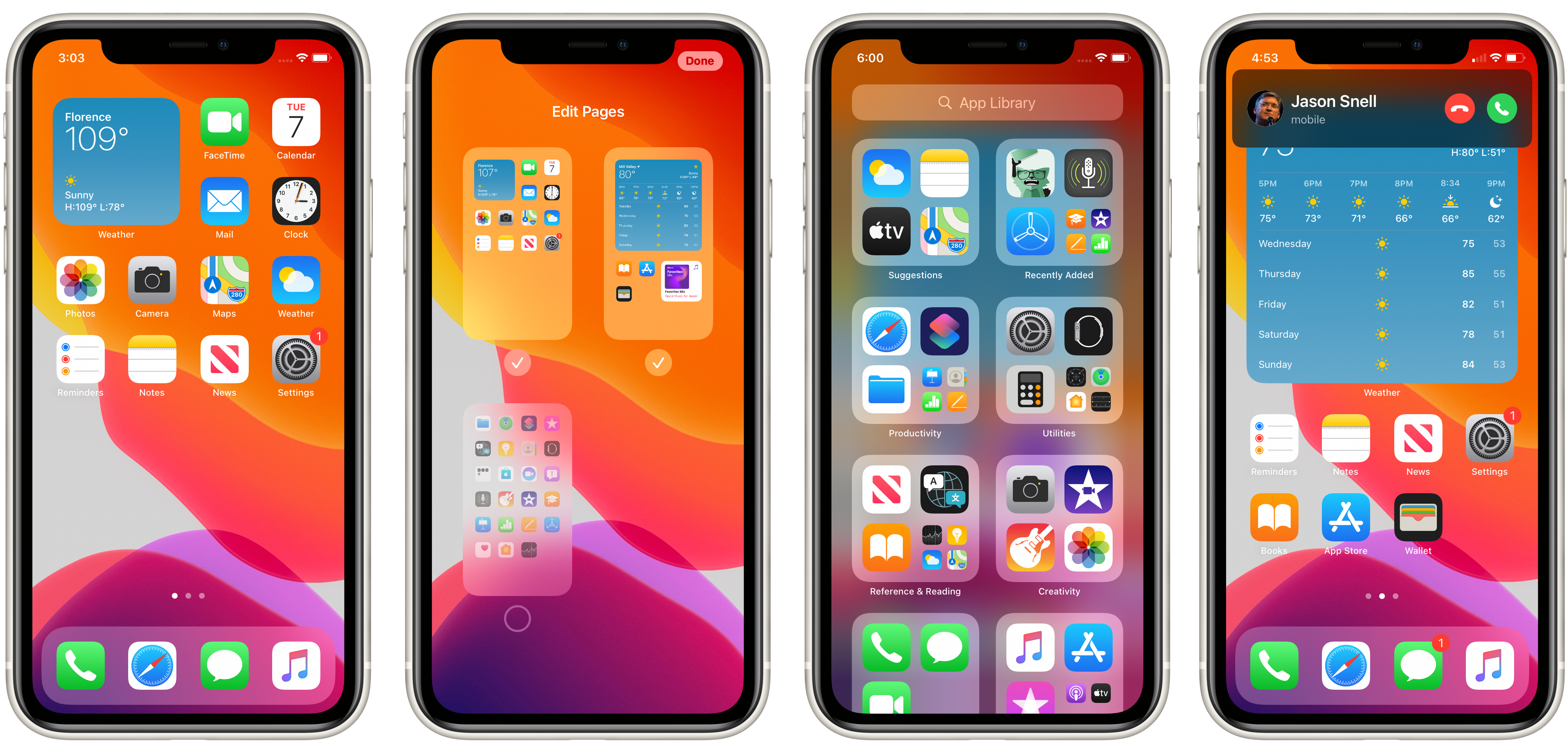
By far the biggest change in iOS 14 is to the home screen, which has largely followed the same concept since the original iPhone release in 2007. For the first time, Apple is letting you break out of the grid of app icons—and make app icons disappear altogether if you don’t need them in your face.
Apple previously let apps create Widgets that lived off in the Today view, which you could make visible by swiping left to right on the first page of the home screen. While those Widgets are still compatible with iOS 14, Apple’s set them aside and designed an entirely new Widget mechanism for this new operating system, and these Widgets have some interesting new properties. (They’re also gorgeous—it’s like looking at little Apple Watch interfaces.)
For the first time, Widgets can live out on the home screen among your apps.1 The Widgets come in three sizes: small (the size of four app icons — two icons high by two icons wide), medium (a full row, four icons wide by two icons high), and large (four icons wide by four icons high).
Apple, of course, supplies a bunch of Widgets with iOS 14. Even without third-party apps in the mix, there’s a lot there, including a gorgeous set of weather Widgets and ones from Maps, Photos, Music, Podcasts, and more.
If you don’t like the idea of using Widgets to get information (and quick access to more!) out into your home screen, you don’t have to use them. But if you do embrace the Widget lifestyle, you have the opportunity to pretty radically change how you use your home screen. Mixing Widget data with apps, or even using entire pages for Widgets, really changes the feeling of that screen.
Apple has also done a great job in further increasing the information density of the home screen by allowing you to stack Widgets of like sizes. It works a little like making an app folder—you drag a Widget on top of another one and they join into a Widget Stack. Widget Stacks show a single Widget at a time, but if you swipe up or down, you’ll see the next or previous Widget. I’ve added a couple instances of the Weather Widget, set to different locations, into a stack, so I can flip between my local weather and the weather in Arizona where my mother lives, so I can remind myself this summer about just how grateful I am to live in the Bay Area.
You can even opt for a Stack to use Smart Rotate, which will change which item in your Stack is visible based on Siri’s guess about the most important information in all of the Widgets. There’s also a Smart Stack, which selects widgets for you based on the apps you use the most, and it can also be set to Smart Rotate, of course.
I’m really enthusiastic about the potential for Widgets in iOS 14. It’s past time for the home screen to go beyond just being an application launching system—and Apple’s implementation seems like a great way to put more data at our fingertips. (And if you prefer your Widgets out of sight, you can still place Widgets in the Today view to the left of the first page of the home screen.)
Silence in the App Library

Speaking of app launching, there are a couple other features of the iOS 14 home screen that could dramatically change the iPhone experience if you choose to use them. You can now hide pages of your home screen entirely, so if you have pages and pages of apps (or folders of apps) you never use, you don’t need to see them anymore. The apps are still there—in fact, the pages are still there, they’re just hidden from your view. You can bring them back anytime.
Even though those app pages aren’t there, you can still launch those apps, either via search (swipe down on any home screen page to bring up the search interface, which has been expanded with data from inside more apps) or swipe all the way past the last visible page to see the new App Library page. The App Library is a collection of ways to browse or find apps, from a search box to some Siri suggestions to a bunch of collections of other apps.
I like the idea of the App Library, but it does feel a bit redundant. Its top two features, the search box and Siri Suggestions, are also available by swiping down and getting to that Search screen. Yes, the two screens are different—the swipe down brings up the keyboard so you can quickly type a search query (and it searches everything, not just apps), while in App Library you have to tap on the search box to enter text (or just scroll through an excellent alphabetized list of all installed apps)—but they’re not that different.
As much as I like the look of the App Library, I question how much I’ll use it, since I can still swipe down and search for apps from the Search window. It feels like these two features could stand to be redesigned so that there’s less overlap between them.
Get out of my way

Another feature that’s existed since the original conception of the iPhone is getting brushed away in iOS 14: interfaces that completely take over the screen when you don’t want or need them to. The obvious example of this is the Phone app, which covers everything you’re doing when you make a call—or when someone calls you! The idea of an app completely taking over your screen when someone else does something without your consent else seems bananas, right? And yet the legacy of the iPhone as a telephone has meant that the phone interface has gotten special override powers for ages.
No more, though! In iOS 14, when your phone rings you get a sort of mega-notification that slides in from the top of the screen.
Similarly, Siri queries no longer take over your screen. When you trigger Siri, a floating icon appears at the bottom of the screen. Answers are displayed in a floating window that you can dismiss. It’s so much better.
A couple of features from the iPad are now making their way to the iPhone in iOS 14, too. Picture in picture, which lets you keep playing video while in other apps, is now supported on the iPhone—and it’s about time. And you can now minimize a FaceTime call and look at another app without the person you’re talking to seeing a “call suspended” screen. I use both of these features all the time on my iPad. Given how iPhone screens are large and getting larger all the time, these big-screen features should be welcome additions on the iPhone screen, too.
App improvements
As always, iOS updates are also an opportunity for Apple to update the stock apps that ride along with the operating system. And iOS 14 has a large number of upgrades on that front.
Messages gets more conversant

I am a member of many group conversations in Messages, and many of them feel unmanageable. Or it might be more accurate to say, I feel powerless to manage them because the conversation tools in Messages pale in comparison to what I’m provided in other messaging apps I use.
Apple seems aware of the issue, because that’s where most Messages improvements are concentrated. You can now pin conversations to the top of the screen, so you can keep your BFFs closer, and can attach a unique icon to a conversation.
You can now mention people (think of at-mentions on Twitter, Slack, or similar services)—and you can set your notification settings to ping you only when you’re mentioned. Previously, I found myself stuck between getting notified on every single post from a group chat, which is something I wouldn’t wish on my worst enemy, or never getting notified at all and missing important stuff. With this new approach—as long as your co-conspirators are on iOS 14 and use the feature—you can suppress most notifications from the chat, but they can get your attention if you’re needed. I like it.
You can also now reply directly to specific messages in a chat, creating a reply chain. (To reply, just tap and hold on a message you’d like to reply to, and then choose Reply from the pop-up menu.) This is a feature that can be effective in adding context to conversations and allow multiple conversations to happen simultaneously, all of which is good. But it really will rely on everyone getting on the latest versions of iOS, iPadOS, and macOS in order for it to work clearly. People not on the new versions won’t see the reply context, but will just see a stand-alone message. Still, it’s a good addition.
There’s more work for Apple to do on Messages, of course. A few years using Slack heavily have convinced me that while Apple’s Tapback feature (which lets you quickly reply to a message with a symbol) is great, it’s too limited. I want to be able to use Tapback with any emoji, and for the Tapback interface to be populated with my favorite or most recent emojis. But instead, I’m limited to the same old six gray tapback images. Maybe next year.
Maps goes green

Apple Maps is getting an upgrade across Apple’s platforms later this year, but I suspect iOS is where we use Maps most frequently. This year Apple is focusing on some greener features, looking beyond the car to provide more detailed cycling directions, which include not only different routing but climbing data and the ability to avoid hills and busy roads.
This is a great addition, though it’s a shame that it’s only rolling out in a small collection of cities to start. I’m sure Apple will be cranking away to add this functionality everywhere.
Apple is also adding electric vehicle routing to Maps. While EV’s drive on the same roads as other cars, they have some different needs in terms of range planning and charging. Maps in iOS 14 will build in charging stops along your route, which sounds great—but for it all to work, you’ll need to be using a “supported vehicle.” I’m unclear whether this means Apple will require car apps to be updated to share information on charging and battery status with Maps, or if this is using some direct communication with cars, but as the owner of an older EV I’m assuming this feature won’t be available to me, which is kind of a bummer2.
One of my very favorite new features of Maps is Refine Location, which uses machine learning and your phone’s camera to pinpoint your location in clogged urban areas where GPS signals become unreliable. (I once stood still in the middle of San Francisco and watched my Maps dot glide unpredictably around about a five-block radius.) Refine Location works by looking at the buildings across the street from you and matching them to Apple’s database of street photos until it figures out where you are. That’s both brilliant and bananas, but I love it.
And many, many more

I can’t go into all the app improvements in great detail, but there are many more. A new Translate app lets you quickly translate either with writing or typing, promising an easier experience when you’re trying to express yourself who doesn’t understand you. And it supports offline translation, in case you’re in a far-off country without a data plan. (I’m still wishing for a Word Lens-style feature where I can point my camera at a label in a grocery store and have it translated for me on the fly, and the ability to auto-translate Messages conversations. Maybe next year.)
Siri and Search have both been bosted with support for new data types and deeper searches. It seems like the Search field has been upgraded with extra Siri integration, so you can just type general queries that you might previously have spoken out loud.
The Camera app has been upgraded to reduce the time it takes to take your first shot, as well as the time between successive shots. Night mode has also been upgraded with more feedback from the device’s gyroscope to keep your aim steady. And the Photos app has added some improved filtering effects and support for captions (previously available only on macOS).
There’s a lot more. Around every corner as I explored the beta, I found more tweaks to apps I use a lot, like Weather (which has added Dark Sky-style precipitation charts) and Reminders (you can assign reminders to people sharing your list).
Wait till next year
In addition to all the features that you’ll get when you update to iOS 14—whether it’s this summer or when the final version is released in the fall—Apple is also laying the groundwork for some features that might change the world… eventually.
A new Car Key feature will let you unlock future cars with your phone. The new App Clips feature promises a future where you’ll be able to tap or scan a code and instantly load a miniature app to order food or pay for parking. And the new Find My Network feature extends the ability of the Find My app, previously limited to your Apple devices, to find other objects made by other companies—once they make those objects to match Apple’s specifications.
All cool stuff, but nothing you’ll probably encounter if you choose to install the Public Beta. Check back in 2021 or 2022.
Obligatory beta warning
iOS 14 is an exciting new chapter in the life of the iPhone, and one that will be immediately noticeable upon upgrading, thanks to all the improvements to the home screen. I don’t blame you for wanting to jump in on the Public Beta.
It’s okay. If Apple didn’t want you to use this software, they wouldn’t offer it. But be sure you know what you’re getting into. There will be bugs. Your iPhone might be a lot less reliable. It might eat through its battery faster. Some of your favorite App Store apps might not work right, and that’s not the fault of their developers.
And if you do choose to walk the beta path, please note the existence of the Feedback Assistant app. If you see something weird or broken, send that feedback to Apple. It’s an important part of the beta process, and an annoyance you notice today might be one Apple can fix before the final version of iOS 14 ships this fall.
If you appreciate articles like this one, support us by becoming a Six Colors subscriber. Subscribers get access to an exclusive podcast, members-only stories, and a special community.