It’s not quite right to say that for the first five years of its life, the iPad was an iPhone with a really big screen meant to be a lean-back consumption device. After all, the very first iPad shipped with a productivity accessory in the form of the Keyboard Dock.
But ten years ago, Apple got serious. It shipped the very first iPad Pro, and began a decade-long conversation about whether the iPad could be used for work and even whether or not it was a computer.
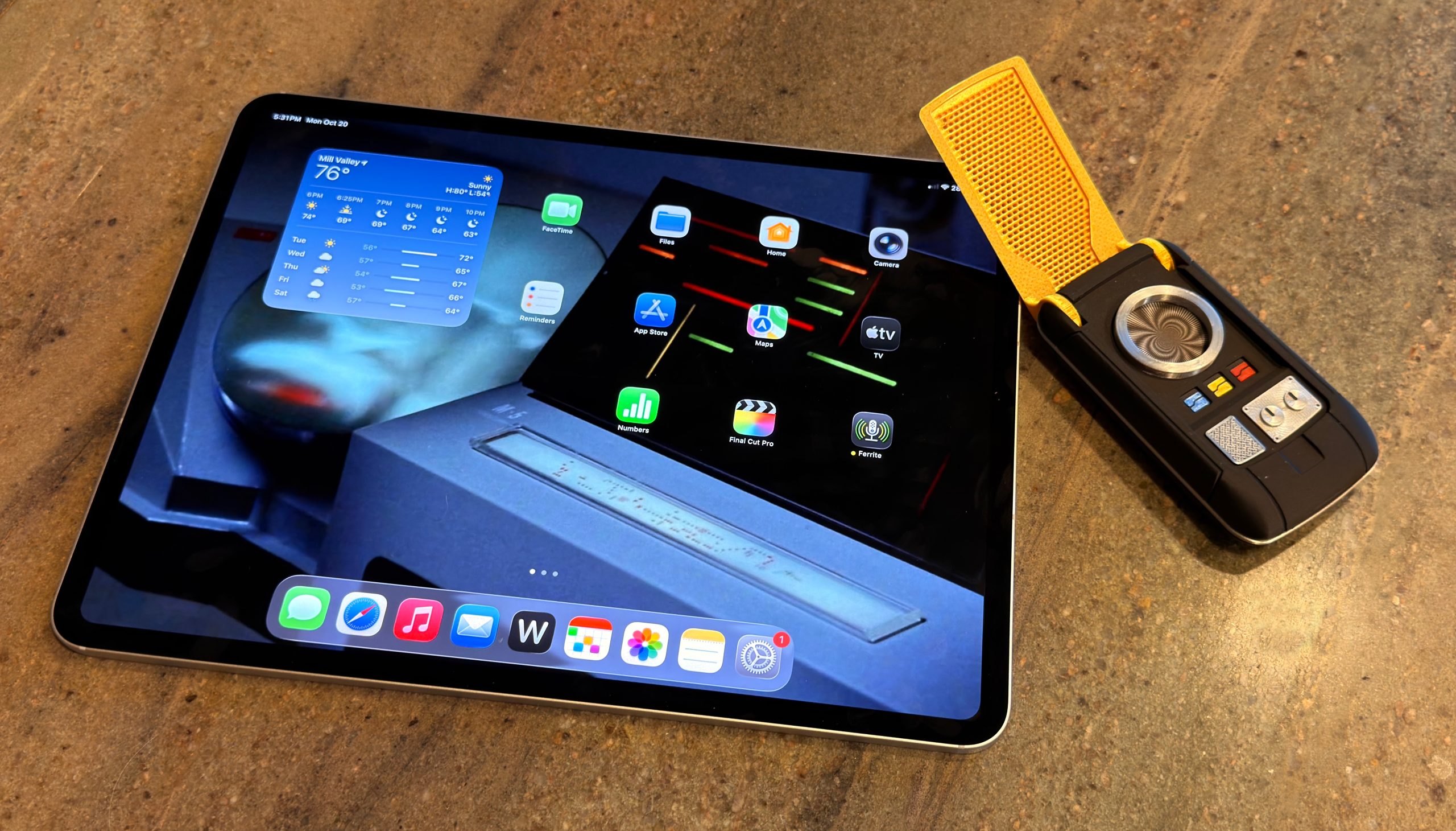
Today, the M5 iPad Pro and iPadOS 26 have settled a lot of old scores. But it’s been a long, strange journey from “Hey Siri” day in San Francisco to now.
One of the things that I think about from time to time is Apple’s collection of apps. Some are the crown jewels, like Apple’s pro apps, and others help an everyday consumer to tackle their iLife. All are pretty starved for attention and resources, outside of infrequent updates aligned with showing off the native power of Apple Silicon, Apple Intelligence, or demos of platform integration that never quite get all the way there.
Three things really brought this up to the surface for me recently: The neglect of Clips and iMovie, the radio silence regarding Pixelmator/Photomator, and Final Cut Pro being trotted out for demos but not shipping appropriate updates.
Voice commands we use regularly, whether robotic pets benefit society, recent tech features that surprised us, and our e-reader and page turner preferences.
This week’s Apple updates are, to some quarters, boring. Yes, it’s true, there were no real exterior changes this week. Instead, it was just another new Apple-designed processor, with the usual, boring set of speed improvements.
A predictable update schedule means that incremental updates are inevitable. Revolution then evolution is not a bad thing; it’s okay that not every release is exciting or groundbreaking. It’s how technology has worked for decades.
…but some people have short memories. Before the Apple silicon introduction, we all wanted steady, predictable progress in Mac hardware development. We wanted each product in the lineup to be updated regularly and not wither on the vine for years. For the most part, Apple has delivered. Just look at this chart of the progress Apple has made since the M1 on the CPU side of things:
Stephen’s post contains some charts, disappointingly not in some sort of 512 Pixels style where all the “colors” are different Atkinson dithers of gray. Maybe next time.
It reminded me, though, that I have tried to build some charts to help visualize how Apple’s chip progress is going. I wrote about this for the A series of chips back in September. Here are the requisite M series charts:
It’s nearly impossible to isolate the rise in the speed of Apple’s two different kinds of CPU cores, and over time, it tweaks one or the other and changes the mix of both, but obviously each individual core gets faster and the gestalt over the entire processor, whether it’s got eight or ten CPU cores, is a more dramatic move upward.
In the second chart, I’ve divided the Geekbench GPU score by the total number of GPU cores on the system to create an isolated view of per-core GPU performance. As with last month’s A19 Pro release, it’s clear that this generation offers a “standard” bump for the CPU, but a more impressive one for the GPU.
So the very, very broad overview of what the M5 brings is a lot like the overview of the A19: In this generation, the CPU cores got a bit better, and the GPU cores took a much larger jump.
Assuming that M5 Pro and Max chips are in the offing in 2026, loaded with GPU cores, I anticipate some pretty explosive GPU test results. But so far, through five chip generations, Apple has proved to be a bit shifty from generation to generation. It would be wild if it just never released higher-end M chips, wouldn’t it? But not impossible.
Jason has spent a little while with the new M5 iPad Pro, M5 MacBook Pro, and M5 Vision Pro (with accessories!) and we review them all. Also, Apple’s deal with F1 crosses the finish line.
The new 14-inch M5 MacBook Pro is very much like its M4 predecessor, in that it’s got all the advantages of being a MacBook Pro, but by using Apple’s lowest-end M5 chip, it’s also the most affordable model.
Except it’s not the lowest-end M5 chip, at least not so far. It’s the only one. Apple has released a single M5 chip and placed it in three products: this laptop, an iPad Pro, and a Vision Pro. We can probably assume that MacBook Pros powered by M5 Pro and M5 Max chips are in the offing, but unlike in the M4 generation, this base-model MacBook Pro is the only Mac on stage at the debut.
On the one hand, no: Apple’s cutting-edge VR computer hasn’t exactly taken the world by storm. It’s a view of the future that, at its current size and price, doesn’t have much of a place in the present.
On the other hand, it turns out that the M2 processor that powered the Vision Pro was underserving some of its advanced hardware. Apple also probably needed to stop making M2 chips, and the M5 is fresh out of the oven. Upgrading the Vision Pro allows the company to keep it around without a major overhaul.
It’s been ten years since Apple released the first iPad Pro. In 2015, there were already people trying to integrate the five-year-old iPad platform into their working lives, but the wisdom of that choice seemed questionable—at least until Apple validated it by adding a true, professional-level model.
Unfortunately, it’s been a decade of rough sledding. Apple would occasionally feint toward embracing the iPad as a productivity device akin to the Mac, but (with certain exceptions) the experience was just too limited and restrictive.
In the past few years, things have changed. Apple has finally brought its pro media apps, Final Cut Pro and Logic Pro, to the iPad. And with iPadOS 26, Apple has delivered numerous improvements that get the iPad far closer than it has ever been to being a device that can get all sorts of different work done, without the need of a traditional computer as a fallback.
iPadOS 26 especially shines on the M4 iPad Pro, a device with a new, ultra-thin design, and bearing one of the best displays Apple has ever made: a tandem OLED screen with high dynamic range and remarkable brightness and color fidelity.
Into this very different world comes the M5 iPad Pro, which inherits that remarkable design and a much more capable operating system. Pretty nice.
When I was in college, a friend told me about working a summer job at one of those art stores that sold extremely average factory-produced oil paintings that were designed to fit people’s decor.1 They probably made most of their money from the markup on frames.
The FileMaker Pro database used to manage sales and inventory was finicky. Once, it crashed on my friend, and her boss was not happy about it. He decided she had done the sequence wrong: “You close a window first, then quit a program!” My friend was livid: that was not how Mac programs work then, nor is it how they work now. The app has to manage its windows so that when you choose File > Quit, it properly handles open windows. Though this was nearly 40 years ago, it remains true.
There was a time when you couldn’t trust an app, though, and in that limited sense, my friend’s boss was right: closing all your windows could be more reliable than quitting, because you got to see the file close in a saved fashion. I recall—as do many of you, I’m sure—saving a file or clicking the red close button in the window and clicking Save, and then getting the watch icon or the spinning rainbow circle of doom. You’d wait a long time, hoping that the hidden situation resolved itself and your danged file saved.
Six Colors reader Jason (not our fearless leader, Jason) wrote in with a question2 about the polar opposite:
I often have to open multiple CSV files in Numbers. When I close those documents, I have to hit Delete every time. I tried quitting the app and see [a] warning… But there’s no option to just close them all and forget about them. Back in the day, there used to be a “close all and don’t save” type option, but I can’t find it. I have my Mac set to close windows when I quit an app.
I’m in the same boat, member Jason! Managing logistics for shipping books and Kickstarter campaigns results in a lot of CSVs that I open in Numbers, and for which I don’t need to retain changes. Unfortunately, Apple has moved away from any option that involves losing data. Is that unfortunate? Only in our particular circumstances.
You can disable an option that appears to be related: System Settings > Desktop & Dock > “Ask to keep changes when closing documents.” But it only sounds like what you want. This option, rather, relates to automatically saving files when you close a document: when disabled, supported apps (including all of Apple’s) save changes without a prompt; when enabled, you’re asked if you want to save. But files that haven’t been saved at all are unaffected: you’re still prompted.
The way out of this situation, which I expect is both niche but also affects a reasonable number of Six Colors readers with particular apps, is an automation program, like Keyboard Maestro or BetterTouchTool.
In Keyboard Maestro, you can set a trigger, like “long press Command-Shift-Option-D” (long press helps avoid a single press closing a document). Then add actions: close the window and click the Delete button.
Keyboard Maestro lets you make a straightforward macro that can, in effect, close a window without saving.
For a number of Numbers or other app windows, you can encompass the above with a While loop, setting it to remain active while there’s a Delete button in the foreground. That could be very, very dangerous, so perhaps only for the strong of heart.
[Got a question for the column? You can email glenn@sixcolors.com or use/glennin our subscriber-only Discord community.]
Apple released new M5-based devices this week as Eddy Cue gives us a wink and a nod about Apple TV. AI continues to do… whatever this is.
Release the presses!
As was widely predicted in the days leading up to the event—like saying “Just watch, Chad’s bringing a box of store-bought cookies to the potluck again.”—Apple announced new hardware this week via press releases.
Apple put brand spanking new M5 chips in the MacBook Pro, iPad Pro and—oh, look!—even the Vision Pro. A chip that may take over your starship is certainly very exciting but these enhanced speeds are a little bumpy. All of these devices are largely the same as their previous iterations, with just some minor non-processor enhancements.
The Vision Pro, for example, comes with a new Dual Knit Band, which sounds like a Scottish folk music group.
“Laddies and jeeeentlewomen, The Stinky Haggis is proud tah prahzent… DUAL KNIT BAND!”…
As widely expected (and teased by none other than Eddy Cue), Apple announced on Friday that it’s zoomed into a five-year deal with Formula 1 to be the exclusive United States broadcaster of the racing circuit. Previously, ESPN had rights to air races in the U.S.
Apple’s coverage is starting-line-to-checkered-flag, including everything from practice to the Grands Prix and will be available to all Apple TV1 subscribers. Practices and some races will also be available for free to all in the app.
And Apple being Apple, this deal goes well beyond simply showing the races and instead across all of the company’s properties. There will be live updates in the Apple Sports app, of course, including Live Activities and “a designated widget” for the Home Screen, but also integrations in Apple News, Apple Maps, Apple Music, and even Apple Fitness+.2 (What of Apple Invites? Will you be able to quickly organize your watch parties?!)
As for F1 TV Premium, the circuit’s own subscription service, it’s not going anywhere—at least for the moment. Instead, it’ll be available only via a subscription to Apple TV. If you’ve already got such a subscription, you get F1 TV Premium as part of the package. (It’s not immediately clear if that means the races will be in the app, or you’ll simply log in to the F1 TV Premium app with your Apple account.)
More details are still to come, according to Apple, including more on how the races will be produced and all the integration details.
Though I’m not an F1 aficionado, I do find myself wondering about exactly how far Apple will go here. Five years is a goodly amount of time, and it’s possible that what this product looks like in year one of that deal is very different from what it looks like in year five. Will Apple spend the time putting its own stamp on the entire production, as it has with other sporting forays like Friday Night Baseball and Major League Soccer? This deal is certainly closer to the latter, if not quite the “wall-to-wall” terms that the company aspires to—after all, these rights are only for the U.S., not worldwide.
By which I assume they mean the vibrant new identity of Apple TV+. ↩
[Dan Moren is the East Coast Bureau Chief of Six Colors, as well as an author, podcaster, and two-time Jeopardy! champion. You can find him on Mastodon at @dmoren@zeppelin.flights or reach him by email at dan@sixcolors.com. His next novel, the sci-fi adventure Eternity's Tomb, will be released in November 2026.]
Perhaps you’ve heard the tempest in a wall wart over Apple not including a charger in the MacBook Pro in Europe. While some have been quick to blame this on EU regulation, it’s a little more complex than that. Nick Heer does an admirable job unpacking this whole brouhaha:
First of all, the dollar is not the currency in any of these countries. Second, the charger in European countries is €65, which is more like $76 right now. Third, Apple is allowed to bundle an A.C. adapter, it just needs to offer an option to not include it. Fourth, and most important, is that the new MacBook Pro is less expensive in nearly every region in which the A.C. adapter is now a configure-to-order option — even after adding the adapter.
There’s plenty of cynicism to go around here: some want to point fingers at Apple for cheaping out. Others want to blame Europe for silly and onerous rules. As it turns out, neither of those is really true.
Nick’s larger point is that it’s worthwhile—and, more importantly, incumbent upon—those of us who write about these things to take the time to get all the details.
Hulu goes worldwide, Apple drops the plus and explores a relationship with Formula 1, the Lakers get immersive, the NBA is everywhere all at once, and our TV Picks.
The New England Aquarium received a $9 million philanthropic donation – the largest private gift in its 56-year history – to expand a lab that helps companies be more “environmentally responsible,” aquarium officials announced Wednesday.
The gift was provided by Phil Schiller, an Apple executive, and his wife, Kim Gassett-Schiller – both of whom are prominent philanthropists with standing gifts out to several Massachusetts institutions, including Schiller’s alma mater, Boston College, and Salem State University, where Kim Gassett-Schiller graduated in 1983.
The New England Aquarium is a time-honored institution in the Boston area; I’ve been visiting for as long as I can remember, and I just took my kid there at the end of the summer.1 It’s really a marvelous place.
As to why Phil and his wife chose the aquarium, apparently he worked there as a teen in the 1970s.
“My time working and volunteering at the New England Aquarium as a high school student reinforced a love for the ocean that has stayed with me for decades,” Schiller said in the release.
Now the only remaining important question is whether they will name a penguin “Phil.”
Apple’s M5 updates and whether we use AI locally, media that’s brought us joy recently, whether the Vision Pro update changes our minds, and the Apple services and products we would rename.
Apple SVP Eddy Cue was the guest on this week’s episode of The Town (Apple Podcasts, Overcast) with Matt Belloni. The whole interview, which is focused on Apple’s TV and film ambitions, is worth your time, but I want to focus on what Cue responded when Belloni1 asked him about sports rights:
MLS is closer to what we wanted to do, which is we’d like to own a sport end to end, so that we can offer customers what we do today, which is you don’t have to worry about blackouts, you don’t worry about how to watch, we can do picture-in-picture, we can do all kinds of things that every sports fan wants. I know what I want when I’m watching all these other sports.
Taking little rights here and there across all these different sports just doesn’t deliver that. And so that’s not an area that we’ve been interested in…. I can tell you, we are not, we have not been in the bidding process to take chunks of sports.
Not only does this make me think that Apple’s F1 rights will include everything currently provided by both ESPN and the F1 TV streaming product, but it makes me think that this is a testing ground for Apple to perfect its coverage of F1 in the United States and then begin buying up rights to the sport in additional countries around the world, with the possibility that eventually it’ll own F1 everywhere.
That’s an enormous long-term goal for an extremely popular international sport, but Apple certainly has the money and the ambition to try to make it happen.