

By Jason Snell
June 26, 2018 10:15 AM PT
macOS Mojave: Back to the Mac
Note: This story has not been updated for several years.
For a few years now, it’s seemed that any forward movement macOS might make was coming in lockstep with Apple’s other platforms, most notably iOS. What was new to the Mac was generally something that was also new to iOS, or was previously available on iOS.
With macOS Mojave, available today to the general public as a part of a public beta, the story is different. macOS Mojave feels like a macOS update that’s truly about the Mac, extending features that are at the core of the Mac’s identity. At the same time, macOS Mojave represents the end of a long era (of stability or, less charitably, stagnation) and the beginning of a period that could completely redefine what it means to use a Mac.
Is macOS Mojave the latest chapter of an ongoing story, the beginning of a new one, or the end of an old one? It feels very much like the answer is yes and yes and yes.
A new look
In 2014’s Yosemite release, Apple added the ability to turn the Mac’s menu bar black, a perplexingly limited design flourish that didn’t extend beyond the menu bar and Dock. Mojave finally makes good on the promise of a true dark theme for macOS, one that can (optionally) change your Mac’s windows to be predominantly dark with light text, rather than light with dark text.

Why go dark? For some people the answer will be novelty, or the sheer coolness that comes from going from an Imperial Stormtrooper color scheme to one befitting Darth Vader. But dark themes have long been popular in software that caters to content-generation professionals, who prefer to have their images or video not be swamped by a lot of bright interface chrome. (Apple’s pro apps, Final Cut and Logic, both received dark-interface updates in the past few years.) Even if you’re not a pro, you may appreciate an interface theme that makes your photos and documents appear to pop out of the screen more, because they’re framed by darkness rather than sitting on a bright white background.
Your favorite apps won’t automatically take on the dark appearance, however: app developers will need to update their apps to support dark mode. Of course, Apple has already updated its own apps to support the new dark appearance, though even there you may be surprised at some of the quirks you’ll find. The fact is, a lot of app design (and content design on the Internet) assumes a standard black-on-white interface, and those assumptions can be laid bare when you enter Mojave’s dark mode. Apple Mail offers a preference to display message content in dark mode (it’s off by default), but if you’re viewing a richly-formatted HTML email message, you’ll see it rendered in its usual white-background style.

Once you’re used to dark mode, content that doesn’t follow that sensibility sticks out even more. It feels like it will take a while for the dark interface to feel truly, consistently dark—not just in terms of apps being updated and redesigned to support the new appearance, but also in terms of how web design is impacted. There will need to be a method for web designers to create dark themes for their sites (not just for Mojave, but for the dark theme in Windows 10, and perhaps a future version of iOS as well).
The Dark Mode design itself isn’t just an inverted version of the light mode; Apple has made a bunch of subtle design changes, including a different shadow, a very subtle light ring around the dark window to increase the definition of window edges, and a subtle background color that picks up an average color from the items that are behind it.
Speaking of features that seemed ripe for elaboration but never got it, since the early days of Mac OS X there’s been the concept of an appearance color, but your only options were Blue and Graphite. Blue was the standard Mac OS X interface; Graphite removed colors from places like the “stoplight” icons in the title bar of windows and emphasized shades of gray. It always seemed like one day Apple would expand beyond the single color option, but it never happened.

Mojave, though, puts a spin on this idea by introducing the concept of an accent color, so that a bunch of interface features (the buttons at the end of pop-up menus, for example) can be colored something other than blue—you’ve now got a choice of eight different colors. The concept of a highlight color (the color that shows when you select text or pull down a menu item) still exists, though in the public beta it’s unclear if it’s Apple’s intention for you to be able to select different colors for highlight and accent, or if the concept of a highlight color is going to fade away.
One of the delights of being a Mac user is being able to personalize your computer interface so it’s undeniably yours. Adding two different appearance types and a selection of accent colors is a nod from Apple to this fact, and while it’s long overdue, I’m very glad that it’s in Mojave. (Though might I suggest a feature that would automatically toggle dark mode on at sunset, or when a Mac’s light sensor detects that it’s dark? I’m not sure I want to use dark mode all the time, but it would really work well when I’m working late into the night.)
A view from the Gallery
What makes a Mac a Mac? At the center of the Mac experience is interacting with the filesystem via the Finder. (Compare this to iOS, where app launching is at the center, with file access consigned to the Files app.) Yet it’s been a while since Apple lavished any attention on improving the Finder experience. But in Mojave, the Finder gets the attention it deserves, with a new view option, upgrades to Quick Look, and several improvements to the Finder’s most important piece of real estate: the Desktop.
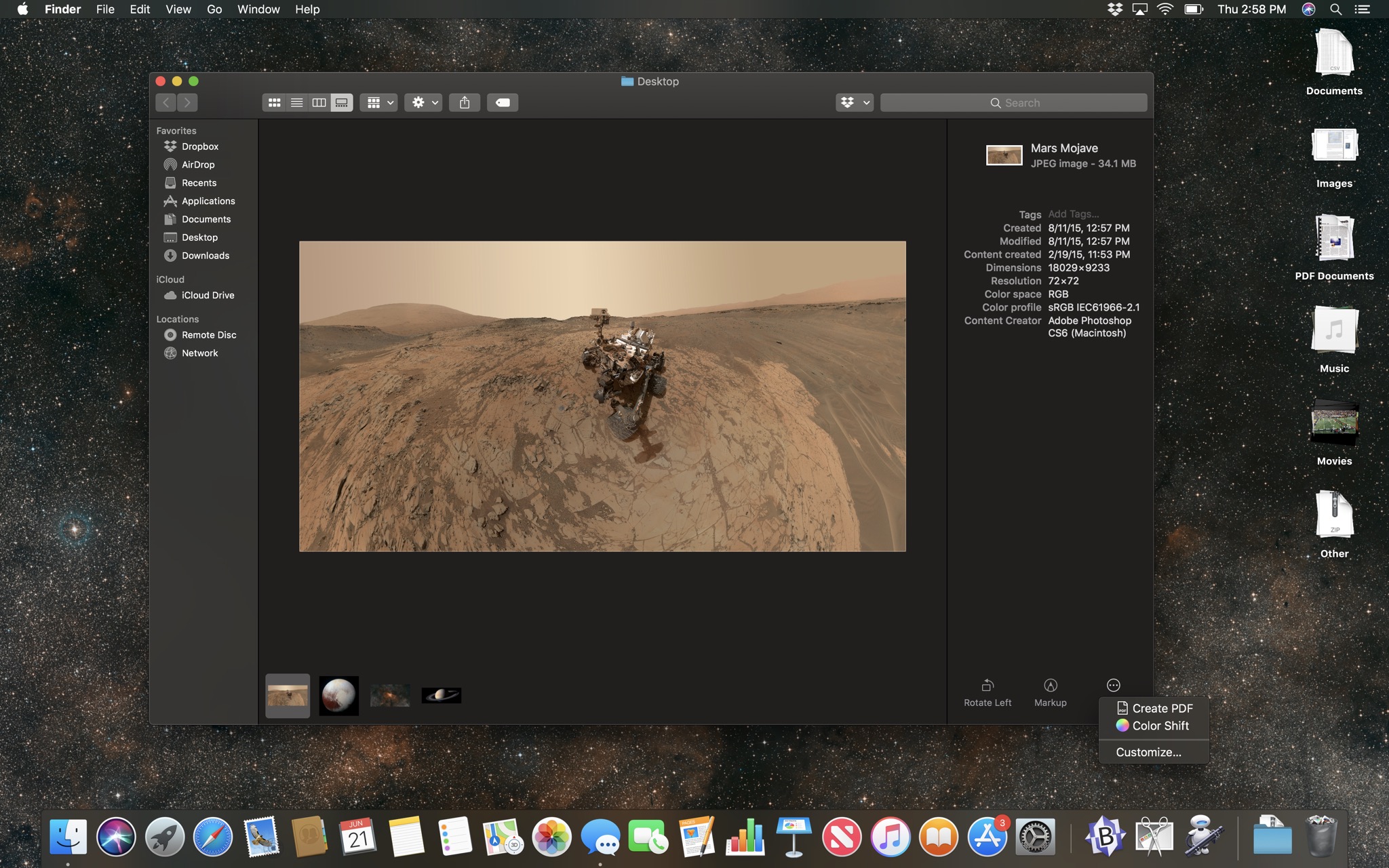
Cover Flow view, a Steve Jobs favorite that displayed previews of files above a list view, is no more in Mojave. (Did you know it was still there?) It’s been replaced with the new Gallery view, which displays a very large preview in most of a Finder window, with a strip along the bottom showing thumbnail previews of every item in the folder.

To the right is the Preview pane, which has existed for a while now, but it’s been upgraded to display a wider selection of metadata associated with the selected item—both general file information (date created and modified) and context-specific content information (for images, it shows dimensions and color profile). A new option in the File menu, Show Preview Options, lets you set specifically what metadata gets displayed in that pane.
I have a hard time imagining how I’d use Gallery view broadly, but it’s perfect for folders of images or PDFs or videos or other media types where the content is more important to browsing than the filename, creation date, and size.
There’s also a surprising twist: At the bottom of the Gallery view, there are a set of Quick Action buttons that let you modify the item you’re looking at, without opening any apps. Rotate or mark up an image, trim an audio or video file, or act upon just about any file type using an automation that you built yourself. (More on that in a little bit.)
I have to admit that it gives me pause to imagine the Finder as a place where you modify the content of documents, but it just makes sense. Why open an app to rotate an image file or quickly trim a video?
The ability to modify files isn’t limited to buttons in Gallery view, either. If you keep the Preview pane visible in list or icon view, you’ll see a preview of the item and have access to the same Quick Actions. And some of these commands also appear in Quick Look, where they appear as buttons at the top of Quick Look windows. So even if you’re viewing a folder in Icon view without the Preview pane selected, you can press the spacebar to view an image file and then rotate it or mark it up, right from Quick Look.

A pile of Desktop features
Here are two facts about me: I’m the kind of person who puts a lot of files on his Mac’s Desktop, and in the real world I am a somewhat messy person who tends to make stacks or piles of papers, books, and the like, rather than actually file or shelve them. It never occurred to me that you could combine my digital and analog organizational tendencies, but Apple has done it in Mojave by applying some basic piling techniques to our messy Desktops.

This comes in the form of a new feature called Desktop Stacks, which borrows the Stack concept from the Dock and applies it to the files on the Desktop. Files can be grouped by kind (Documents, Images, PDFs, Music, Movies, Other), date (last opened, added, modified, or created), or tags. Folders are left untouched.
Even the messiest desktop will get a lot cleaner when all the files get sucked into one of these Stacks, which is the size of a single file icon. If you hover the cursor over a Stack and swipe left and right on the trackpad, the Finder will step through the contents of the Stack one at a time, with the filename and preview icon appearing in place of the Stack name and icon.

If you click on a Stack, it expands, with the contents of the stack appearing below the stack icon itself. I found this approach a little confusing—I think I’d prefer all the items to appear in a popover, as they appear when you click on a Stack in the Dock, or as a folder. Instead, the icons on your Desktop just increase temporarily, with the new icons pushing the old ones farther down or to the left.
In any event, once a file is visible, you can double-click on it, select it and drag it elsewhere, view it with Quick Look, or basically everything else you expect. (In the Public Beta there were some quirks I noticed when trying to interact with a file that I exposed by scrolling over the Stack. Sometimes when I moved the cursor away from the top of the stack—to click an item in the Quick Look window for the file, for example—the stack went back to its generic state and the preview of the item vanished. I’m going to call this a bug and assume that Apple will get it worked out before the final version of Mojave gets out the door this fall.)
I actually keep my desktop organized enough that I can’t envision using Desktop Stacks as it’s currently designed. The feature would probably benefit from added flexibility in how to group Stacks; for example, I often keep a bunch of Zip archives on my desktop, but they just get poured into a Stack called Other with various other miscellaneous file types. Using tags would be a workaround, which I might consider if things get unruly—but the thought occurs to me that this is a feature primarily for people who haven’t organized their Desktop and aren’t going to start. Desktop Stacks probably aren’t going to transform most Mac users’ personal filing systems, but they might make it easier to find a file on the Desktop, and that’s the point.
If you’re a messy person whose files litter the Desktop, you might not even realize this, but there’s generally a pretty picture back there. Apple has complicated the simple concept of a Desktop picture in Mojave by adding what it’s calling a Dynamic Desktop, an image that shifts over time (and changes immediately when you switch into Dark Mode). The Mojave Public Beta comes with a single Dynamic Desktop image, of a sand dune in the Mojave desert with different creeping shadows throughout the day. (What happens at night when I’m in Dark Mode? Is it constrained to a smaller set of images? If I work late into the night in Dark Mode, does the sun begin to rise? These are the questions that keep macOS reviewers awake at night.)
Dynamic Desktop pictures are not a new phenomenon—people have been making apps that do this for ages, perhaps most notably Live Desktop. But now it’s a fundamental part of macOS, which is interesting. Apparently the Mojave Dynamic Desktop is made up of 16 different still images packaged together into a HEIC file, which is a container file for the HEIF image format Apple adopted last year across macOS and iOS. Within a few days of Mojave being announced, people had reverse-engineered the format; I would assume that many non-Apple Dynamic Desktop images will be available by the time Mojave ships.
Quick Actions get automated
When Sal Soghoian left Apple, I assumed that we’d never again see new features that extend support for user automation in macOS. (Meanwhile, iOS 12 has Siri Shortcuts, which are extremely exciting.) In any event, I was completely wrong: macOS Mojave increases the visibility of the user automation feature I use every single day on my Mac, putting it front and center in several different parts of the Finder.
That feature used to be called Services, and it let you build an Automator action that can run in any app, but most notably the Finder. Services can be run from contextual menus in the toolbar of Finder windows, via a control-click, or even an assignable keyboard shortcut. Those actions can do just about anything, including run Automator commands, AppleScript scripts, shell scripts, or any combination thereof. I use them to build simple Finder commands that perform complex actions on the files or folders I’ve got selected. They have saved me vast amounts of time.

In macOS Mojave, Services plug-ins in Automator have been renamed as Quick Action Workflows, and their visibility has increased. Quick Action Workflows appear in the Preview pane in the Finder, alongside other commands like Apple’s own Rotate Image and Markup commands. Automator has been updated so you can assign an icon to each Quick Action Workflow so that it’s easier to differentiate them from one another. (You can choose from 43 icons provided by Apple, or add your own.)
Quick Action Workflows can also appear in the Touch Bar, courtesy of a new Workflow icon that you can add to the Touch Bar’s Control Strip. Tap on that icon and the Touch Bar will display the icon and name of your Quick Action Workflows. (Ones you can’t currently use will be grayed out.) You can customize which items appear in the Touch Bar list from a new Touch Bar section in the Extensions pane of System Preferences.

For those of us who use Services today, this is a nice addition that will let us surface them more visibly in a few different places in the Mac interface. I have to admit that I’m a little hopeful that it might actually increase the visibility of the feature itself, because it’s incredibly powerful and has the potential to save a lot of people an awful lot of time.
Moving iOS apps to the Mac
Viewed on its face, the addition of four new Apple apps to macOS is welcome. I’m not a big fan of Stocks or Voice Memos, but they’re available on iPhone and it makes sense to spread them across all of Apple’s platforms (including iPad) and sync them with iCloud. News is an strategic app for Apple, and it’s been missed on the Mac the last couple of years, so it’s good to see it arrive.

Most of all, the Home app—and accompanying Siri support for HomeKit—is a big winner for those of us who use Macs in a home filled with HomeKit devices. I can’t tell you how many times I’ve had to go into another room to find an iOS device in order to turn a HomeKit device on or off… when I had my Mac sitting right in front of me. It’s great to be able to adjust lights and thermostats and all sorts of other smart-home stuff from right on my Mac.
Delve a little deeper, though, and you’ll start to notice that these apps don’t feel entirely like native Mac apps. The Home app displays the iOS date picker, which is… not really an interface designed for a trackpad or mouse. Notification settings in the News app happen in the content sidebar, rather than in a preferences window. The preferences window in News features an Acknowledgements tab full of copyright text that should probably be in the app’s About box. Every app is a single window.
This is, of course, because these four apps aren’t just similar to their iOS equivalents… they are their iOS equivalents, translated into Mac apps via a method that will be available to non-Apple software developers next year. And while some of the particular quirks of these apps may be ironed out by the end of the summer, the reality remains: Apps born of an entirely different Apple operating system are coming to the Mac.

This move has major ramifications for the future of Mac software. All iOS apps are developed on macOS, but even veteran iOS developers can find it a difficult transition to writing macOS software. Using Apple’s as-yet-unnamed approach, it should be much easier to bring iOS apps over to enrich the Mac. I like that Apple is testing this approach itself before handing it out to everyone else, because there’s clearly a lot more work to be done—not just in fixing bugs before Mojave ships this fall, but in the next year to make sure that iOS apps translated to the Mac behave properly and work well.
Looking at the four apps making their way across this fall, it’s hard to tell if Apple is foreshadowing a broad rethink about how Mac apps should be designed—single-window interfaces with control panes on the left—or if the similarities in design are more a side effect of the limitations of the current UIKit-on-macOS process.
We’ve got a year to ponder what the future of the Mac might be, whether bringing apps designed for touchscreens augurs the arrival of touchscreens on the Mac, if iOS developers will bother to put the work in to bring their apps to macOS, and any number of other ruminations. In the meantime, here’s hoping that Apple irons out some of the quirks in these four apps and then keeps improving the method by which they were translated, so that next year’s apps are rock solid.
And the Rest
As with any operating-system release, there’s always a grab bag of other features, little improvements here and there that aren’t necessarily the most eye-catching, banner features, but still have an impact. Mojave is no different.
Screenshots. Apple has built a new screenshots interface behind the new shortcut Command-Shift-5. (Command-Shift-3 and -4 still work as always.) When you choose Command-Shift-5, a floating palette appears with options to capture the entire screen, just a window, or just a portion of a window—all features you could already perform, but only if you knew the right combination of shortcuts. Providing visible options is a much friendlier experience. There are also options to start a screen recording, a feature that previously was integrated into QuickTime Player but now is more sensibly included here. Finally, there’s an Options menu that lets you choose where to save the resulting screen shots, and if you want to use a timer to delay when the screen shot gets taken (a feature previously available in the venerable Grab app).

When you take a screen shot, by default you will see an iOS-style floating thumbnail in the lower right corner of the screen, which you can click to open Markup and quickly edit or discard the image. If you don’t like this intrusion—for instance, when you’re taking several screen shots in a sequence and don’t want the floater to appear in any of them—you can turn the feature off from the Options menu.
Continuity Camera. Once you accept the premise that we have a constellation of devices around us all the time, software can be built to take advantage of that fact. Using the Apple Watch as a biometric authenticator to unlock Macs is a good example. With Mojave, the portable, high-quality camera in our iPhones becomes a feature of the Mac. Apple has updated several apps, including Notes, Mail, and the iWork apps, so they can directly insert images gathered by an iPhone on demand. For example, in Notes you can choose Take Photo or Scan Documents from an “Insert from iPhone” item in the File menu. Your nearby iPhone will spring into action, letting you quickly capture an image or document, which is transmitted to your Mac and inserted right where you asked for it.
Multi-person FaceTime. At long last, you can now use FaceTime to contact more than one other person. I always dreamed that Apple would up the limit to 3 or 5, but instead it’s gone all the way to 32! I haven’t had time to test it with a large group, but this makes FaceTime a viable group chat app for groups that have standardized on Apple platforms. I imagine that this fall, my daughter will be using it to chat with all of her friends. And probably some of your favorite podcasts will at least experiment with it—unless someone’s running Windows or Android.
Mac App Store. The Mac App Store has been around for more than seven years now, and it has never proven to be the powerful force in driving Mac software sales that the iOS App Store has been for iPhone and iPad software. This year Apple’s taking several steps to improve the relevance of the Mac App Store, with a new App Store app that’s been redesigned to feel more like its iOS counterpart, complete with better graphics and ongoing editorial content about Mac apps, and new categories focused on key areas of the Mac, including apps tailored for creative professionals.

With Mojave, Apple is also broadening the privileges Mac App Store apps can ask for, allowing more full-featured apps to get into the store, including Panic’s Transmit and Bare Bones’s BBEdit. And next year, of course, we’ll start to see apps currently available only on iOS appear on the Mac.
This really feels like a new start for the Mac App Store, but it will take time for developers to decide if getting in the store is worth the effort. From a user’s perspective, the Mac App Store app looks quite good, and if the regular features written by Apple’s in-house editorial group can maintain the high quality generated the past nine months in the iOS App Store, it will be worth it to launch the App Store app on the Mac a few times a week just to see what’s going on. It’s a start.
Security improvements. Taking some cues from iOS, Mojave limits the access software has to your Mac’s microphone and camera. Each app that wants to use those devices must ask and receive permission from the user before doing so. Many apps will also need to ask before accessing application data (such as mailbox files for Mail), or running automation routines.
Safari tweaks. Every macOS release brings improvements to Safari, and Mojave doesn’t disappoint. Safari will now automatically generate and insert strong passwords whenever you’re signing up for a new account on a website. (You can also audit your passwords to find reused ones and change them via the Passwords section in Safari’s preferences window.) When you receive a text message with a code meant to be entered in as a part of a multi-step authentication process, Safari will automatically fill that code in. The app has been modified to make it even harder for people to track you across different websites. And finally, you can now opt to display favicons in browser tabs.

Mail improvements. Apple Mail will now suggest folders for you to file messages in based on your behavior, which is a really cool feature that I wanted back when I was filing messages in folders. (This is actually a feature that existed in High Sierra, but only appeared in the Touch Bar, while it’s now at the top of the Inbox view.) Also, there’s now an emoji button so you can more easily get to emoji when you’re composing emails.
Recent apps in Dock. The Dock, another huge part of the Mac experience, hasn’t changed as much as the Finder, but there’s been one iPad-inspired improvement: Now to the right of your favorite apps, there’s a new section for recently used applications. If you launch an app that isn’t currently in your Dock, it now appears in this section… and might even stick around after you quit it.
Advice for the daring
As always, installing a beta version of an operating system—even one designated as a “public beta”—is not something that should be done casually. Beta software has bugs. Often, lots of bugs. If you rely on your Mac to get work done and you don’t have a backup or an external drive (or internal partition) you can boot into in case the worst happens, don’t use beta software. Back up your data before you install.
If you do decide to jump in, don’t just use the software and grumble if you discover something wrong. The beta process is a special time where Apple actively wants to receive your feedback about what’s not working. That’s why the public beta includes an app called Feedback Assistant, which will let you report anything bad you find directly to Apple. Use it early and often.
Personally, I’m more excited about macOS Mojave than any recent macOS beta. The new dark mode alone is a huge change in what we have come to think of as the Mac interface, and the changes to Finder have an awful lot of potential. I’m also really happy to be able to control my HomeKit devices directly from my Mac, either via the Home app or Siri.
We’re about to enter a major era of change for macOS. Mojave is the last hurrah for some technologies—most notably 32-bit apps—but it’s also our first glimpse (in the four new Mac apps based on iOS technologies) of what is to come. Even if you don’t install the public beta now, I expect this to be a compelling update when it arrives in final form this fall.
If you appreciate articles like this one, support us by becoming a Six Colors subscriber. Subscribers get access to an exclusive podcast, members-only stories, and a special community.